How to Create Social Media Posts and Reels to Increase Traffic on Different Social Media Platforms
November 29, 2023

Designing social media posts entails taking into account a variety of factors in order to create visually appealing and engaging content. Here are some important elements to consider while designing social media postings:
Canvas Setup
Indicate the recommended dimensions for various social platforms (for example, Instagram, Facebook, and Twitter). Discuss how important it is to design for different screen sizes and orientations.
Adjust the dimensions of your canvas to match the platform’s recommended size:
Instagram Post : 1080 x 1080 pixels
Facebook Post : 1200 x 630 pixels
Twitter Post : 1024 x 512 pixels
Instagram Story/Reel : 1080 x 1920 pixels
Color Customization
Choose the colour of your canvas’s background. Offer colour modification or theme choices that complement the brand. Make sure the background and text are different colours to ensure readability.
Typography
Typography is like dressing up your social media posts – it’s how you dress up your words to make them appear good and easy to grasp. Fonts, styles, and text arrangement can all have a huge impact on how people view and understand your message.
Good typography unifies your brand across multiple posts, organises content, and creates the right mood.
Whether you want to attract attention, direct the reader’s gaze, or ensure that everyone can read your posts on any device, properly selecting fonts and styles ensures that your social media material is not only visually appealing but also conveys your business message simply and effectively.
Logo Placement

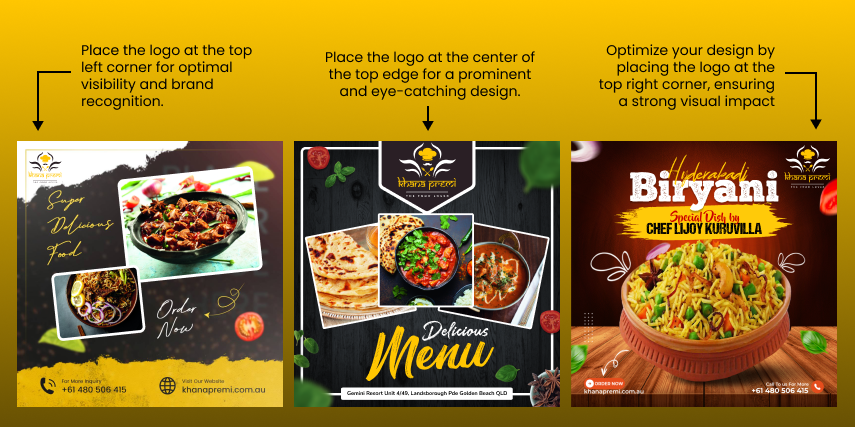
The positioning of a business’s logo in social media posts is an important part of brand visibility and awareness. It’s similar to selecting the best stage for your business to shine.
Where you position your logo whether as a profile picture, watermark, or integrated within the content affects how quickly your audience identifies and remembers your brand.
The strategic placement of your logo enhances credibility, fosters trust, and contributes to a cohesive brand presence. It’s not just a visual element; it’s a brand ambassador that, when well-placed, leaves a lasting and positive impression, reinforcing your identity in the fast-paced landscape of social media.
Use high-quality photos and videos
High-quality photographs and videos are appealing to the eye, and they also assist to highlight your brand and, in some situations, the impact of your brand.
The usage of high-quality photographs and videos is critical in social media post design. These images not only grab the eye, but they also represent professionalism and credibility.
Crisp images and well-produced videos enhance the overall visual appeal of your posts, capturing the attention of your audience and leaving a positive impression.

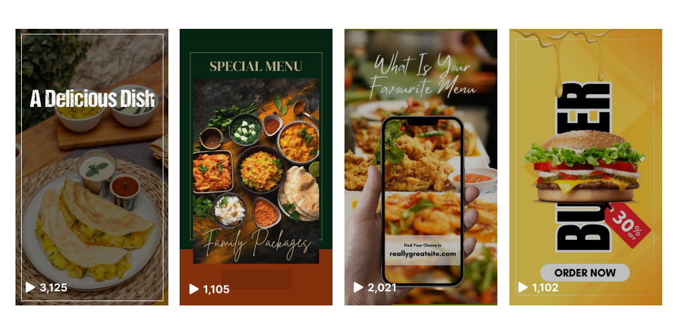
Choose eye-catching thumbnails for videos
Logo Selecting eye-catching thumbnails for videos in social media post design is crucial to capturing the audience’s attention and encouraging them to click and watch.
Tips for Choosing Eye-Catching Thumbnails
High-Quality Imagery : Use clear, high-resolution images that accurately represent the video content.
Contrasting Colors : Choose colors that stand out and create contrast to grab attention.
Readable Text : If including text, ensure it’s readable and relevant to the video’s content.
Faces and Expressions : Human faces and expressive emotions can attract attention and make the thumbnail more relatable.

Importance of CTA in Social media post
A clear Call-to-Action (CTA) and a succinct message are more successful. A simple prompt is more likely to elicit a response than a lengthy explanation.
In social media post design, a Call-to-Action (CTA) is like a digital guidepost that directs your viewers on what to do next.
It’s a prompt or instruction strategically placed within your post to encourage a specific response, whether it’s clicking a link, making a purchase, subscribing, or engaging in some other desired action.
Don’t use too much text
While writing is an effective instrument for transmitting information, it is not necessarily easy on the eyes. An lot of text, in fact, might be visually overpowering for viewers.
Written content’s rich features can strain the reader’s eyes and provide a barrier to successful communication. Finding the correct balance of text and visual elements is critical to providing your audience with a pleasant and engaging experience.
Conclusion
Finally, creating social media post photos and reels with the objective of increasing traffic necessitates a deliberate and user-centric approach within the field of UI design.
You can make your material more engaging and shareable by emphasising visual appeal, integrating intriguing storytelling elements, and keeping a balance of text and imagery. Utilising platform-specific capabilities, optimising for mobile consumers, and adhering to brand aesthetics are all important concerns.
Ultimately, the success of your social media design hinges on a thoughtful blend of creativity, user experience, and a deep understanding of your target audience, ensuring that your content not only captures attention but also fosters meaningful connections and interactions across various social media platforms.
Share on


