Top 10 Web Design Trends of 2015
April 28, 2015
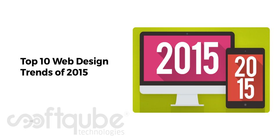
Web Design is an ever growing field In IT industry. Every day we can see something different in this field. But, experts believe that best will come in 2015. And few of the web design trends of 2014 will also be included in 2015.
However, something new will definitely be available in 2015 and so let’s take a look at these trends and find what new it has in this year.

Web Design trends of 2015
- Increased Length of Websites: Most of the new websites developed today have long length as compared to those developed previously. Today’s is the trend of longer scrolling sites. This makes it easy for people to view sites even on mobile devices.
Just keep on scrolling to read ahead. Long scrolling is not only limited to home page but now it can be seen on every web page. The reason, scrolling has enormous benefits and so these are now available on various pages like About Us, Product page etc. This trend can be seen on Apple’s Page of iPhone 6 where the website has adopted scrolling feature to know about specs and features of the phone.
- Interaction: An important part of any website is its content because next to design it’s the content that actually engages users with you. Hence, it’s a plus point for business owners if they are able to describe their entire story in a perfect manner through their content.
In 2015, people will focus more on revealing stories to the users in order to keep them engaged as well as make the website interactive as much as they can. Interaction along with animation in the website can usually provide a wow factor to the website.
- No show of large header background images: If we constantly see the websites of last few years then we can notice huge background images having text on the top and this is one of the things visitors usually see when they visit your website. Recent website designs have left out this trend by not using large header images.
So, now visitors will have the header as well as large typography but what it will lack is the huge background image after the heading. This is somewhat different from the usual trendy site designs that actually use such large images to attract visitors.
- Clear away unwanted designing elements: A web design is complete only when all unnecessary elements are removed from it. This means websites can have simple designs that look elegant and attract visitors.
Certain design elements are actually removed by the designers itself in order to keep the website simple. Instead now they are looking for clean and simple website design and this makes the website look and feel different from the competitors who have designed websites with heavy colours and images.
- Fix centre width: Generally websites use 100% width so that images can properly stretch out. But previously, websites used to have fix width and were centred in the page and now the same fix width trend is arriving back.
Now days, some sites are opting for maximum width in order to keep their content in centre in the viewport. This provides a nice focus to the site content.
- High quality photography: Professional photography or custom photography can bring the website design a step further rather than just picking the stock imagery and this makes the website look unique in such a way that no other competitor can include those pictures in their websites.
- Slide out Menus: Trend for responsive web designs is going on. Previously, importance was given on making the site look great on desktop devices but now days they should look great on mobile devices as well.
Hence, design elements are developed keeping in mind every single device that is used to access internet. One of such elements is Slide out menus which are often used technique in web apps and responsive designs.
- Hidden Main Menus: Like slide out menus, certain websites tend to hide their main menus in a perfect combination when visitors first visit their website. These hidden menus are visible only when visitor agrees to move ahead and click on the relevant icon.
- Including large typography: Last year, typography was an important part of website design and in 2015, the trend for large headings and typography is still going on. Large typography is one of the key trends of 2015 used to boost the visual hierarchy of the page by making sure that visitors read largest text as soon as they arrive on the web page.
- Performance and Speed: Several design trends are motivated to load sites faster and intake less bandwidth. Certain trends discussed here are likely to be used in order to reduce the size of the website and find several ways to load the site quickly.
Website design and developers are now slowly becoming aware of the weight of the website. Several other factors like slow network speed, device type has led designers and developers to heed to the file size as well as the website load speed on various networks.
Wind Up
Keeping these trends in mind, one can easily create the professional website which can easily meet the trends. To get the websites developed from experts, you can get in touch with Softqube Technologies, well known Web Design Company India.
Share on


