Mastering Website Design in 2024

Creating a compelling website is both an art and a science, encapsulating the essence of your brand while ensuring functionality and user engagement. At Softqube Technologies, we excel in crafting bespoke websites that not only captivate visually but are also intuitive and user-friendly. Our expert guide to building websites highlights the key components of successful web design and UI/UX, which are crucial in enhancing the digital marketing landscape. By focusing on these elements, we ensure that your website not only draws in traffic but also converts visitors into leads, optimizing your online presence for maximum impact and reach.

In this comprehensive guide by Softqube Technologies, we delve into 14 key aspects of building effective websites, showcasing our prowess in design and UI/UX. Our focus is on creating sites that not only look stunning but also drive traffic and lead conversions, a vital element in the digital marketing arena. From the importance of a well-structured header to the power of compelling CTAs, each point is designed to elevate your website’s impact. This guide is a testament to how Softqube harmonizes aesthetic appeal with user experience, turning your website into a potent tool for digital success.

Header

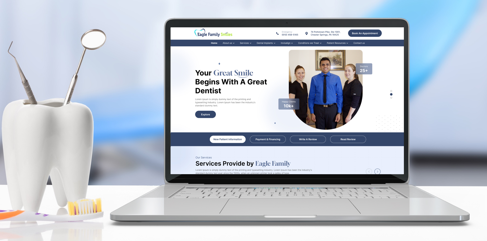
The header of a website is crucial as it serves as a navigational beacon, providing users with an overview of the website’s offerings and establishing its identity. It includes key elements to facilitate user interaction and streamline navigation.

  1. Logo and Website Name: Your logo is an iconic symbol that represents your brand’s identity. It should be carefully designed to be memorable, enabling users to easily recognize and associate it with your business. Equally important is the website name, which provides a textual representation of your brand that complements the visual impact of the logo. Together, they form the foundation of your brand’s recognition.
  2. Navigation Menu: The navigation menu serves as a digital map that guides users to different sections and pages within the website. It is crucial to carefully organize and clearly label navigation links. These links act as signposts, directing users to the information or products they are looking for. Dropdown menus can be used to categorize and subdivide content, making it easier for users to explore.
  3. Search Bar: A prominent and well-functioning search bar is a valuable tool for users seeking specific content or products. It offers an efficient alternative to manual navigation, saving time and enhancing the user experience. For e- commerce sites or platforms with extensive content, an effective search bar is essential.
  4. Contact Information or CTA: The header also plays a role in establishing trust and accessibility. By displaying essential contact information, such as an email address or phone number, you signal to users that they can easily reach out for assistance or inquiries. Additionally, including a “Contact Us” button or a primary Call to Action (CTA) can guide users towards initiating contact or taking other desired actions, enhancing user engagement.

Navigation Menu

A well-designed navigation menu is crucial for a website, serving as a roadmap for users to explore and access different sections and content. It ensures a smooth and intuitive user experience, helping visitors find information or products quickly.

  1. Clear Organization: A well-organized navigation menu is crucial for user-friendly navigation. It should be intuitive and reflect the hierarchy of your content. Begin with broad categories and then delve into subcategories, if needed. For example, if you have an online clothing store, you could have categories such as “Men’s,” “Women’s,” and “Accessories.” Under “Men’s,” you can further categorize items into “Shirts,” “Pants,” “Shoes,” and so on. This structured approach makes it easier for users to find what they are looking for.
  2. Dropdown Menus: Dropdown menus are useful when you have a large amount of content or products to showcase. They allow you to neatly categorize related pages or subcategories, reducing clutter in the main menu. For instance, on a restaurant website, the main menu could include categories such as “Appetizers,” “Main Courses,” and “Desserts.” When hovering over “Main Courses,” a dropdown menu could appear, displaying options like “Vegetarian,” “Seafood,” and “Steak.” Dropdowns simplify navigation and assist users in finding what they are interested in. However, it is important to ensure that dropdown menus are user-friendly and that the items within them are clearly labeled.
  3. Mobile-Friendly Navigation: With the growing number of users accessing websites from mobile devices, it is crucial to ensure a mobile-friendly navigation menu. The mobile menu should be easily accessible and user-friendly on smaller screens. A popular approach is to use a “hamburger” menu icon (three horizontal lines) that, when tapped, reveals the navigation options. Furthermore, the dropdowns and submenus in the mobile menu should be touch-friendly and easy to navigate. It is essential to ensure that the mobile navigation adapts to the screen size, providing a seamless experience for users on smartphones and tablets.

3. Hero Section

Hero Section

The Hero Section of a website is crucial for making a strong first impression and guiding users towards specific actions. It serves as the virtual doorway, grabbing users’ attention and conveying the website’s purpose.

  1. Prominent Image or Banner: Your choice of image or banner is crucial. Select high-quality visuals that align with your brand’s identity. Whether it’s a breathtaking landscape, a product image, or a captivating illustration, the image should instantly captivate visitors and pique their curiosity to delve deeper.
  2. Compelling Headline: The headline is the elevator pitch for your website. It should be concise, memorable, and communicate the value of your website. Think of it as a brief but powerful statement that informs users about what to expect. For instance, if you operate an online furniture store, your headline could be “Furnish Your Dreams.” This succinct phrase implies that your website provides a diverse selection of furniture to assist customers in creating their perfect living space.
  3. Subheadline or Description: To provide more context about your website’s offerings and elaborate on the headline’s message, include a subheadline or a brief description. This is an opportunity to explain why users should explore further. Building on the previous example, your subheadline might say, “Discover an exquisite collection of handcrafted furniture to transform your home. Our pieces are designed to enhance comfort, style, and functionality.”
  4. Primary CTA Button: The primary call to action (CTA) button is crucial for encouraging visitors to take the next step. It could be an invitation to shop, learn more, sign up, or contact you. Make sure it stands out and uses action-oriented language. For example, in our furniture store, the CTA button could say, “Shop Now.” This clear and compelling message directs users to explore your product catalog, advancing them on their journey.

4. About Us

About Us

The “About Us” section of a website is crucial for connecting with users on a personal level, building trust, and showcasing the brand’s story, mission, and team.

  1. Company Information: This segment explores your business’s history, mission, values, and what makes it unique. You can share the journey that led your company to where it is today, highlighting important milestones, challenges overcome, and successes celebrated. A concise and impactful mission statement expresses the purpose of your business and the impact it aims to create. Values serve as a moral compass, reflecting what your company cherishes and aligns with in all its endeavors. Uniqueness encompasses what sets your products, services, or approach apart from others in a crowded marketplace.
  2. Team Details: Behind every successful business are the people who lead it. In the “Team Details” section, you can introduce the key players in your organization, sharing their roles, expertise, and what motivates their dedication to your mission. This is an opportunity to showcase the human side of your brand and the faces behind it. Share team members’ backgrounds, highlighting their qualifications, experiences, and their journey to your company. This not only humanizes your brand but also establishes credibility by showing that you have a dedicated and skilled team driving your vision.
  3. Building Trust: Transparency and authenticity are essential for trust. This section is crucial for building trust by communicating with users in a way that shows you are not just a business, but a passionate group dedicated to making a difference. By sharing your company’s story, mission, values, and introducing your team, you let users know that you are more than a faceless entity – you are a partner, guide, and community. Building trust means making visitors feel like they are joining something larger, something they can trust and believe in.

5. Services/Products

Services/Products

In your website, the “Services/Products” section is crucial for showcasing your business offerings. It’s important to provide detailed information to assist users in making informed decisions.

  1. Listings: Each product or service listing should be presented clearly, providing not only the name but also relevant details for users to evaluate its suitability. This may include specifications, sizes, variations, and other relevant attributes. Taking a comprehensive approach allows users to compare offerings easily and find exactly what they are looking for.
  2. High-Quality Images: High-quality images are essential for effectively showcasing the appeal and quality of your products or services. It is worth investing in professional-grade photographs that accurately depict what you offer. Utilizing multiple images from various angles, demonstrating the product or service in use, can be especially impactful. Clear and high-resolution pictures significantly contribute to capturing the attention and trust of potential customers.
  3. Descriptions: The written descriptions accompanying your products or services should do more than just explain their functionality. They should tell a captivating story about what makes your offerings stand out. Emphasize their unique features, benefits, and how they solve problems. Utilize persuasive language and emotional triggers to capture the interest of users and address their concerns or questions. A carefully crafted description can not only inform but also inspire, motivating users to make a purchase or inquiry.
  4. Pricing: Transparency in pricing is crucial. Users should be able to easily view the cost of each product or service, with no hidden fees or surprises during the checkout process. Provide a clear breakdown of prices, including any discounts or promotions that may apply. If applicable, offer multiple pricing tiers to cater to different customer segments. Remember, a simple and transparent pricing structure builds trust and encourages conversions.

6. Testimonials

Testimonials

The Testimonials section of a website is crucial for building trust and credibility by showcasing positive feedback from customers who have experienced the products or services. This can greatly influence potential customers, assuring them of the value and quality offered.

  1. Customer Reviews: In the Customer Reviews sub-section, you can display honest and positive feedback from customers who have personally used your products or services. Customer reviews provide authentic endorsements of what you offer. They emphasize the real-world benefits and satisfaction levels that others have experienced by choosing your business.
  2. Build Credibility: The main goal of the Testimonials section is to establish credibility and trust with potential customers. To accomplish this, it is crucial to include genuine and unaltered reviews.

7. Portfolio/Projects

The Portfolio/Projects section of a website is a powerful showcase of skills and accomplishments, demonstrating expertise and experience in a compelling manner.

Images, Descriptions, and Links:

  1. Images: High-resolution images capture the essence of each project or achievement. Visual content serves as the initial hook that attracts visitors and piques their interest.
  2. Detailed Project Descriptions: When writing descriptions for each project, it is important to go beyond the visuals and provide context and insights. Explain the objectives, challenges, and the solutions that were delivered for the project. Additionally, highlight any unique or innovative approaches that set the project apart.
  3. Links for Further Details: Include links that allow users to delve deeper into each project. These links might direct users to dedicated project pages, case studies, or relevant content that provides an in-depth exploration of your work.

Demonstrate Expertise:

  1. Expertise and Skills: Your portfolio serves as a platform to demonstrate your expertise, skills, and the variety of services you provide. It assists potential clients or partners in comprehending the extent of your capabilities.
  2. Past Successes: Highlighting past successes demonstrates a track record of delivering results. Share metrics, testimonials, or awards associated with the projects to further validate your expertise.
  3. Problem-Solving Abilities: Emphasize your problem-solving capabilities by narrating how you addressed challenges in each project. This showcases your ability to adapt and find effective solutions.

8. Blog/News

Blog/News

The Blog/News section of a website is essential for businesses and organizations to connect with their audience, share informative content, and establish their expertise.

  1. Regular Updates: A blog or news section is the pulse of your website, offering a consistent flow of fresh and relevant content. Whether you publish daily, weekly, or monthly, maintaining a regular update schedule keeps your audience engaged and informed. Consistency is key to building a loyal readership and sustaining their interest.
  2. Categorized Posts: To enhance user experience, it’s imperative to categorize and tag your posts effectively. This organization allows visitors to quickly find content that aligns with their interests. Categories can range from topics related to your industry, services, or products to broader subjects such as tips, how-tos, and news updates. Tags further refine search results, providing even more focused access to your content.
  3. Social Sharing: Including social sharing buttons on your blog or news articles enables readers to effortlessly distribute your content across their social networks. This not only broadens your reach but also fosters user engagement. When users find valuable content, they are more likely to share it with their connections, leading to increased visibility and potential for new audiences to discover your website.

9. Contact Information

Contact Information

The Contact Information section of a website is essential for facilitating communication between a business and its site visitors, building trust, and encouraging engagement.

  1. Contact Form: A user-friendly contact form simplifies the process of reaching out to your business. This form typically includes fields for the user to input their name, email address, and a message or inquiry. By providing a structured way for users to send messages, you not only make it convenient for them but also ensure that you receive essential information to respond effectively. The key elements of a user-friendly contact form include clear labels, straightforward instructions, and, if necessary, validation checks to ensure that user-provided data is accurate. Additionally, consider including options like drop-down menus to categorize inquiries (e.g., sales, support, general questions) and a ‘Submit’ button to send the message.
  2. Address, Phone Number, and Email: Displaying your physical address, phone number, and email is a way to offer multiple means of contact, giving users the flexibility to choose their preferred method. Sharing your business’s physical location can be particularly important if you have a brick-and-mortar presence. Include a full address with details like street, city, state, and postal code. The phone number is clearly visible, and, if relevant, consider providing multiple phone numbers for different departments or purposes (e.g., sales, support, billing). It’s important to ensure that the email address is easily clickable or copyable, promoting quick and convenient communication. You may also use different email addresses for various functions, such as [email protected], [email protected], or [email protected].
  3. Interactive Map: Including an interactive map is especially valuable if your business’s physical location is pertinent to your operations. An interactive map can help users pinpoint your exact location, providing visual guidance. Interactive maps often include features like zooming in and out, street view, and directions. These features offer an interactive and user-friendly experience, making it easy for site visitors to find you.

Footer

The footer of a website is a crucial space that serves as a navigational hub, legal resource, and connection point with visitors. It contains valuable information and actions to enhance user experience, promote trust, and maintain legal transparency.

  1. Links to Important Pages: The footer houses an array of links, granting visitors access to critical pages with ease. These pages may include the sitemap, privacy policy, terms of service, and more. These links offer visitors an additional way to navigate the website and quickly find the information they need.
  2. Privacy Policy and Legal Disclaimers: Legal compliance is paramount in the digital world, and the footer is the perfect place to ensure this. The inclusion of a link to the privacy policy and terms of service provides transparency and reassurance to users about how their data is handled and the rules governing site usage. These pages outline your website’s commitments and responsibilities, fostering trust.
  3. Social Media Links: In today’s connected world, social media plays a crucial role in brand visibility and interaction. Social media links in the footer offer visitors an invitation to connect with your business on various platforms. These links enable users to stay updated with your latest updates and engage with your brand on their preferred social networks.
  4. Newsletter Signup or Additional CTAs: The footer is a prime location to encourage user engagement through newsletter signups or other CTAs (Call to Actions). By including a subscription form, you provide users with the opportunity to receive regular updates, promotions, or informative content directly to their email inbox. Additional CTAs can be tailored to suit specific site goals, such as requesting a quote or scheduling a consultation.
  5. Copyright Information: At the bottom of the page, you’ll typically find copyright information that indicates the ownership and copyright status of the website’s content. This legal declaration reinforces the website’s ownership rights and deters unauthorized use of its material. It provides clarity on who holds the rights to the site’s content and protects against plagiarism or unauthorized distribution.

11. CTAs (Call to Action)

CTAs (Call to Action)

A Call to Action (CTA) is a crucial element on a website that guides users towards specific actions or behaviors to achieve website goals such as generating leads, increasing sales, or fostering user engagement. CTAs play a central role in driving conversions, which are actions that lead to achieving website goals.

  1. Contact Us: A “Contact Us” CTA encourages users to reach out for inquiries, support, or other communication.
  2. Purchase: CTAs such as “Buy Now” or “Add to Cart” lead to sales, converting visitors into paying customers.
  3. Subscribe: Newsletter signup CTAs aim to convert visitors into subscribers, allowing you to communicate with them regularly.
  4. Download: Encouraging users to download resources, such as e-books, whitepapers, or software, is a conversion action.
  5. Sign Up: Registering or signing up for an account can be a crucial conversion for user engagement and retention.
  6. Request a Quote: In businesses where services or custom products are offered, this CTA initiates the quoting process, converting prospects into potential clients.
  7. Learn More: For educational websites or those providing detailed information, the “Learn More” CTA encourages users to delve deeper into your content.
  8. Share: CTAs for sharing content on social media convert users into brand advocates, expanding your reach.

A search bar on your website allows users to find specific content, products, or information easily. It acts as a virtual compass, enhancing navigation and efficiency for visitors.

  1. Quick Search: A quick search ensures users find what they need swiftly, enhancing their experience and reducing frustration.
  2. Accurate Results: Accurate results mean users receive relevant information, guiding them to their intended destination effectively.
  3. User-Friendly Design: A user-friendly search bar is prominent, easy to use, and adapts seamlessly to different devices, enhancing the overall user experience.
  4. Search Analytics: Search analytics provide valuable insights into user behavior, helping you understand what users are seeking and how to improve your site’s search functionality.

13. Newsletter Signup

Newsletter Signup

The Newsletter Signup section on a website is a valuable feature that invites visitors to become part of your online community. By subscribing, users receive updates, news, and exclusive promotions directly in their inbox. Consider the following for additional information.

  1. Value Proposition: Highlight the benefits of subscribing to your newsletter, such as receiving exclusive discounts, early access to new products, or insightful industry updates. Make sure visitors understand what they’ll gain by subscribing.
  2. Ease of Use: Ensure that the signup process is simple and efficient. Use a clean and straightforward form that asks for minimal information, typically an email address and, optionally, the user’s name. The easier it is to subscribe, the more likely users are to do so.
  3. Privacy Assurance: Address concerns about user data privacy. Assure visitors that their information will be securely stored and not shared with third parties. Include a link to your privacy policy for further transparency.
  4. Call to Action (CTA): Place a prominent and action-oriented CTA button (e.g., “Subscribe Now” or “Get Updates”) near the signup form. The CTA should clearly convey the action users are taking and entice them to click.
  5. Confirmation and Welcome: After users subscribe, send a confirmation email to verify their email address. Once confirmed, send a welcome email that thanks them for subscribing and reiterates the benefits they’ll receive as a subscriber.
  6. Content Quality: To retain subscribers, consistently deliver high-quality, relevant content. Craft engaging newsletters that provide value and make readers look forward to each edition.

14. Sitemap

A sitemap is a visual roadmap of your website’s structure, serving as a guide for both users and search engines. It can be in XML format for search engines and HTML for users, each with specific functions.

  1. Visual Representation: A sitemap typically presents your website’s structure in a tree-like diagram or list format. It visually outlines the relationships between different pages, categories, and subcategories. This clear visual representation aids users in understanding the organization of your site, making it easier for them to find the content they seek.
  2. Navigation and SEO Aid: For users, a well-organized sitemap provides an alternative means of navigating your website. If users struggle to find what they need through the main navigation menu, they can turn to the sitemap for a more direct path to their desired content. From an SEO perspective, search engines use XML sitemaps to crawl and index your site more efficiently. This can lead to improved search engine rankings, ensuring that your content is discoverable by a wider audience. Additionally, it helps with SEO by providing search engines with metadata about your website’s content, such as when each page was last updated.

Conclusion

Softqube Technologies brings to the table a unique blend of creativity and technical expertise, crucial for crafting exceptional websites. Our in-depth guide reflects our dedication to excellence in web design and UI/UX, vital for boosting digital marketing outcomes. Each of the 14 points we’ve explored serves as a cornerstone in building websites that are not only visually appealing but also highly functional and user- centric, ensuring they effectively drive traffic and convert leads. Trust Softqube to elevate your online presence with our unparalleled digital solutions.

Eagle Family Smiles: How a New Landing Page Sparked Transformation

In Chester Springs, PA, Eagle Family Smiles, led by Dr. Bhadresh Patel, boasted a stellar local reputation but struggled with online conversions. Softqube stepped in to transform their digital presence, enhancing their website to translate traffic into meaningful online appointment bookings.

Transforming Eagle Family Smiles: A Challenge of Conversion and Trust

Eagle Family Smiles faced a challenge – their website needed a makeover for better lead conversion and building trust. Dr. Patel aimed to make it easy for patients to find services and feel the clinic’s warmth and professionalism.

Softqube’s Approach: Redesigning Eagle Family Smiles’ Landing Page for Success

Softqube's Approach: Redesigning Eagle Family Smiles’ Landing Page for Success

1: Identifying Clear Objectives

Through extensive discussions with Dr. Patel, we outlined the primary goals of the project. This involved understanding patient needs, questions, and what influenced their choice of a dental clinic.

2: Seamless User Journey

We focused on creating a smooth path for visitors. Clear Calls to Action (CTAs), easy access to service listings, and prominent patient testimonials were integrated to enhance the journey from site landing to appointment booking.

3: Establishing Trust

In the dental industry, trust is paramount. We strategically placed Dr. Patel’s professional photo on the landing page to make a personal connection with visitors. Genuine patient testimonials were featured to bolster trustworthiness.

Crafting Trustworthy Smiles: The Story Behind Our Website’s Design Choices

Crafting Trustworthy Smiles: The Story Behind Our Website's Design Choices

When you visit the Eagle Family Smiles website, you’ll immediately notice our distinct color palette and font family. These design choices were carefully selected to create a welcoming and trustworthy online environment for our patients and visitors.

Lush Green (#87BD20)

symbolizes vitality, health, growth, aligning with our mission for top-notch dental care, signifying a fresh, confident smile.

Cool Blue (#4F638C)

Conveys professionalism, trust, and calmness, creating a serene, secure environment for our visitors.

Cyan (#05C7D9)

symbolizes hygiene, purity, and our commitment to cleanliness and a refreshing patient experience.

The font family we use on our website is “Inter. “Here’s why ‘ve chosen this particular font:

Readability: Inter is known for its exceptional readability, making it easy for visitors to read our content without straining their eyes. It’s especially crucial for sharing valuable information and education about dental health.

Versatility: Inter is a versatile font that can adapt to various design styles while maintaining a consistent and professional appearance. It ensures that our website looks polished and cohesive across all pages.

Modern Aesthetics: The clean and modern aesthetics of Inter align with our commitment to staying up-to-date with the latest dental practices and technologies. It reflects our progressive approach to dental care.

Through carefully selected visuals, we craft an inviting atmosphere and showcase our commitment to dental well-being.

Using images on the “Eagle Family Smiles” website serves to create a warm and inviting atmosphere. These visuals are carefully chosen to help convey our commitment to your dental health in a gentle and reassuring manner. Pictures of our caring dental team, clean and modern facilities, and smiling patients are included to show the friendly and professional environment you can expect when you visit our practice. These images also aim to reduce any anxiety or apprehension associated with dental care, making you feel comfortable and confident in choosing Eagle Family Smiles for your dental needs. By using images thoughtfully, we hope to provide a visual representation of the compassionate and quality care we offer to our patients.

Strategic Framework for Landing Page Success: Softqube’s Unique SOP

1: Landing Page Objective: Capturing Dental Care Seekers

Eagle Family Smiles’ landing page strategically targets Chester Springs residents in need of dental care. It addresses various dental concerns and positions the clinic as a premier provider. Drawing traffic from various sources, the page aims to engage new and prospective patients. Its central message highlights top-tier dental services, and success is measured by metrics like appointment bookings and user interactions.

2: Strategic Positioning: Directing Traffic and Actions

Strategic Positioning: Directing Traffic and Actions

The Eagle Family Smiles landing page is strategically placed within the user journey. The input recognizes the significance of local SEO and search traffic, while acknowledging the role of social media and referrals. As for output, the primary Call to Action (CTA) is crystal clear: “Book an Appointment.” This guides users efficiently in taking the next step towards their dental care journey, ensuring a seamless and purpose-driven experience.

3: The Power of a Clear Message in Dental Care

The landing page for Eagle Family Smiles delivers a straightforward yet impactful message: “Your trusted local dentist in Chester Springs offering a comprehensive range of dental services.” It addresses the real problem of fear associated with dental procedures, presenting solutions through experienced dentists, modern technology, and a comfortable environment. This approach introduces a new way of experiencing dental check-ups without anxiety and discomfort. The page successfully bridges the gap with SmileBright’s expert care, ensuring a pain-free and professional experience for patients.

4: Defining a Strong Dental Brand Image

When it comes to shaping the positioning of the Eagle Family Smiles landing page, several key elements are considered. The tone of voice is a blend of professionalism, care, and community-centeredness, ensuring a welcoming atmosphere. The personality exudes expertise while maintaining an approachable demeanor, with an unwavering focus on patient care. Semantically, the page incorporates terms that resonate with dental care, expertise, and trustworthiness. To maintain clarity in patient communication, it wisely avoids using overly technical jargon. This strategic approach helps create a strong and reliable brand image for Eagle Family Smiles.

5: Crafting a Dental Brand Image: Positioning Essentials

Eagle Family Smiles’ landing page ensures a professional, caring, and community-centered tone. Its personality strikes a balance between expertise and approachability, always prioritizing patient care. Using dental-care-related terms and avoiding technical jargon, the page establishes a strong, trustworthy brand image, fostering clear communication with patients.

6: Data-Driven Insights for Landing Page Success

Utilizing SEMrush and Google Analytics, the landing page research unveils traffic-driving keywords and visitor demographics. LinkedIn and local forums provide community insights. Collaboration with the reception team yields valuable patient feedback.

7: Engaging Hero Section: Crafting an Inviting Website Entry

Engaging Hero Section: Crafting an Inviting Website Entry

The website opens with a warm image of Dr. Bhadresh Patel, an inviting “Your Great Smiles Begins with A Great Dentist ” headline, clear service listings, and a prominent “Book an Appointment” CTA. Grabbing attention, it encourages visitors to join those who’ve transformed their dental experience with expert care, leading them to explore services in detail.

For a comprehensive overview of the project, we have extensively covered all the essential information in our blog. However, if you’re seeking a more in-depth exploration of the project, including a detailed case study that delves into the specifics, please feel free to click on the following link Case Study of Eagle Family Smiles Website. This case study provides a thorough examination of our project, offering valuable insights, data, and a deeper understanding of our processes and outcomes. Don’t miss the opportunity to explore the finer details by following this link Case Study of Eagle Family Smiles Website.

Conclusion

Eagle Family Smiles’ transformation showcases the impact of a well-designed landing page. It’s about understanding the audience, their needs, and guiding them seamlessly online. Businesses seeking a potent online transformation should consider the importance of a well-crafted landing page. Connect with Softqube today to script your own success story.

Your Modern Web Architecture Must Future-Proof Your Product – Find Out How

While working on a project how do you choose a suitable web application architecture? Do you really check with the required parameters or do wide research or just select it randomly?

Finding the right architectural style for your application will always give you the upper hand. Looking at the scalability requirements, the structure of your organization and the project goals and volume will impact the decision. Making mistakes at this fundamental step can cost you a lot and will affect you in the long run.

Worry not. If you know different types of architecture and their features, functionalities, and the reasons why they exist, it will help you select a future-proof approach for your awesome project and avoid further costs.

Let us head over to all that we are going to discuss in this post.

What is Modern Web Architecture & Why is it So Important?

Software architecture means the main components, structure, and layout of the system. It also defines how system parts connect and communicate with each other. Talking about the architecture of a modern web application, let us find out what relations exist between the high-level structural parts.

  • Client application: user interacts here with the browser
  • Web server: process requests and provides responses
  • Databases: storing and accessing data
  • Cloud services: for all types of cloud-native solutions
  • Third-party APIs and integrations and much more

To know the reasons for choosing modern web architecture for your application, there are some key factors and properties of your application you know and how it impacts directly choice

Methodology and Timeline

The amount of time it will take to create your application, the way your team will handle the requirements, and organize and manage project development.

Team and skills

Web development team structure, required expertise, and composition

Cost

Budget of the entire project, cost of services of web development, upfront expenses, and technologies that you will require to get it up and running

Flexibility

The speed of adopting new services or technologies, modernization, and migration to new platforms or frameworks, adding new features and functionality

Performance

Finding the overall pace and ability to handle the growing load and an increasing amount of user requests, data, etc. with zero compromises on user experiences

Support

Need of skills and cost for supporting the application and maintaining infrastructure

So as you can see, the choice of architecture creates an impact on how the application will work and when you will put your product into the market-leading what amount costs. All this goes beyond the technical requirements. And all these choices will directly impact your business objectives and goals.

In addition, the architectural approach is going to play a fundamental role in the ability of your application to scale and evolve with the changing goals and technical requirements. In the post, we are going to talk in detail about the characteristics of web applications and give quick tips on how to choose the right type of web application architecture.

Diagramtical Explanation of Web application architecture

Take this classic example of a modern web architecture for your application that consists of two basic components that are a client-side application – that runs in a browser and a server-side – code at the backend. These components are the core parts of any web application and they can transform into different forms based on various architectural styles.

Client-Side

The client-side application is also known as frontend and refers to the dynamic web interface opened by users in a browser to interact with real-time situations. Like sending requests, surfing pages and scrolling, using online services and much more. The responsive, quick, and rich front end is developed with modern Javascript libraries and frameworks like React, Angular, Vue.js, etc.

Server-Side

The role of server-side components is to receive, process and respond to the request coming from the client application. In the simple diagram above you will see the backend generally has all the business logic and performs the heavy lifting. Also, it validates user requests, stores the database, pulls out data from the database, and is quickly responsive to the requests.

With a gamut of programming languages, tools and frameworks in the tech stack, you can develop the choicest web application at the backend. Your choice is based on various factors that include the type of web application and its functionality.

Looking from the very beginning, you will find this architecture diagram above very simple for developing web apps giving you a general overview of what all contained in a web app.

Based on the specification of each app, the task distribution varies between the front end and the back end. In some cases, some parts are moved to the client-side for attaining a certain speed and usability goals. While in other cases, the core components of the web application architecture transform into a pretty complex multi-component structure addressing important technical requirements or business goals.

Types of modern web app architecture for various projects

Various modern approaches can be applied to build a web application. Apps like Gmail, Uber, Slack, or NetFlix use some of these seven widely used modern web architectures. We shall split based on the two components.

Server-side Approach

Microservices

One of the most eminent and widely applicable approaches to building scalable web applications. Microservices is based on the principle of modularity and decentralization. To be precise, the system is bifurcated into a range of microservices. And each microservice is created around a single business function and then deployed on an independent basis. It can also be created with a customized set of technologies having its data flow and database.

This approach is well known for being highly scalable and reliable with incredible tech and business agility. Being so popular, it builds large and distributed web applications with great ease and flexibility.

Monolith

One of the most simple approaches to creating a web app architecture. The monolithic web application is built as a single unit that operates most of the functions. At its core, it has many layers such as business logic, presentation, and data. All user requests are directed to these layers and returned back to the user with a response. Monoliths comprise one or more databases and can be hosted on in-house servers, in the cloud, and also can be integrated with third-party platforms.

One of the most important characteristics of monolith is its undivided future. Monolith is often faster to perform the entire app development cycle which makes it a viable and cost-effective solution for MVPs and small projects needing to be rolled out with a stricter deadline. Along with the same, monolith applications take time to scale and get modernized due to their requirement of making changes to the entire system.

Serverless

Serverless means deploying applications and running them on outside servers that are owned and maintained by cloud service providers. There are various modern cloud platforms such as AWS, Google Cloud and MS Azure containing an entire set of tools and services for managing, building, and supporting a web application infrastructure of any kind of complexity and volume.

Serverless architecture is a great option for companies who do not have the in-house expertise to take care of their web app infrastructure or reduce the cost of support by providing flexible pricing that is given by the cloud providers.

Single-page applications

A single-page application exactly performs what the name suggests. It offers the years only one web page that keeps changing whenever the user clicks on something or does interact with the page. The page is not reloaded entirely while the user sends the request. Instead, SPA makes relevant updates on the relevant component of the page. And that is why SPA apps are lightweight, quick and highly responsive. Works great for apps like Google Maps etc.

Multi-page applications

It is a traditional design approach tailored for applications with multiple workflows and functions. MPA is implemented by way of several dynamic web pages. Each of the page functions distinctively and gets reloaded whenever a user sends a new request. Like eCommerce web application that contains separate pages for various services.

Progressive Web applications (PWA)

In the past years, PWA has offered a lot of acceptability because of its two major benefits. One is its offline mode functionality and providing improved user experience. PWAs merge the idea of a web app that runs in a browser with a native application that is installed on the device. This becomes real when PWAs start taking advantage of the service worker who sits in browsers, processes the request of the users and pulls the data according to the requirement.

Micro Frontend

You can make a healthy comparison between microservices and the micro frontend approach. Here, the client-side of the web application structure is split into different independent modules that can be developed and deployed by using various technologies as per the server functions. The advantage of the component is its flexibility and scalability. You can develop and deploy every micro front end on its own. In addition, you can split your development teams to work in parallel and increase speed to focus on specific business functions. Micro frontend gives a good solution if combined with microservices.

Best Practices of Web application architecture

Some modern web architecture for the apps are developed with the best practices and principles that can help you understand which approach works best.

Clarity

However complex your web app structure is, you must keep it understandable, simple, and navigable with clean and reusable codes.

Scalability

The entire web app and each component must be scalable as per the given requirements and future business needs

Security and reliability

The security standards must take care of the security needs because web app architecture is meant to be built with great reliability and consistency

Error traceability and effective fixing

The technical team must find it easy to detect, trace and fix the errors with no major failures

Automation

In case possible, app testing, deployment, maintenance and support should be automated to improve productivity and reduce costs.

Develop a future-ready custom web app with Softqube

Working on a new app or want a skilled team of developers and experts who can implement your project at the right time? Are you finding ways to optimize and scale your current product and migrate to microservices and leverage the cloud?

If this is all you are looking for and anything similar around, Softqube is here to assist you. From a team of senior engineers, designers, architects, and developers with project managers, we have a proven track of successful deliveries. You can rely on our specialists no matter what stage of the project you are in. Contact our experts and tell us about your project today.

Top 5 HeatMap Tools To Improve Your Website UX Designs

The name says it all: UX means User Experience. The story is all about what, when, and how about your users. Pretty much this makes sense to remain focused on the users during the data collection from the website. It starts with getting well-equipped with enough data to optimize the needs of your users.

Maybe you have some clues about user behavior by studying the traditional analytics data. But that is not enough to help you out in spotting a real problem even when you find one. So from where does the entire game start?

Being a UX designer, marketer, or developer, you work on user experience every single day. And here, heatmaps can help you to gather data on the way people interact with your website. And that shall give you insight on enhancing the UX and the metrics that really matter to your business.

This piece of the blog will help you learn what a heatmap is in the actual sense and how you can use it with effective tools to optimize your UI designs and scale your business. So let us just get started.

HeatMap in UX Design

Almost all the UI/UX professionals resort to the heatmap. With heatmaps, the data collected fetches a clear idea of the content and look of the online environment. Users give you the most authentic and fair feedback on your digital designs. Heatmaps become a reliable tool to get quality feedback to help you succeed. As a result, the insights that are pooled in, help you enhance the overall user experience of websites.

So basically, heatmap gives you access to check the performance of your website and the way the users interact with your content. Through heatmap tools, you watch the users click, how far they can scroll, and what are the hotspots of your website.

The most important aspect of accessing heatmaps for UX design is to get natural insights from the users. As they interact with your website they are still not part of a controlled or moderated experiment. However, they are helping you get real feedback. How incredible it is!

Importance of HeatMap in UI/UX Design

Companies use heatmaps to enhance marketing campaigns and advertising strategies. This improves the conversion rates and makes the users a crucial part of the design process. In turn, the designers get to understand the pain points of users and can meet their needs effectively. The significance of heatmaps in UI design can be prominently seen in the below areas:

CTA Buttons

The best way to check the conversion rate and performance of your online content is by watching the number of clicks your CTA buttons are getting. Heatmaps tell you all this with great ease just by viewing the online product heatmap. Also, you can check whether the CTAs are getting the highest engagement or not.

Navigation

The main navigation and footer become the most significant features of a webpage. The way you organize your content in the menu can have a big impact on the user experience. The choice of words also impacts the navigation in the menu. This ensures that you’re using the language that your users are familiar with. A heatmap in UX can tell you whether your menu is working or not. It can also tell you which items in the navigation are working well and can, therefore, be highlighted in a better way.

Page Length

Page length leaves a strong impression on users’ minds. Too long pages make them overwhelmed and tired. And so, they jump off the website in no time. A heatmap tells you how far you should go and where your audience actually gets off the website.

Unexpected Clicks

The users sometimes go and click at the places where they feel it is clickable. If these clicks do not give any result, the users can get frustrated. Heatmaps can identify such spots on a webpage and help you rectify the issues.

Usage with other UX tools

Heatmaps fill you with so much valuable information. When you use it with other UX tools, it can turn out to be of immense help to the overall user experience. With Google Analytics, you can get a clear idea about your advertising campaigns and the overall performance of web pages.

5 HeatMap Tools To Give You Coolest UX Designs

Various heatmap tools are good enough to help designers benefit. In the case of technical services, you must know which tool or software fits the best. Well, the answer is not as simple as it appears. Several tools available in the market have unique features. The website chooses heatmap software based on the nature of the project you work on, the website purpose, and the target audience. Let us head over to the top 5 heatmap tools that I believe are the best ones for enhancing your UX designs.

1. Zoho PageSense

zoho-pagesense

A low-cost solution to create website heatmaps. With ZohoPageSense you can create heat maps and get a good idea of the time users spend on a specific section of the website. Similar to Zone-based Heatmaps of ContentSquare, here too specific segments of webpages get a good amount of attention. UI/UX professionals use these insights to concentrate on the smaller elements.

The most attractive feature of this heatmap tool besides its low cost is the presentation of analytical information. Zoho is a combination of ample solutions and services. The varied solutions of Zoho enable you to work on a single product offered by the organization.

The reports formulated and presented by Zoho PageSense are quite easy to navigate and understand. You can use multiple filters to focus on different segments of the report and even customize the report based on your preferences.

Additionally, like other heatmap tools, this solution also enables you to view the behavior of users using different devices. Using a single tool, therefore, you can see how your website is performing on desktop and mobile devices.

2. Hotjar

hotjar

One of the eminent heatmap tools available in the market. It is successful and widely popular due to its seamless usage. Hotjar uncomplicates things. It gives you several features that you want from any heatmap tool. Hotjar enables you to watch recorded sessions of visitors’ interaction with a website. These recordings can be watched at a fast pace and, thus, do not consume a lot of time.

One of the outstanding features of Hotjar is that it enables live feedback. You can use a widget provided by Hotjar on your website and invite feedback from users. The visitors can simply click on the widget, record their feedback, and let you know what specific feature on the website is causing issues. This is an informal type of UX research where you do not go into in-depth analysis but get quality feedback with minimum effort.

The cost of Hotjar is a little higher than other heatmap tools such as Crazy Egg or Mouseflow. Using Hotjar, however, is a delightful experience in itself. If you’re looking for quality analysis and are not facing serious budget constraints, investing in Hotjar is definitely a smart idea.

3. ContentSquare

contentsquare

Another excellent resource tool for websites. It is named “Zone-based Heatmaps”. It is very much true to its name. These heatmaps give you specific analyses about an element or zone on the web page. Contentsquare also gives you the estimated revenue you are generating from certain elements or CTA buttons on a webpage. This information is of great value to the marketing teams as the number provided here can give a good indication of what is working well for the business and what needs improvement.

Quite similar to Crazy egg, ContentSquare gives access to conduct A/B testing while making the comparison of the two versions of the same webpage. If you are a UI/UX designer, you can use this information to create the best version of a webpage.

Cost: Pricing is based on the monthly number of page views.

4. Crazy Egg

crazy-egg

Wishing to take your heatmap game a step further? Here you go. This tool actually helps devise solutions and implement them. Crazy Egg has all the basic features a designer needs. Like record clicks and check out the areas on the web page to get the best engagement rate.

One of the best features that Crazy Egg offers is that of A/B testing. UI/UX designers conduct A/B tests day in and day out, especially for online content. With Crazy Egg, your work as a designer is reduced, as the tool itself provides you with quality analysis between two different versions of a particular webpage. This can help you identify which alternative is working well and how you can get better engagement and an increased conversion rate.

Cost: Plans starting at USD 24 per month

There is no free version of the tool except for a 30-day trial period. You can enjoy the benefits of the tool with the limited features.

5. Luck Orange

luck-orange

The next best option that you can use for the creation and analysis of the heatmaps is this tool. The common features of heatmaps, like recording sessions, several clicks, and hotspots on the webpages, all remain available in the tool. In addition, Lucky Orange gives an aesthetically pleasing and comprehensive dashboard that you can use to view the overall website. The dashboard assists you in answering basic questions like what is working on the website, where do the users come from, demographic distribution, and much more.

If you’re running a website that focuses more on conversions and generating new leads, then Lucky Orange will be of special interest to you and your business. This heatmap tool provides you with a conversion funnel that can delineate user journeys, helping you identify the leads that you can work on. Conversion funnels can be extremely useful in creating new customers and also enable you to retain the existing ones.

If you look at the cost of Lucky Orange, it is also quite low compared to other competitors. It is, therefore, worth mentioning that this tool has the promise of not being a burden on you financially.

Conclusion

Heatmaps are outstanding tools that help you improve the organization’s online presence. If you are working on a single-page website, a professional portfolio, or any complicated ecommerce website, heatmaps are always available. A little effort, little money, and lots of creativity and analysis will do in heatmaps. And you can always see, the benefits are immense.

The tools that are listed in this blog bring in a lot of value to your experiences as a UI/UX designer. No matter at what level you are working as a designer, updating yourself about the heatmaps will take you a long way. Particularly, professionals will get a great boost.

So, go ahead and make your projects worthy enough and improve the utility of your websites with the power of heatmaps.

Softqube Technologies Pvt Ltd Recognized as one of the Best IT Services Companies by Clutch

Softqube Technologies Pvt Ltd is very excited to share that we have been recently named as one of the best IT and Software solutions & services companies in India. We are happy to share this amazing achievement with all of you!

clutchs-2022-research-list

We are excited to be featured on Clutch’s 2022 research list of incredible B2B companies in India. This is such a huge milestone for our company! We couldn’t have asked for a better way to start 2022.

For those that don’t know, Clutch is an established platform in the heart of Washington, DC, committed to helping small, mid-market, and enterprise businesses identify and connect with the service providers they need to achieve their goals.

Our team would like to extend its appreciation to Clutch and their team for making this award possible. We would also like to thank our clients for choosing us as their IT partner. Your business has played a major role in our success. Without the support and confidence of our customers, this feet would not have been possible. . To that, we want to say thank you from the bottom of our hearts.

On officially receiving this award, here’s what our CEO Nitin Suvagia has to say:

“More than the award, this recognition means a lot to our team at Softqube. This award is another success milestone in the journey of our company. We would like to thank our customers and team mates for their valuable contribution. We further resolve and commit ourselves, more than ever, to work in the direction of empowering our customers with the right technology tool to support their businesses. ” – By NITIN SUVAGIYA

What is The Cost of Developing an eCommerce Website in 2021? – A Comprehensive Guide

You will have to consider several attributes while estimating the cost of an eCommerce website. From the website design to including the advanced features, you need to decide upon the maximum budget, your specific need, and the chronological breakdown of the website elements. Once you determine the goal and identify every single aspect of creating a robust eCommerce website, you are all set to acquire the accurate cost of building it.

Based on our experiences and the prevailing market scenarios, an eCommerce website costs somewhere around $5000 to $200000. Sometimes it can be even more. Well, to make your job easier and quite simpler, you can ask yourself these questions. Once you get the answers, you can take it ahead and frame other aspects with great convenience.

  • What is the scale of your website?
  • What kind of traffic do you expect?
  • How soon do you want it to be ready?
  • Do you want to develop a custom website or wish to use a SaaS platform such as Shopify instead?
  • How much emphasis will be put on the design?
  • What additional features do you want on the website?
  • How many products will be listed on the website?
  • What kind of marketing strategy do you want to follow?

The answer to these questions will bring you closer to the right figure. Well, this is just the beginning. The way forward, you are supposed to answer plenty and for that keep reading the below article to get more insights and a deeper clarity of what you really want for your eCommerce website.

We shall cover the below topics.

How To Scale Your eCommerce Website With Suitable Method

The buzzing internet is an abode to all kinds of eCommerce websites. From online stores hovering around with a singular product to finding a holistic platform that sells every single thing under the sun. However,every website has a different goal perspective that varies with scope and objectives. And so they employ different methods of building their website.

So first things first, identify your position in the eCommerce market. Who are you? A startup with a huge capital or a successful retailer with an established business. Because the key to tracking an ideal website in your mind is strongly based upon your financial independence.

Secondly, it also comes down to a particular method in which you want to build your website. Like do you want to keep it open-sourced or a SaaS eCommerce platform or a customized one? Every method has its pros and cons. To understand each of them thoroughly and keep reading below to know more.

Cost Allocation of Your eCommerce website

Cost Allocation of Your eCommerce website

This table will help you understand how the cost varies from one case to another. It’s the functionality section where you could cut cost the most by going with SaaS eCommerce platforms such as Spotify. These platforms will save you a lot of time and money, but they aren’t the ideal option if you want your eCommerce store to stand out. However, you can counter this demerit through customization, and also scale as per requirements.

On the other hand, there are no boundaries in terms of features, cost, and time. Even though you can customize various aspects of your SaaS-based store, custom development will always be more flexible and effective.

Website Cosmetic Creation Expenditure

Users come with the shortest possible attention span. Looking into the abundant options available for every single thing, you must find out a way to grab the attention of these individuals and stay there for a longer time to make purchases. Get impressive user interfaces. The design plays a crucial factor to make your website stand out from the rest of the competitor market.

Taking the advantage of the eCommerce platforms like Shopify and WooCommerce, one can build magnificent web design without spending a single penny. These platforms come with free themes that come in handy for those walking on a budgetary tightrope. Some of these free themes look amazing too; however, the cookie-cutter options eventually prove insufficient achieving only the bare minimum.

Another option is to get one of the paid themes. A Shopify theme would cost you somewhere between $140 to $180. Such themes are more professional and rare compared to the free ones. Moreover, you can take them a couple of notches higher by customizing them. You can expect to shell out $1,000 for minor changes and branding the theme. And if you are looking to introduce a wider variety of changes, then the customization will cost north of $5,000.

If you want a customized development model, then there is no limit to the design cost. It all depends on how engaging UX you want to keep. If you’re a retailer planning to take your brick-and-mortar store online, then brand perception matters even more. Custom designing costs begin from $10,000 and go up to thousands of dollars. The price for design also varies with features. Numbers such as $30,000 and $75,000 aren’t exactly ludicrous for an eCommerce-website design.

Cost Based on Functionality

You need some very basic features no matter how simple or advanced a store you wish to create. So get the basic functionality with the right features to ensure you meet up with the needs like product management, shopping cart, a payment module, etc.

If you’re going for a simple eCommerce website, then you’ll discover that most features are already there. Irrespective of the eCommerce platform you use, there will always be plenty of gaps in terms of functionality.

Cost Based on Functionality

The plug-ins and add-ons come quite handy. You can easily find out the free and paid add-ons to improvise the functionalities of the site. The things get trickier here. The free ones are not so good. Usually, the third parties develop paid ones and so they do not always go well with the website.

So, go for the customization. That will always be great.

Basic features: SaaS platforms

Just the way it was with themes, you can also hire developers to customize the add-on for your site. They could even create one from scratch. The two options depend on what you need. The customization for basic eCommerce features on platforms like Shopify and WooCommerce can cost between $5,000 and $15,000.

Advanced features: SaaS platforms

Customizing advanced features requires a bigger budget. If you have a decent eCommerce website budget, you should go with customization. The more functional the website, the easier it becomes to attract customers. For this bump, you’d need to pay an extra $5,000 to $12,000.

Having said that, there aren’t very many changes when you move from eCommerce platforms to custom eCommerce development, and the importance of basic and advanced features remains the same.

Basic features: custom development

The average cost of primary-eCommerce features for custom development ranges between $20,000 and $30,000. They include features like product management, product categorization, payment portal, and the like.

Advanced features: custom development

However, if you wish to augment your basic custom eCommerce website with advanced features, this upgrade will cost around $10,000 to $16,000. Discount management, personalized suggestions, wishlist management, and multiple languages are some of these advanced features.

Cost of Typing in Physical or Digital Ends of the Store

Website building is just a part of the entire game of running a successful eCommerce business. It is just half the battle won. So keep up with your promises by delivering the services on time, maintaining product quality, and serving the customers with a difference.

Here, the fulfillment service shall remain the backbone of your eCommerce business. It doesn’t have much to do with the website, but you need to ensure that your fulfillment software is in sync with it.

It should automatically update inventory status, send out notifications, seamlessly interact with delivery partners, and generate accurate invoices. And this list has just the bare minimum actions.

You can either get an eCommerce-fulfillment software or get one custom developed. Most fulfillments come with a monthly subscription plan. It works well for most eCommerce startups as they can always scale later, thus saving a handsome amount during the initial stages.

Options are available in quite the range. You can get one for as low as $30 per month and as high as $400 per month. There are also a few which charge a one-time license fee. These alternatives could charge you around $5,000. And if you decide to get it custom developed, this cost will also be in the vicinity of $5,000.

Cost of Marketing With Various Methods

You have a fantastic website with great features and wonderful products. But the problem is the customers are not particularly visiting your site. If this is the case, how would you solve it?

You have to attract shoppers to your eCommerce website, especially at the beginning to gain some traction. A lot falls under the marketing umbrella — everything from the web copy to a PPC campaign is capable of generating traffic.

Start with SEO and Copywriting. The cost of copywriting is directly proportional to the number of pages and is more like a one-time investment. SEO, on the other hand, is a dynamic process: you need to keep at it for as long as the store is functional.

SEO and copywriting will depend a lot on the type of your website and its scalability. If you’re a small eCommerce startup with a limited budget, you can take care of them yourself. Just put in some effort, and you’re golden and you do not need to spend much for this.

For medium and large businesses, marketing plays a more prominent role. They go beyond SEO and invest in PPC campaigns, remarketing themselves, and other digital-marketing strategies. Some create blogs while others resort to email marketing. There are just so many ways to get the job done.

The cost of marketing can amount up to $500 to $2,000 for a small store whereas it can shoot up in the range of $4,000 to $5,000 for bigger eCommerce websites.

Maintenance Costs

As an entrepreneur, you must keep notice of each little change that your website needs from time to time. Timely attention and maintenance become so important because the real flaws come to the picture only after the website goes live.

In tune with other aspects, your eCommerce website maintenance is totally dependent on its scale. Being a small store entrepreneur, you need to keep the focus on your sales and leave the maintenance part to the service provider. Customization sites are critical to handle in terms of maintenance.

Inspect and update regularly to remain with the market trend. Apart from tech-maintenance costs, there are expenses for store maintenance as well. Bigger businesses might need to train and employ customer-support executives to upgrade their service. Random bugs and glitches also add up to the website maintenance costs.

Miscellaneous Costs and Spendings

At the initial stage, you really need a domain and hosting to get going. SaaS platforms such as Shopify and BigCommerce normally include hosting within the plan. The hosting solutions provided by SaaS eCommerce platforms don’t need any effort to set up either. Everything is ready to use, and you can start working on the store right away. They even include an SSL certificate, which is a great perk. The plans either come with a monetary limit on the sales or allow just their preferred payment gateway.

With Shopify, you need to give 2% additional off the sale if you choose any other payment method except Shopify way of payment mode. Here small fee matters as it gets compounded every year turning into a huge expenditure.

The hosting cost for SaaS platforms starts around $30 per month, and the premium plans can go up to $300 per month.

You also have the option to self-host the website. You’ll find plenty of hosting services that have specific plans catering to eCommerce websites. You can easily scale these plans as and when needed, and you pay only for what you use. The only downside of self-hosting is the tremendous legwork it needs. Even though the hosting provider will help you with the setup, you’ll still have to manage most things by yourself.

Self-hosting also comes with a wide range of plans that cost anywhere between $75 to $10,000 per year. It all depends on the scale of your website.

Cheaper hosting plans won’t include the SSL certificate, so you’ll have to get them separately. The higher-end SSL certificates which take care of everything are priced somewhere around $75 a year. Besides, your domain name will cost you between $7 and $15 a year. However, there are instances when domain names can go for thousands of dollars. It normally happens if you want to acquire a domain name that’s already taken.

How Will Softqube Help You Build a Robust eCommerce Website

To build or amplify your eCommerce website and increase your business via website traffic is a quite daunting task. You require a reliable and proficient team of experts who can shoulder this responsibility and can design perfect web development solutions to scale your business. For each of these needs, Softqube stands to be a perfect choice as it carries decades of work experience with a powerful team of engineers, developers, and designers.

From developing a customized website to working on a SaaS platform, or building an eCommerce store on Magento or Shopify, Softqube has it all covered. We implement agile development methodologies and sprint plans for a swiffer delivery of projects. Also, we keep our customers in the loop and provide constant updates on the work progress with timely stand-ups and weekly demos.

Reach out to us to create a flawless, seamless, and a high feature-rich eCommerce website!

Web Designing Tips To Make Your Website A Success.

On the internet, web design tips are available. Many people do offer a wide range of information when it comes to website development. For any website design is subjective and most important, also it is one of the most important factors for the success of the website. According to studies, more than half of people believe that the main factor for website success is web design. Also, it influences the bounce rate, conversions, and much more.

Some of the best web design tips that one should consider while website development.

Don’t test User’s Patience

It is one the debated topic, that speed for web design is quite important. According to different students, the bounce rate is determined by user satisfaction and revenue conversions. If your website is slow, users won’t be coming back to your website. Many users do care about speed. Also, various search engines consider the website speed to rank them on the list.

Consistency and clarity

Ensure that your website theme is easy to understand. As per the study done by Google, a huge percentage of users do not like the complexity of the appearance. The more complex your website the more unlikely it is to be visited by users. Your website should be consistent in design so it looks aesthetic and appealing.

What does it mean?

Ensure that your website is simple for example, many visitors are in favor of the single-column design rather than the multi-column design.

You should stick to standard layouts, many users do like to visit sites that follow a standard layout. It is a good idea to stick with common website designs and layouts. It would help you to stand out from the crowd.

Effective communication

Since you are a website developer and designer, you should ensure that the communication between you and users is viable. Communication between visitors and clients should be clear and understandable. It is quite important to ensure that clients and visitors should be encouraged enough to retain your services.

You should ensure that the content, code, visuals, and interactivity of the website are the main factors that are responsible for the seamless communication between the stakeholders and clients.

Feature of Simplicity in Your Design

Simplicity plays a major role when it comes to web design. It improves the design and user experience. With more white species between the characters and lines, you can make the text understandable. Also, it helps readers to make the most out of the content. With an extra amount of white space, you can highlight the important content. It allows readers to gain information quickly.

Focus on the Load Time

With so many sites available, many users do not need to visit the slow website. If you have a website that has low speed, you won’t be able to retain them. You should ensure that your pages load faster so it becomes easy to convert them to leads. Even a small delay can lead to a low conversion rate.

Different search engines do consider load time as one of the major factors in their ranking algorithms. Most search engines will showcase websites that are much faster. Hence it is quite essential to optimize your website. Optimization of the website would help you to gain more visitors and generate more leads.

Typography

If you want a flawless website, you should consider typography. Just like the color combination, the typography is the most essential part of web design. You should ensure that your fonts are quite aesthetic and consistent. You should create a hierarchy to design typography for your website. You should include some basic font families and apply some style to the headings.

Align with headings, you should include styles for the body test, alert messages, and forms. Such styles would include some basic font families like Roboto, Montserrat, and many more.

All your font sizes should be written in the pixels, it remains consistent throughout all the elements.

Usability

Usability is responsible to measure how well your users can make use of all the features of design and features of the website. Usability is quite important throughout the development process. It ensures the maximum use of the website from wireframes to the outcome.

Manage Navigation Efficiently

You should include the descriptive labels in the navigation buttons. A navigation bar is an essential and key component for any website that indicates relevance. The navigation appears on every page, hence you should ensure that it is self-descriptive and guides the users.

Navigation labels such as the videos, photos, white papers, and much more explain to the visitor about the type of content. A label should not have any format based navigation since it does not describe much and not useful to the visitors.

Design mobile-friendly

Mobile has been the most important electronic gadget and mostly everyone owns them. It is constantly changing and revolutionizing the way we communicate and access information. Before you design a website, you need to make a design that is responsive and adaptive. A responsive website can adapt to the different layouts, which means that you can make a website that looks similar on the different screen sizes or devices.

With an adaptive web design, you can build unique layouts for the devices, which means, the website features different versions and designs.

Summary

If you want a responsive and adaptive website for your business, you should consult Softqube Technologies. It is the leading web design, service provider.

A website design is quite important and many factors need to be considered while making it. A web designer would help you to create a functional website for both mobile and desktops. Their design experience would ensure the best usability of the website and its design. Also, they will consider all the critical factors that will make it easy for users to navigate and interact with the websites.

Contact us

10 Web Design Principles every Designer should Deploy

Web Design is quite an essential factor in determining the success of the website according to web Development company India. It depends on the web designers who design the websites and web applications with full determination and focus—different factors such as usability and utility degree the website’s success. If the website is not visually appealing, many users do not stay on the website for a longer duration.

Web Design with a good User Interface and User Experience would lead to getting more customers on your website. Hence, Web Design should be a priority for any business to get attractive and easy to use. As you know, the first impression decides everything. Similarly, the new user receives the appearance on the first visit to your website. Web page design determines and plays a vital role in getting actual conversion rates.

The search engine ranks such websites higher, whereas poor user experience and fewer user views websites are ranked below.

web design services

What are Web Design Principles?

Design principles are the most applicable laws, design considerations, guidelines, biases that designers apply to build web designs. Different professionals from various disciplines work on behavioural sciences, physics, sociology, and much more to use the design principles.

Design principles are quite basic, easy to use, pleasurable designs. You can apply such techniques to organize, select, or create the elements or new features for your design.

Different types of web design principles

Website Designers use principles like learnability, findability, and visibility to address the customer’s behaviours. They use a variety of directions.

Some of the web Design Principles

  • Get user’s all the information about the system status. You should take and give feedback to the users.
  • Maintain consistent standards, so users have complete stepwise instruction of what to do next.
  • Have fewer errors wherever possible; you can warn users about the errors before they commit any actions.
  • Ensure that your design is flexible; both novice and expert can choose among the choices available.
  • Ensure that your design is aesthetic and minimalist in decision making. And your web design should be decent enough rather than clutter with unnecessary components.

Ten best web Design Principles that every web developer should imply to make an attractive website.

A proper Route for the web visitors through the directional cues

Web Developers must ensure that there are enough directional cues available to your website that guides the newcomers to go to the specific web page. It could be the call to action or the lead generation form that points the users towards the conversion goal. However, you don’t need to have the directional cues as the arrows. You could make use of fingers that point towards the next page or tilted head. You could make use of man using the visual cues.

Fair use of the Whitespace

Whitespaces make it convenient for the users to keep an eye on the website’s page. Many visitors leave the website when they find it difficult to read the content of your page. Hence you should ensure that you have enough white spaces in the web content. Here are some points that you should consider while designing the content for your website.

Increase the number of white spaces by writing more paragraphs instead of the text blocks. Also, having the sections increases the readability of the content.

  • Maximize the white spaces between the pages’ elements such as footer, sidebar, and much more.
  • Ensure that you check the text style and have the right font size for the website content.

Get a Call to Action Button

All the pages in a website contribute to generating leads. Hence you should design a call to action button on your website. You have to place a call to the action button so that it catches the visitor’s attention. You could make use of the contrasting borders or make it stand out from other web page components. Just ensure that it looks quite different from all other elements in your website.

Have a great colour combination on your website

You should choose some vibrant colours and designs that look decent. For example, you can use the different variations of the colours that give off various emotions and great vibes. Your website’s overall scheme should contract with the components like a call to action buttons and headlines. You should keep the colours reserved for the CTA button as it is quite essential for your website.

Hicks law for website design

According to different psychologists, people take a lot of time to decide if there are many choices available or offered to users. Hence according to it, you should build web design so that your customers have a collection of options that can boost your client conversions. But you need to ensure that you don’t overwhelm your users with too many links in the navigation bar because it could make your user not stay on the page.

You should make use of “The rule of thirds.”

The rule of thirds is quite a famous role for photographers. According to this rule, you should divide your websites or images into thirds, horizontally and vertically. It would develop the nine equal sections for your website. With this, you can make fair use of your website.

It would help if you also used the different sectors for different purposes,s like the middle four sections for all the essential design elements. You could include a product image, call to action, review, and much more.
Align with the business objective

You should rank all the elements of your website so that it fulfils your business’s objective. All the details for your website should be attractive and align with your products and services.

Law of continuity

Many of the users do tend to perceive the line continues, which establishes the direction. And when there is an intersection between the objects, they perceive the two lines as two single links.

Occam’ Razor

Occam’s razor urges the users to make the assumption and put the most straightforward explanations. With Occam’s razor, you can have multiple reasons for different facts where one of them is more likely to be correct.

Summary

Effective Web Design or art is not the same since many psychological principles, or design principles can be applied. With such regulations, you can build a great website using relevant laws such as typography, images, and layout. The above listed are the tested and the most prominent metrics to design the web page, and most of the Website Development companies suggest that. Hire an expert of Softqubes offering website development services in India for the best results.

Contact us

Don’t Miss Out on These Website Design and Development Trends in 2021

Trends, practices, and expectations in the digital world are constantly evolving due to technological advancements. Some of these trends last for a season, while others soon become outdated. Digital trends play a crucial role in transforming the workflow, design, and optimization of web pages in the coming days by giving an entirely new dimension to website development. Businesses always try to keep up with trending practices and incorporate innovative ideas to generate higher leads and sales conversion. There is ongoing competition among firms to pioneer new ideas that others will follow soon.

With every New Year, designers get to work with innovative concepts using unlimited technological resources. Currently, neumorphism and dark themes are quite popular among the digital audience. Rapidly changing trends and user preferences challenge and inspire designers to come up with new innovative ideas. Web Development Services in India love to mix digital illustration with realistic design elements, play with floating elements, layers, and shadows. Recent experiments with colour-changing gradients and new font styles are also quite popular. Social media platforms are incorporating engaging videos and user-triggered animations for entertaining the audience.

ui design trends 2021

The Growing Popularity Of Dark Themes

Dark-coloured themes are here to stay, and more apps are following this trend. It allows users to switch between dark and light modes as per their preference. Developers can make use of CSS media queries for optimizing colour schemes and switching between dark and light modes automatically.

Top brands like Mercedes-Benz, Sony, Apple, and Android use this cool trick to attract new users to their interfaces. Dark colour themes help enhance a web page’s overall aesthetics, giving it a more elegant look. High contrast ratios make the design elements stand out and improve accessibility. Moreover, Dark themes also reduce the strain on the eyes and eliminate related sight problems. Dark themes are also great for enhancing OLED and AMOLED screen longevity by reducing power consumption.

Incorporating asymmetric shapes and layout

Asymmetric designs are the most trending practice in 2020 and will make its way in the coming years. However, it brings several challenges to traditional website development processes while offering better individuality and aesthetics.

Besides, asymmetric shapes and layouts make a website appear less blocking and allow designers to incorporate exciting design elements. Different varieties of asymmetric shapes, spaces, images, patterns, and borders enhance a web page’s appeal. However, web designers need to keep in mind that balance between the different forms should be preserved without compromising functionality.

Creative application of designs and colours

Colours have a psychological impact on the viewer’s mind and play a key role in pursuing a visitor to a web page. The human brain works more than the eyes when it comes to perceiving bright colours. There is a certain degree of subconsciousness associated with specific colours used in depicting cultures, emotions, social messages, events, and feelings. Similarly, colours help define particular emotions, and designers are particularly interested in picking the right colour palette to make a lasting impact on the viewer’s mind.

First impressions are valued the most, and with billions of websites, it is essential to ensure that the initial impression makes a lasting impact on the visitor. For instance, when selecting a colour scheme for webpage design, designers try to invoke certain sensations associated with the colour. Above all, the design should effectively capture the user’s emotions and depict the brand in its most accurate form.

Lately, Web Development Company India uses creative approaches for combining colours that make webpages stand out in the crowd. The colour combination should perfectly match with graphical elements. Above all, understanding the audience is vital to develop designs and content that appeal to them.

Big headlines and bold fonts

Big headlines and bold fonts have gradually started to take over the digital world again. Marketing experts believe that it is the most effective means of attracting potential visitors to a website. Bold letters help to emphasize messages and prompt users to take action accordingly.

Similarly, website visitors read big headlines first, which plays a significant role in making a lasting first impression. Designers prefer to use different types of fonts and section titles for improving readability and visual hierarchy. Also, strong typography and window designs help in uplifting the aesthetics of a web page.

Data visualization

Humans are always attracted to the visual element presenting numerical smartly, and appealingly improves the information’s readability. Data visualization helps transform boring data into attractive graphics, thereby offering a more engaging interface for the end-user. Besides, this practice allows users to perceive information faster with the help of graphically displayed information.

Virtual reality

VR or Virtual reality is gradually making its way into website design, and it will soon become a powerful tool that allows the user to skim meaningful content. Moreover, it offers a realistic purchasing experience with interactive sessions.

infographic Website Design Trends in 2021

Conclusion

The primary focus is on interactivity and creativity that will continue to exist in the coming year. Online users are now looking for more than just an engaging interface. Web development companies are also focusing on usability and accessibility by introducing enhanced functional elements in the interface. Designers looking to attract steady traffic and improve the digital presence in this competitive market can consider web design trends.
All types of Website development trends evolve fast with the emergence of new technologies like voice user interface, virtual reality, interactive 3D micro animations, and many more. All these developments are improving the overall experience of the end-user through a creative approach.

Websites with excellent visuals are no more adequate for attracting visitors. People are looking for highly responsive, accessible, and engaging web pages to give them a broad feel and experience. Designers can consider implementing the trends mentioned above to enhance the brand and web page’s appeal and aesthetics. It will help improve user satisfaction and play a significant role in achieving higher sales conversion rates. Softqube Technologies strive to provide their clients with highly intuitive webpages as per modern standards. The designers brainstorm distinctive graphic elements to give every website a unique feel and appeal.

Contact us

5 Vital matters to Consider before Hiring a Web Design Agency

We can see that the usages of web design agency are increasing rapidly in the last few months. Lately, this industry is making huge profits because of pandemic and lockdown across the world.

People are using online applications to make payments for groceries, food, medicine, and more.

Especially after the pandemic of COVID-19, web platforms are transforming our daily life into an easier one. If you have any thoughts to make profits through the digital medium, then you should pay attention to develop your original web design.Web design agencies in India can help out with that.

The ultra-modern world is all about transforming from macro to microtechnologies since this century has begun. The covid-19 attack has wholly devastated the economy of the world lately.

The market is evolving and emphasizing e-commerce more and more. According to a report by INDIA FORBES, the percentage of paying through online applications has increased by 77% from January to April 2020.

The web platform brings everything in one click. The buyers get to know about every section of service very fast. They can log into it easily from anywhere and anytime. They don’t have to face the hazards of going to the nearest branches to get their job done.

Web Design Agency

The dealings in the marketplaces have dramatically changed with the introduction of mobile applications. Now we order products, and we book hotels, we pay in restaurants, we do money transactions, we pay at shops via online systems.

It is high time to have a well-designed website for the growth of the business. It enhances your client reach, and that brings inevitable success to the company.

There are so many web design agencies in India, but before hiring a web design agency in India, some crucial matters should be considered. Those are the following.

The agency must have an updated portfolio:

  • The agency should have a good project manager and a team who will be working to deliver the best quality to the customers.
  • The agency should be able to maintain deadlines. They must be able to complete the project by the time the client needs it.
  • The company must be technically sound and upgraded. Experts should know programming languages like Kotlin, Swift, PHP, AngularJS, jQuery.
  • Their approach should be very much explicit. It is suitable for their reputation.
  • A modern technology toolkit is a must to deliver the most up to date and high-quality design specifications.
  • The agency must be master in languages so that they can deliver a complete hazard-free website for any device.
  • The services are to be best in quality, but the cost should be reasonable according to other agencies in this highly competitive market.
  • The priority of the agency priority should be the satisfaction of the clients always. That is why the commitment to deliver the best quality service is a must.
  • Last but not least, the customer support of agencies should be available all the time. If that is not the case, then the maintenance of the website is way more complicated.

Web Design Company

Place your requirement on board:

  • The customer should define the requirements. That is why the document stating the needs of the web design process should be prepared in brief.
  • Companies should make specifications of the web platform. The website must be mobile on all kinds of devices.
  • They should specify the technical requirements of your business.
  • The functions of the website should be made understandable.
  • The designing specifications are very vital. The company should choose according to the nature of the business and the taste of the customers.

This article is motivated by the considerations which should be made before hiring a web design agency in India. ALPHA INFORMATION SYSTEMS INDIA PVT LTD. is the best according to FORBES. There are CAPITAL NUMBERS and UNIFIED INFOTECH in the first three of the best web design agencies in India list.
So, what is the USP of these companies? In other words, why do the web designs made by these previously mentioned groups have affluent results? It’s about using the best technologies in web designing.

Set a deadline for each phase:

It is a crucial part of the web design process. You always have to make yourself clear with the deadlines. You may need several meetings to keep watch on how much progress is done.

There are many moving pieces of the project which may affect your launching date. That is why you should set up deadlines for each phase of the project. Thus you always get the idea by what time you are getting your project done.

You have to maintain this right from the beginning and never lose contact with the agency. Otherwise, you may find out that they are busy with other projects, and you have been left waiting. That is why you should choose your agency wisely.

Web designing

Total budget:

You have to make a budget after considering your requirements balancing the initial investment with the long-term profit. Something which must be clear:

  • How much can you afford?
  • Are you going for a package or hourly billing?

Customer service:

The approach of the agency must be creative. They should always look for upgrades and be well equipped with technologies.

The agency must have authorized certificates and a good reputation. The factor is whenever you are making investments; it should be certain that the money is not going in vain.

The agency should be efficient in platforms that are operating in open sources. It brings certainty that this agency can develop customized designs according to the need and tastes of customers.

Now, these are the things to consider before hiring a web design agency in India. After all these things you should remember that it is you who knows what is needed best for your business.

Contact us

Let’s Work together!

"*" indicates required fields

Drop files here or
Max. file size: 5 MB, Max. files: 2.
    This field is for validation purposes and should be left unchanged.