Owe a Professional Website by Enlisting The Best Web Designing Company in India!!

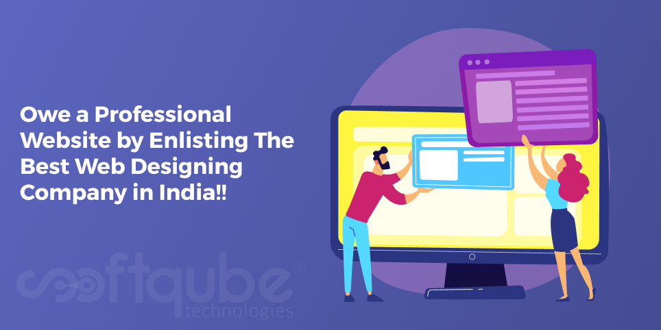
It is a false notion that anyone can develop a website and execute outstanding marketing. It takes profound understanding to develop a top notch site that can drag the attention of your visitors over your market contenders.

Obviously, you want your website to be the best when you desire to establish your online presence through your site. It is an intelligent move to hire the services of a professional web design company to attain your objective.

Professional Website Designing

Below mentioned are some advantages you can achieve by engaging an experienced web design company India for a website design.

Proper synchronization with technology upgrading:

Web design is a field of constant upgrades. Those websites are successful that can adapt the changing demands to remain relevant in the present times. Minimalist design, browser-less content, and responsive website are the latest expressions that are newly attached with contemporary web design. While looking for a web design company; remember to select that company that is aware of every evolutionary point and acquires the requisite skill sets.

Prepared and calculated approach:

The web company has organized the team that understands modus operandi of making your website in a professional manner. You can understand it as inserting a clear message, sharp focus and strategic input of unusual designing elements that are capable of drawing significant traffic to your website. Moreover, an experienced and trained company can acknowledge the worth of lead conversion for your venture, so it will embed the perfect components that will hold viewers for the long-term so that they can convert into loyal customers.

Utilize SEO services:

There is no use of a good design and useful content if your audience cannot find you easily. A well-trained company is proficient in inserting effective SEO tricks so that your website gets popularity instantly. These companies conduct comprehensive research in categorizing the appropriate keywords, and then they use these keywords intelligently in your content so that your site remains on top of the front page.

Develop quality content:

Your website speaks through its content, so it is extremely imperative to position the pertinent content to magnetize the interest of your target audience. A professional company is well-versed with the obligation to accomplish appropriate research to understand your visitors and their requirements. They leverage their knowledge in appending the proper tone, approach, language and format to develop significant content for the appropriate spectators.

Creating a website is not enough a professional web designing company in India needs to be hired. Softqubes technologies have technically & highly developed professional, quality content service, and effective SEO tactics to make you attain your business goals!!

Pre Made Photo-Shop Actions for Web Designers

First of all, let’s understand what Photoshop Actions are?

Website Designers

Website Designers – Photoshop actions are series of steps which are carried out in Photoshop. These are recorded and saved in an action file. These action steps can include anything that you can do in Photoshop.

This can be creating new documents for specific dimensions, image resizing, drawing shapes, applying filters, sketching out any wireframe and saving a file in specific folder on your computer.

Once any action is recorded then it can be played anytime. Photoshop actions can include few steps that have potential to save lots of time and effort. These can also be a good way to avoid the need to remember certain sequences like as optimizing photo, applying any particular effect or creating wireframe layout in new Photoshop file.

These action files can be easily imported and exported in Photoshop software. These are perfect for sharing amongst users. This helps to develop a library of time saving process which can be played at the touch of a button.

Through actions, one can learn more advanced techniques in Photoshop. There are individual steps that make an action and then you can learn everything that is involved in creating certain effect with this.

Photoshop users are free to create and distribute their own actions. Hence, we can say that there are plenty of useful actions that are available for as free downloadable files. There are various commercial actions developed by expert users for helping others so that they can apply more of advanced effects to their images or save time while working.

In our previous post, we learnt how to create our own actions in Photoshop( Hyperlink- 28th April post) and now in this post, we will learn about using Pre made Photoshop actions.

Now, let’s take a look at some of the premade Photoshop actions:

    • II70 Grid System PS Action: This is an action from Pixel Industry which can be used to create 1200 px wide document in Photoshop which will have 12 column grid layout to help you with website designers sketches.
    • Bootstrap Grid System PhotoShop Action -1170 px: This is yet another free action that creates a grid layout for web page designs. Here, the action creates any document which is 1600px wide and contains a Bootstrap grid layout which is appropriate for anyone who designs responsive framework.
    • Photoshop Action : With this free action, one can easily insert dummy text into Photoshop documents. Now, in case if you wish to crowd up your website designers with headlines, body text and multiple word columns or even a dummy document then this action serves the purpose.
    • Isometric 3D Perspective Mockup Photoshop Action: If you wish to give 3D effect various images like as product screenshots or portfolio items then you can use this action.With this action, you will get four types of 3D depths to select from. This offers a good selection of options for how mock-ups can be transformed.
    • Vintage Retro Text Collection 7: Now, if you are in need of logo design for your project then this set of 10 vintage and retro text actions will offer you plenty of inspiration. Every action will convert the text in such a way that it would require serious design chops. This extension is available for $5.

Take Away:

Well, this is not the end. There are many more such Pre made Photoshop Actions available which can be used as per the need. We will definitely share these all in our upcoming posts.

Till then, stay tuned with Softqube Technologies; well known website designers in India.

Creating Your Own Actions in Photoshop

Photoshop is an important part of web design. Without this, the web designer’s toolkit is incomplete. As a part of Adobe’s CC suite of tools, it is recommended that Photoshop must be used by every web designer. We can say that all designers must atleast be familiar with Photoshop.

Now, even if you are creating custom graphics or logos for your website or sketching out prototypes for clients, Photoshop serves to be powerful software which can help you to create some amazing work. This will save your time and effort.

Apart from this, adding Photoshop to web design toolkit doesn’t mean to shell out all of money. One of the useful aspects of Photoshop is its Action Feature. Actions in Photoshop allow you to record all tasks for playback on demand.

This makes it perfect for automating those repetitive as well as complex tasks that is to be conducted on regular basis. Here, in this blog post; we will have a brief introduction of this powerful feature. An amazing feature of Photoshop is its Action. Now, what is this action? Actions in Photoshop are useful to avoid long term process of repeating a huge set of steps again and again.

Instead of repeating the same action step by step, one can record them as actions and then complete it with a single click.

Creating Own Photoshop Actions:

Let’s say if you are a daily user of Photoshop then there are handful of tasks which can be repeated all the time. Here, we can say that instead of repeating them step by step; it is advisable to record them as actions and then fulfill them with a single click.

Now, assume that you always apply certain image cropping or resizing the image elements for your blog post or website. The actions will be recorded as follows:

Windows> Actions> New Control Panel will appear.

Here, click on “Create New Action” and then a dialogue box will appear. Here, you will be able to name the action as well as assign it to a new or existing set of actions. Now, once you are ready, just click “Record” and then walk through the steps that you wish to automate.


Record - New Action

Now, once you have completed the desired steps, click on “stop” button icon which is available next to “Record” icon in Actions Panel.

Using Pre-made Actions:

Apart from creating one’s own actions, website developers can also use Pre made Actions available in Photoshop. These are available as separate files which can be imported and exported inside as well as outside Photoshop.
Let’s say, if you wish to download any Photoshop action file from Internet then these will be archived into a zip file. These can be opened using applications like WinRAR. Once you extract the archive then you can add them in Photoshop in one of the following ways:

  • Double click on Action file to import it into Photoshop
  • Copy Action File to Photoshop Actions Folder on your computer
  • Drag and Drop Action files into Actions Panel within Photoshop

Further, it also has few actions that help you to get started and once you have imported any of the additional actions then these will be listed in Actions Panel. The Panel can be viewed in Windows menu in Photoshop and then choosing Actions from the list.

Take Away:

Photoshop is an amazing tool used by website designers. Here, we learnt about one of its amazing features. Hope this blog post will be useful to you in case you need to use “Actions” in Photoshop.

Stay tuned with Softqube Technologies, expert Web site developers for more such updates related to latest web design development tools.

Things About UX that You are not Aware of

User experience is an important thing to be kept in mind when you are designing either an application or any website. Businesses now have started taking user centric approach to the design of their websites and applications.

UX needs to be evolved constantly with technological changes which are to be considered by teams.

Things About UX that You are not Aware of

Here are Three Things One May Not Know About UX Design:

  1. Avoiding user research and usability testing: Be it gathering feedback about any new site, validating a new concept, getting pointers on how website can be improved or testing a website with representative users before it is launched- it may seem unwise for project handling teams to avoid research and testing.

    In case, they take this risk then they might create something which needs frequent alterations even if users are not happy or in case it doesn’t fit with their expectations.

    At times, teams may feel that conducting research or user analysis can be a time consuming task however this is an important step that must never be overlooked.

    In other cases, teams feel that they know the user very well however it can be risky to create designs based on assumptions. There’s completely a different range of methods that can be used to understand users.

    Spending time with people, listening to them is a perfect way to develop a clear understanding about how one needs to design anything. Observation and listening is useful to develop clarity and understanding as well as empathy that helps to make proper design decisions throughout the entire project.

    For websites that have target user group; one can be valuable enough to learn about general attitudes of any product. Websites that have huge target audience; surveys with several respondents can be useful in answering particular questions as well as learning about user attitudes.

  2. At times, it is advisable to avoid trends: There are various website designers that follow current trends irrespective of some not being right for them. Web designers often develop “scroll hijacking” into website designs in order to create particular narratives.

    Scroll bars belong to web browser with a view to provide uniform experience and hence it fails to offer best user experience. Whereas UX designers that work on any website or application with accessibility in mind, hijacking functionality in this manner may seem to be frustrating for users.

    One must make balance between trends following and understanding what works the best for website users. There are various controversial topics in web design world and one of them is well known “Ham burger” menu.

  3. Proper balance between Digital Marketing and UX design: The way design process progresses, it is common to fall out over a single aspect such as colour of a button or any other feature of website application.

    For teams that think about UX design, there are various number of stake holders to be kept in mind while making any decision. There are users and client to keep happy however with rapidly growing popularity of digital marketing campaigns, marketing managers have an increasing impact on design process.

    Balance can be found between digital marketing and UX. It’s a wise move to involve marketing directors and managers in the initial project stages. In case, these are included in research process then they can understand why designer makes particular decisions.

Take Away

Now, whenever you will create UX design; keep these things in mind as this will help you to develop a better design. Hope this blog post will be useful for you. For more such tips and tricks, stay tuned to Softqube Technologies; well known developers of Responsive Web Design India.

The Most Useful Readable Serif Fonts for your Next Web Design Project

The main element of any web design is typography as well as the selection of fonts that can be used in your project. Yes, we never pay any attention on the same but this can have a huge impact on how these are to be perceived.

According to experts, a wise website design shows that different purposes have different website fonts like as Serif is used best for printed works where as Sans Serif works best for Headlines.

We mainly focus on readability in web design and hence we will only discuss about Serif fonts as these are considered the most legible ones as compared to any other font. So, today; let’s quickly go through the installation process of WordPress font and then choose one by one.

Best Fonts for Website

Adding Fonts to WordPress website:

There are two ways through which you can add fonts to your WordPress website. One is making some simple CSS modifications however these can get annoying in case you wish to try few of them.

Another way is to use plug-ins. One such Font plugin in WordPress is “Use Any Font”. It is a very useful plugin that allows you to upload third party fonts to your server with a simple user interface.

These can be used further via WordPress editor without the need of additional setup. It is useful for both TTF and OTF file extensions.

So, here are some of the useful fonts for your next Web Design Project:
  • Calendas Plus: This was the font launched in 2010 when it was designed for a calendar project. It’s a classic type face that is designed to be completely readable even when used in small sizes. It is available for free.
  • Bitter Ht: It is a serif font having bold design which was developed to use for eBooks. Hence, we can say that it is optimized for readability even at lower resolutions.
  • Fritz: Another unique Serif font that has letters with thin stems and arms having unbracketed serifs with mechanical look. The fonts are available in four variations having multiple weights. It is available in all major font formats.
  • Cinzel: It is a classic type face that is developed from Latin alphabets having modern contemporary twist to its design. This font was designed specifically to be included in Google Fonts library.
  • Modum: This is a serif font with a modern feel. It was awarded” My Fonts Font of the month” award and also “Merit award” from International Typography competition.
  • Margot: This works well in small prints and gives a shining when used in posters and signage thus making it perfect for big designs with readability as main motive.
  • Medio: Another elegant serif font which seems to be a combination of thin and wide strikes and stems thus leading to attractive visual effect. This is not spotted easily while using small sizes.
  • Ainslie: It is a semi serif font developed by its creators originated from Canberra Australia Centennial Typeface Competition. This will be available in 42 variations.
  • Aleo: A sleek slab serif font which is still highly readable. It is free font that will be available in six different styles as well as its bold version is useful for important headlines that are to be highlighted.

Take Away

So, for your next web design project; try to use any one of these fonts and give a perfect look to your website that has easily readable fonts. There are many more available on the internet.

To get proper guidance from experts; stay tuned to Softqube Technologies to avail best web design ideas.

Boost Your Web Design Strategy Using Demographic Data

While developing a website that is effective for your business; it is necessary to have demographic data. This data helps to define the target audience and understand the type of visitors who are accessing your page.

If you are a business owner or a website designer; it is necessary to tailor your website design towards the correct consumer base and for that one must have accurate demographics.

Even if your website designing is outstanding; at times it may not get the interest of ideal customer, sales and conversions will fall flatly. Let’s look at the relationship between demographic data and effective web design:

Boost Your Web Design Strategy

The importance of Demographic Data:

It is a simple form of data that one can collect from audience. Basic questions like as gender, age, location, keywords for which your customers are searching for can help you to use the principles of search engine optimization to the most of your advantage.

With demographic data, one can define design elements like as the colours our target market will give best response to; ideal user experience for average customer’s technical savviness.

With this data, one can gear the website’s content and meta data towards the most searched keywords and terms.

Data which carries out the design:

Basically, there are two types of data: Quantitative data and qualitative data. Quantitative data provides numerical trends whereas qualitative data offers behavioural trends. Both are necessary for an overall web design strategy.

Quantitative Review:

In a nutshell; we can say that quantitative data is the one that shows basic information about visitors and this is how you find out how the visitors are; from where they came and what did they do after being redirected or landed on your website.

This information is available via review and analysis of quantitative data that includes demographics or by directly soliciting the opinions as well as perspectives of visitors.

Applying Necessary Metrics:

It is necessary to note that all the data in the world doesn’t do any good unless it is used to answer specific targeted questions. The main key is to start with solid understanding of what is to be achieved from the data or what questions one is trying to answer.

With specific measurements; it becomes easier to understand whether the website design is successful or not. Ask what the intention is behind every website page. Here, we have mentioned few metrics that can help you to determine your design effectiveness and where this must be able to take further action in order to get aligned with the needs and interests of visitors.

Majority of visitors:

This changes the familiarity tone which can be used along with assumptions that one can make about the users. New users will need a brief business introduction whereas those that are aware about your brand may be simply looking to see whether they are providing anything new.

Bounce Rate: The bounce rate is calculated by taking number of visitors that enter the domain page however leave before further exploring the website and then dividing it with total page views.

High bounce rate show that your homepage is unable to attract more visitors or compel them to take further actions.
Further, web pages with higher views will help you to get information about the type of design and content that is liked the most by viewers. These insights can then be used to plan success.

Most common paths to your site:

Most of the visitors who make the purchase follow the same action path through your site. Users who exit the site are exiting from same location. This information must be used to focus on design that can redirect them towards the other.

Take Away

Demographic details is useful to understand what attracts visitors to your website and what they do once they arrive there and why do they return. So, next time before you plan any strategy for your business; try to collect as much demographic data as you can and then use it for your strategy.

Hope this blog post from well known web design company India, Softqube Technologies will play an important role in providing you a perfect path that can help you to develop result oriented web design strategy.

Some Amazing Web Design Concepts

It is necessary to have an exciting experience. This is only possible with creative web design. With HTML 5; one can now add dynamic interactions to websites and make them alive. Here, in this blog post; we will share with you some amazing web design concepts that will make your website amazing.

These concepts will give you an idea of amazing website. This shows that you are something different and love to do different experiments. There are several websites that can take you to various cinematic video experiences and rest of them have 360 degree views which allow interactions and much more with visual and sound effects that are generated with clicks, drags and hovers along with unusual navigation.

Web Design Concepts

Let’s take a look at some of them:

  • House Hunters Journey: The hunt for perfect house is basically in your mind. With this cool interactive website; one can go through all required steps in order to find a dream home. Get the experience with a scroll.
  • Super Mario: During our childhood, we all might have done this Super Mario game; it is still popular among geeks and if you are the one who still loves Super Mario then this will be down the memory lane. One can explore many eras of Mario game with the help of this simple site.
  • V O I D: This is the website developed by Hi- Res! Agency that serves as a playground for various visual experiments. Follow the instructions and you will be just amazed to see what it means.
  • Make Me Pulse: Here, you can see various interaction features like as reversing letters or bright tape stretching towards your mouse. Mouse over to see more effects.
  • Le Dernier Gaulois: This is a legendary Gallic that is shown via six beautifully illustrated episodes. The website comes with great usability along with well integrated scrolling experience.
  • Fornasetti: This website serves as a design brand that is known for its unique style. It is a playful secret page where you can click shoot at flying face discs.
  • Social Wars: This website is developed to track social footprints of the franchise. Click on Use the Data Force to get started.
  • Norilsk Film: This website is a web documentary film in progress and has 3D videos, panoramas, and documentary plots, real life characters along with unique shooting perspective and Norilsk timelines.
  • Lacoste: It is a360 interactive look book developed by Lacoste in China. Manage yourself in a snow globe where time becomes still and you can see floating models in outwear collection.
  • Holiday Memories: This site shows how British holidays have changed in these hundred years. It features unique old photos and facts about travelling.

Take Away:

With these 11 website concepts; you can find how people are involved in developing a website and how websites can be developed as per the business theme. Yes, you can also choose the concept and design the business website of your own.

In case you need any experts help then do get in touch with Softqube Technologies; well known web designing India.

How do Japanese Websites Function?

What’s so interesting to know how Japanese websites function? We know Japan is ahead in technology and is also the forerunner of minimalism from fashion to architecture. Everything seems to be figured out; particularly Japanese anime and manga.

What is manga? It is the way they form the combination of storytelling and art and then it gets then followed by all those who want to tell their stories. Their track record of beautiful aesthetics sometimes gets to halt.

Certain websites are incredibly mixed up with no design rules nor taking navigation into consideration. There are quite few traditional prints of newspapers that are filled with text. So, why it takes place?

Let’s take a look at some of the patterns of these websites and then find whether they are on the same page or not.

Some Japanese Websites:

Japanese Websites Function

If we take a look at some various websites such as Rakuten, Kakaku, Livedoor, Sankei then we can see certain things to be similar. I would like to highlight them here.

  • Japanese websites are heavy in text
  • They use more whitespace
  • Websites have lots of blue hyperlinks and URLs
  • Ample of advertisements
  • Only small images are included
  • Disregard for easy flow for the eyes to focus on
  • Heavy flash used for banners, advertisements and slideshows.

If we take a look at these websites then they make us remember the period of 80’s and 90’s when HTML used to be the crowning glory of web design. Some remind us of newspapers that have dense rows and columns.

It is necessary to note that these websites bear all the characteristics and it seems as if they are well designed with the same idea in mind.

Japan’s Mobile Culture:

In India, mobile culture has just started whereas in Japan it had prevailed years in advance. Mobile phone usage was an inherited part of their lives and hence they kept the term for it as: mobile phone culture.

Initially; before smart phones became available; camera phones were available in the market and Japan was leading far ahead in camera phones in the rest of the world. The first camera phone made by Japan was J-SH04 in the year 2000.

It was considered as the first real camera phone that can send emails, MMS as well as make use of 3G technology. After this, NTT DoCoMo’s i-mode came into existence and it got 50+ million users in just three years. Various services were launched and altered to go hand in hand with the new technology. With this, mobile versions of several websites were created.

Web Designs Developed keeping in mind the end user:

One of the important factors is to note that this type of web design is not just by coincidence. Apart from optimizing it; for mobile; these were designed as per user expectations in mind. A Japanese user experience architect offers its own perspective on these things.

This means that information must be presented to them without any probe or questions. It is a different kind of Western web design and hence it focuses more on the combination of being eye catching as well as informative. One must also consider the popular browser choice.

Difference in Language:

Japanese typography plays an important role. Those who are not aware of typography; for them these unknown characters appear as cluttered and chaotic because there’s nothing to focus on. Japanese websites tend to include text into images and hence when translated; it adds to the chaotic feel.

Designers must present as much information as possible and this may seem like information overload. Here, the design is no different than Yahoo! You can find links and text everywhere you look. This makes it easy to find the information that you want.

The trend of such type of web designs will keep up for longer while. There are several companies that have started to initiate the changes with Japan’s attitude of conforming to the things that allows the type of design to sustain for decades.

Take Away:

Today, the entire world is busy in developing responsive websites as mobile devices are used the most for web surfing. Japan is found doing the reverse. When it comes to mobile; we must learn something from Japan.

So next time; if you develop any responsive web design or wish to get it developed from experts then keep these things in mind. Let us know how this blog post helped you out.

For more such details, stay tuned to Softqube Technologies; a well known website design company India.

Pitfalls to Avoid During Responsive Web Design

Responsive web design is the need of the hour. Among the latest web design trends; mobile friendly design is one of them. It can get a bit overwhelming to stay at the forefront of all. The end result is just a simple concept that develops online presence where one can get connected with customers and prospects from the device of their choice.

To stay relevant; it is necessary for business owners to be available and accessible on every device where customers are accessing internet. It can be a full sized desktop, tablet or a phone. Responsive design is not only critical to customers but all it is necessary as per Google’s mobile friendly algorithm.

Transferring from Static web design to Responsive web design;

several challenges are to be faced and some of the important ones are discussed here:

Responsive Web Design

  1. Phasing in Responsive Web Design: It seems like a good idea to focus on certain parts of the website and then move to others and approach the project in different phases. Everything changes while transferring from static design to a responsive design.

    Hence, it is best to stay prepared to handle any issues so that unwanted surprises are prevented. Static design is like a fish bowl where a definite border is created by glass container and if you remove the container (i.e. responsive design) then the water can be of any shape.

    Along with this, the entire website structure also changes. It is advisable to make a complete plan before redesigning the website. Some of the elements that must be considered include:

    • Header Design
    • Footer Design
    • Internal Page layout for developing a package of templates instead of unique design for every page.
    • For images; it is necessary to have aspect ratios and maximum sizes in order to prevent stretching and image distortion.
  2. Creating Desktop Design First: Mobile thinking first comes in mind and hence it is much easier to try hands at something small instead of involving into something big. Always create a site that is appealing and user friendly even on smallest screen and then develop it for large screens.

    There are innumerable device sizes available in the market and almost on devices; your website is viewed by people. Choose the size breaks that impact your customers and based on that create the designs keeping in mind those sizes.

  3. If necessary,take help from any designer: It is advisable to hire a web designer who is proficient in UI as well as coding. One needs to have someone who can completely understand the interaction of responsive design elements with each other and who is aware as to how a website can be made visually appealing and easy to navigate.
  4. Testing on the device of your choice: Testing the website needs to be inherent throughout the entire process in order to make sure that your website is perfect for everyone. Different browsers interpret codes in different manner and some have innovative coding options which are not compatible with all browsers.

    It is not always possible to test on your own computer and consider that same will work on everyone else’s device. Prepare a list of team that have people using different kinds of devices as well as technologies to ensure that the website is working as it was expected to.

    There are various different developer tools available for every browser and this helps to gain the experience from different devices. To test in real sense; people must use actual devices to make sure that there’s nothing missing.

    At times, this seems to be overwhelming however with some advanced planning and right team; project can actually be fun. This will motivate you to dig deeper and find what customers want and how you can suffice their needs thus creating a win-win situation.

Take Away:

Next time when you go for responsive design; make sure to avoid these pitfalls. It is necessary to take the advice of an expert. You can also get in touch with well known Web Designers India at Softqube Technologies; a web designing hub since 2009.

Free Resume Design Templates for Web Designers

Web Designers are now in great demand however there are designers who have good designing skills but lack the ability to present it in a proper way. Keeping in mind this thing we decided to write a blog that can help designers to get the job of their choice.

Every web designer wishes to get best price for its designing work. In this tough competitive world, it is difficult to do so. However, with required designing skills; one can get a job but what if the company asks for experience.

If you are a fresher, you may be experiencing this issue. So, how can you get your dream job? The answer lies here in this post. Read out word by word to know…

How to Get your Dream Job?

Your resume is the first step to have a dream job. Gone are the days when a simple word document can serve the purpose. Now days, it is required to have a good resume template which will help you to leave a long lasting first impression.

Here, we have presented few free resume templates which will help web designers to stand out from the crowd. These templates are available in various shapes and forms thus offering you the opportunity to know something that is already hidden inside you.

You can make use of any of the free templates as mentioned here:

  • Dark Theme Resume Template: There are various resume templates designed by the well known designer Ira Vosorowa. This dark theme resume template is one of the templates that are widely in demand. It is also available in various colours like as Neon pink and pale mint.
  • Mint Self Promotion resume template:

    Resume Design Templates

    Mint colour schemes are much popular. This is one of the clean CV templates that can be used by web designers to make their resume attractive.

  • Ultra Minimal Resume Template: This is an awesome resume template developed with a clean, simple and minimal design. The striking green template will definitely tempt employers to take a look at it. One can also select the colours of one’s own choice.
  • Zippy Pixels Resume Design Template: Zippy Pixels has a wide range of enticing premium resume templates. These are available in PSD versions and are available free of cost.

    This template is of premium quality and is available in three colour schemes and also has a cover letter template.

  • Pixeden Resume Design Template: The creative resume was developed to have maximum impact. The design is modern and innovative with the typography as the main design feature. The black and white version is available for free.
  • Swisy Style Resume Template: This template comes with a simple white/orange colour scheme that looks completely professional. It is also preferred by most of the web designers as it gives an elegant look to their resume.

Take Away:

So, next time when you go for an interview to get your dream job then don’t forget to have one design template among the ones listed here. Yes, apart from those available; you can also get several others from internet.

Search it out and get the templates of your choice and then let the employers’ just say Wow! Hope you enjoyed the blog post, for more such tips; stay connected to well known Responsive web design development company Softqube Technologies.

Let’s Work together!

"*" indicates required fields

Drop files here or
Max. file size: 5 MB, Max. files: 2.
    This field is for validation purposes and should be left unchanged.