Web Design Structures that must be known by Every Entrepreneur

In any website design, there are mainly five structural elements which are highly popular on the internet. These are the things that must be known by every entrepreneur as this makes the discussion more interesting.

Web-Design-Layout

Now, let’s take a look at some of the web design structures which are used very often and hence you can easily identify them and know more about how these are used:

Five most common Web Design structures:

  • Navigation Menu: Every website has common navigation buttons which are located in different places. These are the clickable links that direct you to various locations in the website.

    These are usually arranged in such a way that it is easy to find the way around any website so that one can easily access all the content which is available.

  • Web Page header: This is located at the top of the homepage and it is same for every web page. It is generally adorned with high quality image and has a website name. This structural element is the main design feature which differentiates the website and makes it unique.
  • Content: Website exists due to its content. It is the information which is to be seen by everyone. The website content is related to a certain topic and has various sub topics which are spread out among many website pages.

    The web page content usually consists of various things like blog description, hours of operation, contact information as well as an entire list of frequently asked questions as well as specific details about the products and services as offered by the company.

  • Side bar columns: These columns are placed either at the left or at the right side of the webpage and it often offers additional navigation links. These are called side bars and are generally filled with advertisements.

    Several websites place search boxes in the sidebar as well as many other elements that are commonly found on the web pages.

  • Web Page Footer: This is located at the bottom of the pages in a website. It offers various navigation links as well as a link to the webpage’s privacy policy and a link to the its terms and conditions.

    One can also get its copyright information from the website itself. The website has five basic elements of the web page design which you are aware about. Hence, you will have the fundamental data of what a normal website contains.

Wind Up:

Once you are aware of these basic structural elements of any web page design then it will be easy for you to have a basic idea of what a typical website contains. This will help you to know more about the design issues that are highly involved in web design as well as web content.

This knowledge helps you to make better decisions and make wise use of your money. As a result, you will be able to invest your money at the right place.

Hope this article was useful to you. For more such details, stay connected with Softqube Technologies; a well known Website Development Company India.
10 Important Web Design Trends for 2016

Till IT sector is running and alive, the need for website will remain. Every day, new businesses are venturing towards online business and as a result, the demand for professional websites is increasing.

There are many publishers who discover new design trends every year. These trends are used to make website successful. Well, before these trends are revealed; meta study is conducted which brings the most useful predictions from all over the web.

So, the main thing is to take a look at trends and then apply them in the real market. Today, in this blog post we are going to discuss about certain trends that can be followed to develop an updated website.

Important Web Design Trends of 2016:

  1. Web design with fewer interfaces and more union: UX design provides a clear description of these trends. The website union arrives through extensive libraries of interactive design patterns.

    Till the time, your service design is in need of interaction; we can say that convention is already available. If you make things familiar with the user then he/she can easily understand the things.

    At present, we can see the trend of push messaging and changing the content to fit the mobile devices. When artificial intelligence improves; content and services are already recommended.

    This reduces the customer journey thus allowing concentrating on similar interfaces.

  2. Originality is Important: 2016 will give more importance to originality. This is something that agencies must do for their clients irrespective of whether it is done sensitively or whether it is for rigid website elements.

    Animation and Video backgrounds will be used partly due to their desire to look unique. Such elements are considered as divisive design elements. Illustrations and animations are still to be used as a trend in 2016.

  3. Using creative hover states: It is necessary to simplify the need for accent. This can be used as creative hover state which helps the user to identify the parts of a small layout that are easily clickable.

    These interactions are very much enjoyable as these are directly intended for desktop. Some of the well known hover states are as follows:

    • Kinght rider hover state
    • Dynamic hover state on Ghost button
    • Burger button expands on a click and shows a slide out call to action button.
  4. Content in the centre: It is something obvious but hardly have we discussed about the same. It is used keeping in mind the mobile friendly design as well as the convergence of templates.

    The sites that have decided to make use of minimal homepage design with a fair amount of pages under the fold are generally prioritised as message, top and centre. The main message is accompanied with a visual GIF and a strong texture colour.

    Such importance offers a clear message that is used to characterise websites with little content but some people easily adopt their boldness which shows that distinctive branding can get the attention as well as boost the dwelling time.

    A well known brand LUSH has used this approach in eCommerce where they changed the main image and messages every month instead of using a dated carousel which automatically changes the dates.

  5. Full Screen Forms: Keeping in mind the mobile centric design, full screen forms are in demand. These can be in the form of checkouts or search fields. The main aim is to focus on the user doing some tasks at hand and increasing its use as well as subsequent conversions.
  6. Convincing Photography: When you talk about online business; the fact is that people are unable to touch and feel the product before purchasing as they do it in online stores.

    This limitation can be covered by using original and real pictures of the product that will help the customer to take its buying decision. Further, it can also help customers to know about the product and its features.

    Hence, the images that you use must be creatively inspired as well as must get efficiently loaded with high resolution. A website must have high speed so that it can perform well even though it has high quality images.

  7. Sans Serif Headings with Large Body Text: Nowdays, Sans serif photography is in trend as it befits the larger text on minimal designs. Everywhere, body text is increasing in its size as businesses lose the old architecture and move from 10 pts size to something which is more similar to medium clarity.

    This website is the best example of large body text:

  8. Few Scripts: More scripts make the page heavier. In order to reduce the load time of images; third party scripts are used in some sites. It’s very difficult to reduce scripts; hence readers will hope advertising and tracking technology can be easily streamlined.
  9. Sliders are no longer used: Sliders are basically distracters and these make page heavier. As a result, their usage is reduced to an extent. Still there are many businesses that ask for a slider and then they get confused what must be added in it.

    When the slider makes up the homepage above the fold then only they can work better. So, things regarding sliders will be sorted out in 2016.

  10. Using Bolder Ad formats: Native advertising will be used widely by publishers. Hence, using advertiser data and cross device tracking must allow impactful ads that allow publishers to reduce scale and improve UX.
    This means less chaos on mobile as well as desktop.

Wind Up:

So, these are some of the web design trends that one must keep in mind while developing a website in 2016. It will help you to develop an updated website. So, make sure to do some research about more of such trends and then develop a plan accordingly.

Would you like to receive some guidance from experts or wish to hire an expert website designer then you can get in touch with Softqube Technologies; where experts are ready to meet the needs of their clients.

How Often a Website should be Updated?

Now is the right time to take a look at your website and check it for any changes which are experienced by companies or customers. It is necessary to stay updated with the required changes and so ways to connect with the customers change.

Website’s design is an important part of your company’s continued growth. It is necessary to see whether the website design reflects the building blocks that you need to stay relevant to your audience.

Many business owners become self righteous when it comes to their website. Their sites often sit until they are so outdated and an update is unavoidable. This is the traditional thinking. This thinking many times keeps you away from valuable benefits that a website can offer.

Keep your Website Updated Regularly

Every website contains perfect data and here the website is the platform which teaches you about your customers’ behaviour. There are several programmes available to help you get information about customers via their interactions on your site.

These insights about user experience and customer journey help to increase conversions and ROI. The entire data gathered here helps you to keep the fingers on the pulse of the market as well as the needs of the customers which helps’ you to understand your website’s analytics.

It can include some of your guess work from developing impactful messaging. In today’s market; it is need to have a website that keeps on growing constantly thus becoming a part of your business. Website updates from a fresh design to an updated blog helps the audience to get deeply engaged.

How often should a site be updated?

Yes, it is right that website updation is mandatory but how often it is to be updated. Updating a website shows that you are aware about your customers needs and interests. This will help you to develop trust and loyalty.

Companies which don’t stay updated make themselves away from the audiences thus making it harder for people to use and share their websites. The speed at which technology is changing shows that adjustments are to be made accordingly.

Let’s say with the huge amount of smart phone and tablet users; mobile friendly websites are a must. With frequent mobile usage; it is necessary to have a proper design for your desktop site.

A website is a living part of your business. Smaller tweaks and changes are made in the way and hence a complete website redesign after every two to three years is a must. This helps you to stay updated with design and user experience trends and with changes in technology as well as search algorithms.

Wind Up

A web design company like Softqube Technologies is very well aware about making most out of the data that is available to you. Get in touch with us today to know how to make most use of your business website.

You might be having something to share with the world and here we are excited to help you to stay connected with your customers. So, stay tuned with our experienced web designers for more such updates about Website Design.

Web Designing Trends for the Year 2016

Web Designing is one of the IT sectors which keep on updating every now and then. 2015 will end soon and so most of the designers will now start preparing strategies to achieve success and obtain goals in the New Year.

Let’s find the new web design trends which will help to develop a perfect website for our clients. So, let’s begin:

Web Design Trends for 2016:

Some of the web design trends that were present in 2015 will also be applicable in 2016. These trends will still continue to dominate the visual world. Beyond modern minimalism which has dominated the web design world since iOS7.

There are some of the anticipated changes and some of the trends which can bring internet by storm are as follows:

  1. Flat Design: In 2015, we saw many websites following this trend. It started from 2010 and even now it is available with few noticeable movements. The flat design is a relatively new trend.

    Its origins can be traced back to 1940s and 1950s when the Swiss style had launched. Like most of the design trends, this flat style is simply the new form of an older design trend which featured some of the characteristics like extreme minimalism, grid layout, San Sarif fonts and the lack of three dimensional elements like as Shadows and Gradients.

    In order to know the exact difference between the two; you can take a look at the image below:

    Flat Design

    Here you can see flat design as well as Flat 2.0 and the difference between the both. The image on the left shows a design which completely lacks the dimensional elements and while on the other hand, the design on the right includes highlights, gradient shadows and drop shadows.

    As per the UX design platform, the new and improved version of flat design includes following:

    • Long Shadows
    • Bright Hues
    • Sans Serif
    • Ghost Buttons
    • Minimalism
  2. Functionality: Another useful trend that will follow its current evolution path is Functional minimalism. This is characterized by removing all the elements which distract users from the main page content.

    Minimalism dominates the web for its simplicity and elegance. This trend makes things easier for designers while the opposite is actually true. Minimalism catches more attention to the few objects of a page.

    It can be two three or as little as one main element. All these must be chosen with great care and deliberation.

  3. Originality: With the current trend of replacing anything which seems to be produced with custom products, original creations like as hand drawn elements will definitely increase the popularity.

    There are certain websites that combine custom illustration with detailed animations and these will be followed by those who want to differentiate themselves from thousands of other sites which offer a similar user experience.

  4. Container designs: In 2016, we will see more of the UI patterns which are made highly popular by well known sites like as Pinterest and Google+. This grid based design is harmonious and functional and is well suited for a web world which supports functional minimalism and elegance.

    The main advantage of this type of design is the ability to present self contained bits of information in a logical and easy to understand format. In case the design is not done right, it can look cluttered and risk appearing like that of Facebook and Pinterest.

  5. Typography with Dramatic Flair: Apart from achieving legibility; typography is one of the design choices which deliver a message on its own. Certain characteristics of typography include:
    • Extremely large or extremely small typography
    • Typography imposed over images
    • Typography used in unconventional ways
    • Designing own typography to reflect your own brand
  6. Boosting Interactivity: To offer a completely engaging experience for users; interactivity will constantly characterize the sites which aim to engage visitors from the payment they are redirected to a page till the moment they leave and purchase the items.

    Features of Immersive sites are as follows:

    • Card UI Patterns
    • Micro Interactions
    • Long Scrolling
    • Parallax Scrolling
    • Clicking and Swiping
    • Animation and Video
    • Smooth transitions.
  7. Innovative Animations: The reduction in use of Flash animations has not completely removed them from the market. Animations are still used in websites however these are not the Flash ones.

    Today, the popularity of CSS animations have increased and this has offered new world of possibilities for web developers and designers. The animations which will be widely used in 2016 are as follows:

    • Loading Animations
    • Animations which are used to reveal hidden menus
    • Hover Animations
    • Slide Shows
    • Subtle motion
    • Motion activated via mouse movements
    • Animations in background
  8. Bold use of Colours: Bold colours are widely used in professional websites. This trend is used well in combination with flat design principles as it prevents minimalist site from becoming too boring and simplistic.

    Few trends that will continue to dominate the web design world are as follows:

    • Monochromatic Schemes
    • Bolder use of accent colours
    • Colour modified as per the website layout
    • Colour which changes when the cursor hovers over an element
  9. Hero Headers: An important website design trend which will be used in 2016 is the use of huge HD hero images which easily catch the attention from the outset. These appear as the hero headers which completely get the customers involved with the use of stunning photography along with text, image slider, animation and a video.
  10. Storytelling and Interaction: A well designed website differs from the exceptional one in the way it makes interaction easier with the user. Certain websites implement story telling with a guided questionnaire which is a perfect means to make a site about the visitor. Story telling is a powerful technique which is used to engage audiences.
  11. Long Scrolling: Very few websites make use of long scrolling trend however still this trend will get continued in 2016 as well. The reason of its continuity is it keeps users engaged for a longer span of time as compared to sites where same amount of information is spread across several pages.
Wind up

So, in 2016 you can use any of these trends to develop a perfect website for your clients. If you know more of these then let us know so that we can use them too.

In case you have any questions or would like to know more about such website trends then stay in touch with Softqube Technologies; a well known Web Design Company in India.

New ways to develop apps: Codeless Development

Professionals from backgrounds other than coding have a tough time to get an app developed as they lack technical expertise. Coding is a tough task for them but now this belief will change very soon.

Let’s say you have a complete idea about an app but you lack the coding expertise then now it will be easy for you to develop an app. There are various cloud based services which help to develop mobile apps with a simple drag and drop interface for various platforms without having a single line of code.

Codeless Development

With such tools; the users or new entrepreneurs with very less experience of app development can easily develop an app like an expert.

Advantages of Drag and Drop Codeless Tools:

Using such Drag and drop codeless tools; it becomes easy for even non technical users to easily develop an app. It is not necessary for one to be a tech geek. Let’s say you have an idea about an app and then add a layout of same on the paper.

One can easily give shape to your idea by simply using drag and drop options. There are tools which are extremely useful to experienced app developers for developing business apps which boost revenue for the organization.

Codeless tools are very easy to use and they offer freedom to several enterprises to experiment with certain different concepts and one can try various hit and trial attempts. Most of the tools are now compatible with cloud technology and are easily scalable.

The more complex app you wish to develop, the more cost is incurred. Codeless tools offer complete right to the businesses to offer an app for different platforms without the need of developers. These tools are very to operate in such a way that anyone can work on the app even non technical employees.

Disadvantages of Codeless Development:

  • Limited number of options: Codeless app development restricts you from creating something different as these tools have limited options and thus they restrict the user.
  • Coding errors: As the app is not being developed in the native language, the final codes can vary and may not meet the expectations.
  • Native Apps vs. Codeless App Development: Native apps are widely used and written for particular platform and as a result these are more viable. Native apps have the ability to relate with the device specific hardware and software which means that these apps are highly compatible with latest technology on various mobile devices.

    From the above mentioned facts it is clear that codeless tools may not be that efficient in case when apps having complex functionality. In order to create complex app such as enterprise application, it is advisable to hire mobile app Development Company.

    Let’s say if you are a non technical guy who has simple idea to develop a basic app then one can easily opt for codeless app development. But so far multiplex apps are concerned; native app development is still dominant in the market.

So, which one will be the suitable option for you?

There are no such rules to identify as to which option is best for you. It is necessary to analyze your needs and then select the option that is suitable for you. It is necessary to analyze your budget, technical expertise as well as the magnitude of the app idea. Both the platforms are useful as well as have some limitations.

Wind Up

Hope this blog post is useful for all those who wish to develop the apps but lack coding knowledge. Let us know how this blog was useful to you. For more such guidance stay tuned with us.

Softqube Technologies is a well known Web Design Company in India which offers affordable web design and development services.

Call to Action Buttons that Attract Users and Compel them to Act

No matter whatever online activity you do; be it attending webinars, downloading e-books, getting free trials or filling any contact form; all of these will be of no use if your users don’t click and get converted.

It doesn’t make any difference if no one clicks your Call to Action. There’s of no use of such websites that have great content but very few customers. You must have both good content as well as good traffic.

So, before creating the appealing Call to Action buttons; make sure to keep these things in mind:

  1. Colour is not everything: When it comes to choose the colour for Call to Action buttons we can say that there are no such hard and fast rules however the colour should be selected keeping in mind the specific message that is to be delivered.

    While choosing colours for your CTA; it is necessary to choose a colour which stands out and looks something different. We can say that colour is not the only thing on which everything depends.

    It can be optimized in a way that it can be used to motivate target audience. This is true for every Call to Action element that you are optimizing. Forget viewing it as an independent factor instead it must be related as a part of the larger picture, the one that is personalized, targeted and proven effective for a specific target audience.

  2. Use clickable Buttons: Various web designers have a tendency to over design any website. Here, the rule of KISS that is Keep It Simple and Stupid is widely useful. This principle proves its worth when you wish to optimize your websites.

    Simple Call to Action buttons are more effective as compared to that of Fancy ones.

    Use Clickable Buttons

    This can be proved when you test the buttons using A/B Test.

    So, always choose buttons with a simple clear design having contrasting and attractive colours.

  3. Include Urgency: Compel users to take action on that particular moment itself. This can be done by creating time based urgency like as adding time sensitivity to your messaging. This theory was very well tested by a well known IT firm.

    The impact of time based urgency can be easily useful with the help of A/B testing and the conclusion says that advertisements having urgency are likely to get more clicks as compared to that where urgency is absent.

    Urgency is the concept that is widely used by well known websites like as Amazon.

  4. How to get Call to Action? In order to have perfect Call to action; it is necessary for you to opt for CTA best practices and you will get thousands of results. Those elements which can be optimized using CTA are as follows: Wordings, colours, placement, design, size, shape and lots more.

    Here are some quick calls to action best practices which can be used to make your CTA work:

    • Always keep Call to Action above the fold: In order to grab someone’s attention to your website, it is necessary to have CTA button placed at such places where visitors have their eyes on.

      But sometimes; we fail to do so and it is our misconception that people will scroll through the entire page.

    • Follow up Call to action can be used at the bottom: While writing a blog post; add a required call to action at the bottom of the post. Avoid using side bars for placing your CTA button.
    • Be clear about your offer: Let’s say your website has an offer “Download eBook for free”. Now, why will people download this eBook? What benefit will they get? What is the type of information they want to offer to the visitors?

      Website visitors might have questions like what is the need of downloading the eBook. How it will be useful for me? What is included in the eBook? Will this be useful in any way to the visitors?

      In case your Call to action fails to answer all these questions then be rest assured but you will definitely have low click through rates.

    • Use a relevant Call to Action: Your Call to action must reveal your business industry. Promote your business with such keywords and phrases that easily relate to your business.

      This will help you to get readers from each and every corner. Be it social media, email or search because visitors are interested in your product and service. Relevant ads work better as compared to random call to actions.

      Adwords Scan the content of the web page, keywords in the search query as well as the content in your email and then offers you the relevant ad which you can see when you are surfing internet.

Wind Up

There might be many such more tips that can help you to get a better call to Action for your website. If you wish to get a result oriented CTA designed for your website then you can get in touch with Softqube Technologies, Web Design India where all necessary best practices are taken into consideration while developing any Call to Action button for any website.

Just show us your requirements, your business niche and your goals as well as ideas of how you want to have the one and then based on that; we will help you to get an amazing CTA designed which will cover all the trends as well as help you to get more customers.

For more such tips and tricks, stay tuned with us.

What is the cost of running an HTML Powered Website?

Running an HTML website is easy but its maintenance cost is the thing that one must think of. We are aware that there are thousands of websites available on the web and there’s no such fix formula to calculate the cost of the new website or the cost of website redesign.

In this blog post; you will get to know the cost of maintaining an HTML based website as well as making you aware about the other ways so that you can make a right choice.

Website Cost

When you are starting to create a new website; you will get for what you pay. This saying is perfect when it comes to developing HTML based websites. In this era of content management systems, the old HTML based websites seem to be obsolete.

Here are some costs that will occur while developing and maintaining an HTML powered website. So, let’s begin:

Cost of Developing and Maintaining an HTML Powered Website

  1. Domain Name: The name of the website is called domain name. The domain name cost is compulsory one which you cannot avoid. Domain names are not that expensive. The price of a domain name depends on the extension you choose.

    For instance, a domain name with the extension .com can cost Rs.199 for an year, .co for Rs.199, .in for Rs.99 and .club for Rs.399 per year.

    Depending on the need of your business; you can choose the domain name and pay the cost accordingly.

  2. Web host: It is a host that provides you with a space on servers where the HTML site is going to be live. Hosting costs range from Rs.149 to Rs.499 per month based on the options and level of service that you need.

    An average HTML based website usually runs from Rs. 664 to Rs. 1992 per month.

  3. Design and Production: The cost of design and coding of your HTML site can be available for free to thousands of dollars. Typical web hosting companies offer a complete package costing 500 rupees per month for hosting and a free domain name and additional cost for website maintenance.
  4. Professional Designer: In case you are unfamiliar with HTML programming knowledge then you can ask a professional designer to get the job done. In this case, one should be ready to spend sufficient amount based on whether you need to update it with latest information or make some significant changes in the content or optimize the site for search engines.
  5. Site Content: In case you fail to have much time or skill level to create the content then the simple thing is you must hire someone who can do the task for you. Writers generally charge per article, per hour or by word.

    One can add photos, videos, podcasts or other multimedia content to the website and this will definitely add complexity to the HTML project and the cost.

Thus we can say that running an HTML based website requires fortune to be spent on its creation and maintenance.

So, when you lack some programming knowledge and short of money to make investments in order to have the smallest changes to the static website then you can give a try to WordPress or Joomla website.

A full featured CMS is widely used by companies for developing amazing DIY websites of various types with any complexity. So, HTML websites are preferred the most because they have the following benefits as compared to those of WordPress and Joomla websites:

  • User friendly site
  • Proper support
  • Multifunctional
  • Huge amount of Plugins
  • Strong SEO.

So, we can say that converting static website into dynamic one is not a big deal if you use automated tools like CMS to CMS. The service is used by average users and experienced developers in order to make the conversion process fast and endless.

Hence, it is better to switch to WordPress and Joomla and make your life easy. Such websites can help to import HTML data to WordPress to HTML to Joomla without any errors or gaps.

Wind Up:

While deciding as to which website to choose; you can opt for HTML ones and most of these can be easily developed, In case, you wish to get the website developed from experts then stay in touch with Softqube Technologies, Website Design India where professional website designers will be there to help you out.

How to know Whether your Website requires Re-Design or not?

Website is the mirror of any business. It is a very useful resource to get customers. With changing design trends, one needs to upgrade the website accordingly and so it is very important to be aware about these changes.

However, there are times when our website is fully upgraded but we are still unaware that it is. So, how can we recognize whether our website actually needs to be upgraded or just few changes are to be done or the whole website is to be re designed.

Does Your Website Need a Re-design

Based on the needs, websites are altered. Hence, it is important to understand the website and identify the signs that suggest that website actually needs to be updated. Here, in this blog post from well known Web Design Company India, Softqube Technologies; we will learn about some signs which if seen in any website indicates that it’s time to refurnish it.

So, let’s begin:

  1. Improper visibility on mobile devices: We all know that nowdays it has become mandatory for every website to be mobile friendly and so it is necessary that whatever the screen size is ; website should be equally, smoothly and easily visible on each of the devices; be it tablet, mobile, computer or laptop.

    In order to make this possible; we must get our website updated with responsive design. This will help to boost rankings as Google now lowers the rankings of those websites which are not mobile friendly.

  2. Improper Navigation: Navigation is yet another important thing that be considered. This means when any user visits our website; he/she should be able find things easily within less clicks.

    This means our website must deliver relevant results within seconds. Now how can we identify whether our site has proper navigation or not? It’s very simple. When our contact email inbox gets flooded with questions about the website then it is a sign stating that website is having some issues with navigation.

    So, now is the time to get it fixed from experts.

  3. Increased bounce rate: The design, the navigation is important but what is more important is the bounce rate. This means the number of people who don’t visit the entire website and quit very soon.

    The usual bounce rate is generally between 26 to 70% where most of the websites get an average bounce rate of 45%. The increased rate shows that something is wrong with the website; may be in terms of loading the website; increased usability or the design that fails to match the user expectations.

    Here, the only option is to get the website redesigned in such a way that it completely satisfies the needs of our customers.

  4. Company Information Overloaded: Yes agreed, website is the mirror of the business and hence business details must be included in it. However, excess of information can be dangerous.

    We can include the required details such as About Us, What we do, Contact Information and all but it is waste of time to include words and phrases like we can do this, we can do that. For example: I saw a website which had too many unnecessary phrases written and these are as follows:

    • 100% guaranteed customer service
    • Feel the Real experience
    • Avail extra bonus
    • Business since “123” years
    • Market leading
    • Best in class
    • World class and lots more.

    Such words don’t reveal the business expertise but actually follow the same pattern that competitors do and as a result; we appear to be no different. As a result, most of the visitors fail to understand the uniqueness in us (because we failed to explain the same in proper manner) and thus switch to competitors.

    This means that the homepage and everything that a website has must focus more on customers rather than on company.
    If it fails to do so; it’s time to REDESIGN!

  5. Fewer Conversions: Why does one develop a website? Obviously, to increase business; now what will happen if it fails to do so? Just think what can be done if our website fails to generate the business that we actually need.

    We will try to identify the issues, right? And then once we get the hold of them then we will go for solutions.

    Now, every website has two types of visitors: one who just visits the site and one who visits the site and then purchases the product or service. Every website owner wants more of second type of visitors. The percentage of people who actually come to your website and purchase things is called the conversion rate. How many visitors out of 10 actually got converted? If our website generates only one lead out of 100 then it is time to fix the issues.

  6. Lack of an Opt in Box: Website is used to increase the business. Now, if customers don’t find any way to reach us then there are chances that we may lose many of the potential customers.

    Opt in box serves as an invitation to customer in order to begin relationship with the brand. Getting email addresses and developing the list is necessary for any business. In case, the website lacks it ; be it in any form say newsletter subscription, free quote or anything like that then it is time to reconstruct the website.

    Yes, if the current design can be altered to have such opt in box then it can be altered but if there’s no other way then it’s time to redesign.

Brief Note: We are sure that this blog post will be a perfect guide to identify the website issues and know the right time to get it refurnished. Apart from those listed here; there are many more factors that can be considered.

If you know any of those except the ones mentioned here then do share them with us.

Wind Up

Stay connected with us to know more about website trends as well as such guides that can help you to take necessary decisions.

What October has in Treasure for Web Designers in 2015?

Every month, there’s something new for web designers and developers. Today, in this blog post you will be aware about many productivity as well as educational tools, freelancing and start up resources, podcasts, inspiration sources and much more. Also, you will be aware about some awesome free fonts.

Whatsoever, we are discussing here is available absolutely for free. This can be high value paid apps or any tools that boost productivity. These will be useful to all designers and developers including beginners and experts.

Let us know in case we have missed something and you feel that must be included in our list. So, let’s begin:

New Tools for Web Designers:

  • Fizzle: This is a tool that offers online business training as well as has a huge community of entrepreneurs which will be useful to people for support. Free subscription is available for 30 days and thereafter it is available for $35 for 30 days.
  • Annex: This is a simple task tracking and productivity booster app. The main thing is this app is not automatic and so utmost attention is to be paid while using it.
  • DayDeed: It is an application that allows users to make habits which will be useful to achieve goals. Things can be logged as and when needed. It is useful for daily tasks as well as weekly sessions and it can be used as a tool to measure our performance.
  • Zube: An important tool for all designers and developers; Zube is a virtual task board which allows to manage GitHub issues easily. Issues can be sorted out, prioritized as per the need. It has both free and paid plans available.
  • Freelancer Podcast: It is a weekly podcast available for designers, developers and writers.
  • Web Flow: A virtual CMS that can be used for developing custom and dynamic websites. One can easily structure the content; develop custom designs and much more.

    Web Flow- Web Design Tool

  • BoxBox: This is an upcoming design tool that is developed only for screens. It has reusable components, responsive design and lots more.
  • Project Comet: This provides a completely new way to design and develop websites as well as mobile apps. It can be combined directly with Photoshop as well as illustrator and thus it serves to be an all in one wire framing app that will be very much helpful to designers and developers.
  • Adobe Portfolio: With this one can create an amazing beautiful portfolio that will be useful to display your creative projects. It easily gets synchronized with Behance and can be easily set up within few minutes.
  • SYMU: This is one of the fastest ways to get in touch with your clients and discuss things related to designs. It’s very easy to use this tool, just upload the project for free and then you can approach your clients to leave comments.

    Each and every comment serves to be a useful suggestion which will be then acted upon to make things better.

    For example: You got one project related to web design. Now, first of all you will prepare a wireframe for the same and then based on that you will create the original design. Now, here if you upload the rough draft to SYMU then this will be easily visible to the clients and then they can add comments.

    These comments will then help you to modify the design as per the needs and as and when changes are made; you can upload the changed draft to get the comments from the client. This will make your work easier.

  • Pop Motion: It is 12kb JavaScript motion engine that supports animation, physics as well as input tracking.
  • Corpus: It is CSS toolkit which uses Flexbox for the grid and is highly influenced by the BassCss white space module. This contains typography, buttons, forms, colours, borders, images and many more.
  • Vector: It is a designing app which will be useful for print and web. Its desktop version can be downloaded or used straight away in the browser.
  • Content tools: This is a small beautiful content editor that is entirely documented with an API to widen its usage.
  • Rookie Guide: It is a tool that shows how android user interface can be transformed for iOs platform. For each different system, it will have a completely different look.
  • Store house 2.0: It is a place where lots of new features like as enhanced privacy control are available. However, it doesn’t offer much of social media features but still provides options for sharing stories by text, email as well as social media.
  • Sketch Palettes: This is a sketch plugin that helps you to save certain colours which will be useful to design an attractive website.
  • Primer: This app is for those who wish to learn marketing lessons from Google. Every week new topics are added and they teach their students with the practical approach where one must learn itself by doing the things.
  • Land. Io: This is a free UI kit as well as landing page design for sketch. This includes full screen image section, video player, pricing table, social sharing buttons and lots more.
  • Stripe relay: Online shopping has become more popular now days. But today, the trend is to shop from eCommerce sites using their apps. We know recently Flipkart shifted to app only purchases.

    Stripe relay is a tool that allows customers to purchase products directly from their mobile apps. This helps you to sell the products in several numbers of apps like as selling directly through twitter or any apps like as ShopStyle and Spring.

Wind Up

These are some of the very useful tools for web designers that will help them to create an amazing design. For more such updates, stay connected with Softqube Technologies, Web Design Company in India where dreams are transformed into reality with the help of expertise and knowledge related to every business niche.

Introducing Ghost Buttons in Web Design

We all are familiar with the idea of quick call to action buttons. However, sometimes these are designed in such a manner that users are easily distracted instead of being attracted. And here comes the role of Ghost buttons.

So, what these ghost buttons are and how are they actually useful in your web design? Here, we will explain everything in detail and make you aware about the usage of these in your web design.

Let’s begin:

Well, this was adopted already in 2014 but still we can find many websites lacking its usage either due to improper knowledge or may be due to unawareness of its benefits. 2015 is the year where we have seen many changes in the web design world. Today, ghost buttons are quickly adopted by web designers due to their undisturbed look as well as simple photography.

Ghost Buttons – Introduction:

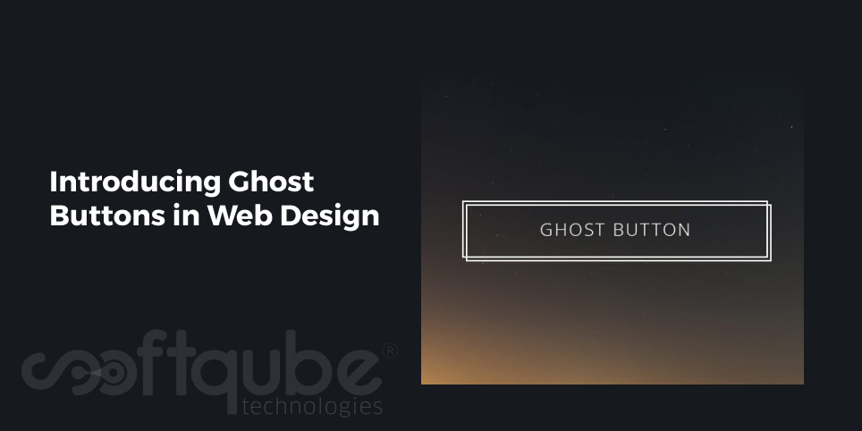
Can you imagine anything in your web design that has a simple outline and no fills or at sometimes only has transparent fills and through which one can easily see the background components? Yes, such elements exist in web design and these are called Ghost Buttons.

Ghost Button

This means designers will create the same button as they do but the difference is they will give a “ghost” effect to it which means the button is there but it is not visible with our naked eyes and it will only be seen once we click or hover the mouse; as per the effect given by the designer. This ghost effect can be given to any design style such as icons, banners, images or any other visual elements.

Ghost buttons offer a beautiful look to the website. These are often preferred to be placed at the top of the website.

Using Ghost buttons in an Appropriate Manner:

Generally, when it comes to website design; the first thought is to use huge images, videos, sliding banners and more. See it’s a belief that huge things attract more people and that’s why everything huge is to be put on the website to attract more people! Ghost buttons really work well on these huge elements.

However, there are some rules that must be considered while using them in your web design. These are as follows:

  1. Ghost buttons must be placed on large visual backgrounds so that they stand out differently from other web design elements.
  2. Ghost elements must always be interactive. This means when someone brings the cursor to that button then it can change colour or the outline.
  3. These must be larger in size as compared to other usually used call to action buttons. It is advisable to use 40px tall and 100px wide ghost button. This is the average size that is recommended to be used as it easily works on touch screens.

After all, mobile design is an important aspect to be borne in mind while creating design elements!

So, following these rules web designers can easily create ghost menus, buttons as well as other interactive elements which are always put on the top of the homepage as this will help to maintain the focus on photography.

Ghost buttons are used throughout the website. This can be found if one goes through the complete website. However, these are available in the different sections of the home page.

Some websites also use these buttons at the end of the page and these are very easy to find while there are certain sites that use it on their homepage. It is also a good way to draw the attention of people towards important tasks such as call to action.

The ghost effect can also be applied to the icons. Designers can create such effects that can keep the users engaged throughout the entire website.

Creating Ghost Buttons using CSS:

Well, till now we understood what ghost buttons and how they are useful? Now, let’s see how these can be created using CSS:

Here, we will explain the process of developing a simple ghost button:

Using simple hand coded CSS; web designers can create lovely ghost buttons. Hover effects can also be added so that these buttons can give visual feedback when hovered upon.

The CSS for ghost buttons is as follows:

Ghost Button Using CSS

Here, one can change the font as well as remove the text decoration of links and can modify the buttons by adding thin border lines, changing the padding and much more. In short, this CSS can be modified as per the needs.

Giving Hover effect to Ghost buttons:

.ghost-button:hover, .ghost-button:active {
color:#fff;
background:#009688;
}

This command can be used to change the background colour of the ghost button in such a way that it changes on the hover of the mouse.

Such ghost buttons when implemented in the website can lead to increase in the visits to the website. Apart from hover effect, one can add more of such effects to make them attractive.

Wind Up

Ghost buttons were initially introduced in 2014 but these were used less and now again in 2015; these have gained the momentum. This blog post covered all the important things related to Ghost buttons i.e.

  • Introduction
  • Usage
  • Creating Ghost buttons using CSS.

Hope this blog post was useful to you. We will discuss more about Ghost buttons and other related web design trends in our upcoming blogs till then, stay tuned with Softqube Technologies; Web Design India where all of your web design needs will be easily met by experts keeping in mind your business niche as well as your own expertise.

Have you ever used ghost buttons? Let us know your experience about the same. We would love to hear from you.

Let’s Work together!

"*" indicates required fields

Drop files here or
Max. file size: 5 MB, Max. files: 2.
    This field is for validation purposes and should be left unchanged.