Web Design India – Get Elegant Designs Developed by Experts

Business owners wish to get their business website developed from experts and hence they keep constantly searching for such web development firms who can actually create any website as per the need.

There are many web development platforms available in the market like as PHP, ASP.net and more. Further, open source platforms like WordPress provide an opportunity to business owners to create a website of their choice irrespective of the code knowledge.

Platforms such as WordPress are actually useful to business owners but at some point of time when the need arises to get custom templates or plug ins developed, there’s the need of web developers who have experience in the field.

At such point of time, people hunt for those who have pretty good experience in the industry and also stay updated with latest trends. Here, in this blog post; we will discuss about the way experts develop the website using their expertise in such a way that it suits perfectly the need of the clients.

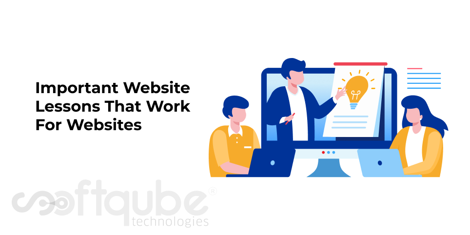
Elegant Designs Developed By Experts:

Get Elegant Website Designs

Well, if one is expert in the field; one will definitely have the idea of what will suit the business and based on that experience; developers can create amazing websites on the preferred web development platforms.

Let’s understand this with the help of an example:

Case Study: PHP Web Development and Interactive Design developed by experts.

It is now important to have a mobile optimized website. When it comes to web development platform, PHP is mostly preferred. Creating responsive designs can be a challenging task but such task was successfully accomplished by expert web designers at Softqube Technologies.

If you click on the above link, you will find an amazing design developed by professionals. This web site initially used to display properly only on desktop. It needed lot of retouches in order to be a perfect one as per the latest trends.

Keeping in mind the client’s requirements as well as the target audience, Softqube technologies started the redesigning process that included:

  • Web Design ( Making it interactive)
  • Web Development
  • Enhancing User Experience.

User experience is an important thing when it comes to web design. So, a website must be developed in such a way that users are able to visit it with ease and in no case they face any hassles in either getting the information they want or the services they are in search of.

Being a banking sector, it is important to highlight the services first. As a result, we can see the website has internet banking, ATMs and Branches located in such a way that it is easily found by users.

Further, now the website is easily visible on devices like tablet, smartphone etc. Even the content is adjustable to the device and is easily readable by the users. This made it easy for the bank to get more clients. You can view our web design portfolio for more idea about our work.

Wind Up

I complete re touch and re make to the website made it look entirely professional. Are you interested to get such websites developed? Get in touch with experienced web designers in India.

Creating Web Forms that boost Conversion rates

Many web designers lack the expertise of developing web forms that actually convert and this is one of the main reasons; businesses get less customers. Web forms are an important part of any website.

Effective web forms can create a perfect impression in the minds of clients. This further helps to increase conversion rates. It is one of the most opted ways to get more clients and this is the way through which one can get required information about clients.

Designing Narrative Forms:

A standard web form will have few required fields that can collect the basic contact details such as name, email address and contact details. But with narrative forms, one can get basic information as well as other details.

These forms have the ongoing conversation with the clients instead of just collecting basic information. Such forms keep the clients engaged by asking them to fill up the details along with the regular information. This becomes somewhat personal.

Such forms will provide you amazing results. It is an investment with maximum return.

Deciding the Form Length:

Another important question is whether web forms should be short or lengthy. But the fact is there’s nothing to do with the length of the form. But it is found that less fields in any form tends to increase conversions.

But here again quality is absent with quantity. This means few fields can bring lots of inquiries but how many of these are real is a matter of question. So, it shows that more fields that ask details rather than just contact information can bring more of quality leads.

However, this depends on the objective of the business. If the client is interested in quantity leads then short forms are welcomed but when it comes to quality; narrative forms are very useful.

Make use of Clear labels and explanations:

The basics of designing a web form must always be remembered. It is advisable to use clear labels and explanations in the forms as this will make it easy to identify the problems which will stop the confusions.

Clarity is more important when it comes to designing web forms. Labels make it easy for users to understand the type of information required.

Include only necessary registration:

Asking users unnecessarily to get registered can reduce conversion rates. Let’s say customer is ready to buy product but during checkout he/she is asked to get registered and now this can be the cause that customer leaves your site and switch to your competitors.

So, ask for registration only when needed. Forceful registrations are harmful for business. Checkout process forms must be as short as possible as this will make it easy for customers to carry out the checkout process smoothly.

Wind Up

Designing web forms is an important part of web design. Hence, it’s necessary to adopt best practices for the same. Bad designs can reduce conversion rates. So, these tips must be kept in mind when designing web forms.

For more such tips, stay tuned with Softqube Technologies, Web Design company in India.

Use of Directional Cues to boost Conversions and Enhance User Experience

User experience is the main factor that one must consider when it comes to developing an amazing website design. Designers are constantly in search of the ways to enhance user experience. Some are able to find the answer while some are not.

Several types of tricks are used by designers to improve the user experience however some may fail or some may work. Today, we are going to discuss about an amazing tip that will surely help you to boost your user experience.

And this important trick is the use of directional cues. What are these directional cues and how can these be utilized to develop a perfect website design?

Using Directional Cues to Improve User Experience

Before understanding the use of these cues let’s have a brief knowledge about what these are and how are these important?

So, Directional cues are elements that are available in various shapes and sizes, these are both explicit as well as implicit. These can be:

  • Arrows
  • Fingers pointing
  • Eye direction
  • Lines
  • Curves

A perfect example of the usage of directional cues is as follows:

This is the landing page of a website known as Salesforce. Here, the use of directional cues is done to redirect the users’ attention to the short web form in case he/she is not willing to sign up with any of the social accounts. Such type of designs can actually keep the users stuck to your website.

Types of Directional Cues:

There are two types of directional cues Implicit and explicit. Implicit ones are: Colour, repetition of size, shape and colour and last but not the least hierarchy.

These are used based on the purpose for which the web page is designed. Every page has its own goal may be getting visitors, asking users to sign up or subscribed to something. When the purpose is not understood, the page navigation may not be implemented properly.

Sometimes it is too much cluttered or sometimes it is completely messed up resulting into bad user experience. When the users receive cues that clearly state the purpose of the page then this helps to improve the user experience.

Clearly defined purpose removes the confusion and frustration and replaces it with confidence as well as efficiency which can only occur if there’s great planning, organization and design.

You might notice some directional cues which prompt visitors to actually read the content. This makes users easy to understand the purpose of the page.

Brief Note: Don’t underestimate the power of directional cues when it comes to Web Design. These are very beneficial for every page and these proved completely useful in enhancing the user experience as well as increasing the conversion rates.

This means users are completely aware as to why they are visiting your site. These are the return visitors who had visited your site previously. Hence, one must include such directional cues which are easy to use and understand.

Wind Up

Your website must suggest users what they need to do and this is what these cues exactly do. Help your clients to get better conversion rates by using appropriate directional cues in their web design.

For more such details, stay connected with Softqube Technologies, Web Design India.

Content Strategy for Responsive Web Design

Responsive Web Designs have been the buzz of the industry. The reason; mobile devices are now being used more to search things and surf the web as well as use the applications. Today, in this blog post we will discuss about some important points that one must consider while developing content strategy for responsive web design.

With the perfect combination of research and experience, expert web designers from Softqube Technologies; well known web Design Company in India have found some amazing techniques that can be used to frame an amazing content strategy for responsive web design.

Let’s take a look at few important steps that must be included to have an effective responsive web design:

What is an effective Responsive web design?

Before we heed on to know about the process of creating content for responsive designs, let’s first understand what this design is all about?

So, when you first type anything in the search bar of any search engine, you see several search results. Some may be relevant to your search while few may not be. Well, it’s not about which are relevant which are not. It’s about how much useful the relevant search results are? Do they actually provide you the information that you need?

Similarly, when you search about anything on your mobile or tablet; is the website easily readable to you. Is the content on that website same as that of the one available on the website visible on laptop or desktop?

Is the site adjustable with your device’s screen size? If the answer to all these questions is a complete YES then such designs are considered to be purely responsive as they adjust with your device as well as are easily readable.

Coming to the content of such designs; how it should be and what points one must consider while writing for such responsive designs is yet another question that has lot of importance.

Points to be kept in mind while preparing content for Responsive web design:

  • Proper Planning is required: When we hear the word “Web Design” what first comes into our mind is that it is purely the work of web development team. But this is completely a false notion.

    Any design be it responsive or non responsive is a joint effort carried out by a complete team that consists of writers, designers, developers as well as strategists. Hence, perfect planning is required for every department to give a perfect shape to any design.

  • Content must be well organized: Writing content anywhere everywhere won’t serve the purpose. Relevant category must possess relevant content. Hence, it is mandatory to maintain a proper format of the content.

    It must be aligned with the relevant categories. Also, this avoids content from being jumbled. Hence, proper alignment in such a way that no matter whether the website shrinks or widens is a must to have a perfect professional responsive website.

  • Offer Proper User experience: When you say your website has “Responsive design” or it is optimized for mobile, so what it means? This shows that the content of site is capable enough to be readable clearly on each and every device and it doesn’t get mess up when there’s a small screen.

    Make as many changes as you want till the time your website content is readable properly on each and every device. Distil and filter the content till the time you are completely satisfied.

    No matter the number of times you fail, accuracy is must here. Try ten thousand times but keep on trying till you get the perfect format that pleases readers and makes your content worth reading.

Wind Up

The more adjustable, easy readable, understandable your content is; the more visitors are likely to come to your site. This will help you to lower down bounce rates. Prefer converting text into images or infographics wherever necessary.

Need more such tips, stay tuned with us. Meanwhile keep sharing your experience with us.

The Concept of Zero UI

Have you heard people talking about Zero UI? What is Zero UI? How it is useful? These are the questions that will occur in our mind when we think about this new interface. Today, in this blog post from Web Design India, we will know more about this new user interface.

What is Zero UI?

The idea of removing the obstructions between user and the device is known as Zero UI. This has a more unending interaction with technology. As we see today; industry advancements are moving towards instinctive technological parts.

These today serve as an environment which constantly keeps us connected with the world thus offering meaningful interactive spaces. Zero UI is everything about how users get connected with the content.

At present; we have devices having touch screen or those that have remote control. Zero UI is the way through which people get more engaged with the technological devices. Now is the time of gesture based user interfaces.

An example of these gesture based user interface is gaming world. Gaming world has adopted gesture controls as a means of offering more natural user experience. Some of the examples are Think Wii, Play Station Move and Microsoft Kinect.

Google’s New Announcement:

The ability to control gaming console is less tied to button commands thus helping us to integrate more properties of physical space and motion. Recently, Google made an announcement about the advancement of gesture control.

This initiative is through the Project Soli; which is a chip that allows user to gesture above a device without the need to touch screen directly. By tapping small buttons on the small screen; users will be able to use hand gestures that affect the physical controls.

Any technical aspect which is not understood properly can sometimes leads to serious issues. We all have technical devices that are a part of this environment however lack of proper knowledge can refrain us from making their proper use.

For the multidimensional lives that we are currently living, it is advisable that we should have multi dimensional devices too. One must understand a complete 360 degree advantage of these technical devices.

Hence, Zero UI as said is the future of all the interfaces. So, here we can say with increase in the use of technological devices; it is necessary that this interface must also be used and adopted by people. In future, it will be mandatory for people to use these user interfaces.

In today’s era; visual things are more important. The reason; most of the devices we use today have screens. It’s everything about making distance from these screens that Zero UI is all about. It is rightly known as Internet of the Things.

Wind Up:

Hope we offered you sufficient amount of information about Zero UI. For more such updates about latest hip and happenings in the design field, stay connected with us. Our web design experts will help you to understand every new concept in depth so as to have proper understanding about the same.

Responsive design support: an important Feature for your Website

Every website has a different need. Hence, every website has different features which lead to the success of the website. If we talk about an eCommerce site then it sells various kinds of products and as a result, such sites may need some inventory control feature to make sure that the items listed on the website are available in the stock.

Yet irrespective of the websites features, one feature that is mandatory for all websites is the mobile friendliness as well as responsiveness. So, how responsive design is important? Here, we have mentioned some of the reasons for the same:

Why Responsive Design is Important?

  • Supports Multiple Devices: Websites are now viewed on many devices having different screen sizes. Customers view any website at different times from various devices. Hence, it is necessary that websites should work smoothly on any device.

    Similar content must be visible on all devices in order to maintain consistency in the information that is delivered to the users. This means a customer finding information about one feature must be able to read same information on another device.

    Ensuring consistency of information on all devices builds trust and they find no reason in leaving your website in mid way in their entire experience.

  • One site for every device: Instead of wasting your time and efforts in developing different websites for different devices like as one for mobile, one for desktop; it’s advisable to develop a single website for all of them.

    So, here responsive site is more useful as it is a well optimized website that can be viewed perfectly on both devices i.e. desktop as well as mobile and tablets. Having a single website makes it easier to manage the website and keep it updated.

    Developing a website using cloud based platforms; one can administer all the management of that site while still it has control over how the website appears on different devices.

  • Enhanced Search Rankings: Recently in April 2015, Google launched mobile friendly algorithm which shows that now even Google has made mandatory to have responsive websites.

    So, now website rankings also depend on how good your website performs on mobile devices and those that are not compatible with mobile may get lowered down in search results.

    Hence, responsive web design has now become an important ranking factor for SEO plans.

  • Future Scalability: This approach provides you the chance to back new devices and screens in the future. Responsive websites can be adjusted as per the need so that they can easily fit the screens.

    This shows that websites will always be ready for all the new devices that are available and that which will come in the market in coming future. All websites will be developed to suit every type of screen size.

Wind Up

Irrespective of the device used, the website goals or the target audience; responsive designs get benefited from a display that works on all screens. So, from now on when you develop a website; make sure to keep responsiveness as priority.

Wish to get responsive websites developed from experts then get in touch with Softqube Technologies, Web Design company in India.

Responsive Design Fails to Provide Proper User Experience

Till now, we all were in a dilemma that responsive websites actually provide good user experience but the truth is out; responsive designs are now slowly failing to provide proper user experience. So, why this happened?

Reason; updation of Google’s Mobile Algorithm; only web content that fits the small screen won’t serve the purpose in fact it is necessary to have a well planned design that works perfectly on the mobile device.

Just adjusting your website for any mobile device won’t serve the purpose; it’s necessary to take a look at the user experience that this website provides to the mobile device users and in case something is missing then try to adjust your design accordingly.

Yes, not all the functionalities of desktop are needed in a mobile based website however they may wish to get some content removed when they are viewing the website on a smaller screen. So, what exactly is the problem with these small screens?

Issues with Responsive design that lead to bad user experience:

  • Arranging Images: According to the survey, clients love to have static images and screenshots of those before they are actually published. Now days, design is more focused on proper arrangement of the elements for various mobile devices and is less concentrated on placing the static images.
  • Screen restraints: Users may face difficulty in reading the content on small screens. The web standards actually inspires people to use a different format for showcasing data on the mobile screens instead of tables and tabs that are used to represent the data in easy manner.
  • Perspective shift: Sometimes, the only problem is of perspectives i.e. consumers’ point of view varies as compared to that of company’s point of view. Businesses tend to ask their customers what they want.

    For instance, if we say registration is an important aspect of any website and this is because businesses need more functionality as they wish that customers should see the logical entry point of entry for which customers are searching.

This shows that responsive designs don’t fulfill all the needs of the customers yet there are many things that are lacking.

How to update responsive designs?

When it comes to website design; the main thing is to make it responsive as well as adaptive. Responsive means that the website should fit to every screen size where as the adaptive approach means changes in content and how it appears depending on the screen size.

Adaptive designs are preferred more as compared to responsive designs. Websites should match the context in which users are using the site with the nature of the content. The requirements of businesses vary as per the type of product or service they are selling.

So, here is the summary of what must be considered while developing websites for different businesses:

  • Pre store: People will reach to the website via social media and they may search for coupons, offers or recipes.
  • In store: Once they enter in store they now are searching for reviews, coupons as well as price comparisons with other sellers.
  • Post store: During post store they are now in search of branded content.

Wind Up

Knowing where customers are while purchasing helps you to design the site in a way that suits their needs. With adaptive designs, users can have good customized experience depending on the device they are using.

Wish to get adaptive designs developed from experts then get in touch with Softqube Technologies; one of the best Web Design company in India.

8 Amazing Geometric Design Patterns

Every business wants to have an enchanting look for their website. So, here we have brought some of the examples of geometric patterns for web design. Many Graphic design have used geometric patterns, shapes and styles in their work.

This blog post from Softqube Technologies, Web Design Company India will represent those geometric shapes that are used by expert designers to develop a website. Let’s take a look at some of these shapes:

Geometric shapes for your website design:

Geometric Web Design Patterns

  • Infinity: This is developed by work created by different natural patterns that are available within Icelandic landscape to form abstract images that can be repeated endlessly. More of the Infinity views are available on the internet.
  • Dogs: Expert designers focus mainly on website designs and proper use of colourful approach which means these are amazing geometric prints that people will love to have their hands on.
  • Feedback Cam: Feedback webcam generator is used to make geometric patterns. It is basically a website where the web cam is pointed out at the back of the screen. With geometric designs; one can create amazing designs that can surprise the visitors.
  • Vector Animals: This is a wonderful creation of geometric designs. These are very popular when it comes to design an enchanting website.Vector animals are nothing but a perfect combination of shapes which can be transformed into a colourful design and with animals included in design; there came the wide variety of patterns and colours.
  • Spray Paintings: This was designed by New York Artist Adam Daily whose work is available on different media with various techniques such as painting, photography and collage.These paintings are a great combination of digital as well as analog tools and these are created with acrylic on PVC panels by applying the paint with a spray gun.
  • Landscape: Among the huge variety of geometric inspired designs for clients; Landscape is one among them. This was created based on the band’s album network.
  • Silk: This type of design is developed with many of the geometrical shapes. A few lines of code can be transformed into a vast original work that is known as “Silk”. All the designs here are beautiful and mind blowing.
  • Bird Mural: Created by a well known Graphic Design Tobias Hall; this design is a work among number of attractive wall paintings developed using such creativities.

Wind Up

So, here we have described few geometric design patterns that can be used to create amazing websites. For more such updates, stay tuned with us. You can also get connected with our expert web designers to get the guidance to create amazing websites.

If you are aware about any such enchanting website design patterns then do share them with us. We would love to listen from you about your website designs and how you chose that design; what factors you kept in mind which made your website look so attractive that it is successful in getting sufficient amount of traffic.

How to Develop an Efficient Website: Some useful web design Techniques

The more easily usable a website is; the more users are likely to use it. Perfect web means better user experience. Users should get easily what they want irrespective of the way they are using internet.

Websites must be developed in such a way that they are maintained easily and are simple to be updated. If your website is perfect and up to the mark then it works very well for everyone i.e. the one who develops it and the one who actually uses it.

Web Design Techniques

An efficient website is a must to have quick accessibility, proper responsiveness as well as proper content strategy and load performance. For this one must select the right CSS property by knowing the exact need which makes the entire project feasible. It is completely about making things faster and better.

So, here are some useful web design techniques for designers and developers:

  • Know why and for whom are you developing the website: So, designers and developers; be ready to develop a website in a systematic way by knowing its exact purpose and to know this purpose; it is necessary to ask questions as to: What’s the need? For whom is it to be developed? What’s the use of it? On what devices is it going to be used?

    Such questions will help you to get proper answers through which you will be able to develop a proper website. A website that will meet the purpose and will be designed in a perfect manner as needed.

  • Use screen readers: With the use of screen readers; one can read the website perfectly as it is developed using the html code. Hence if you write semantic html; it will definitely help yo improve the user experience which consists host for other benefits.

    The semantic quality can be checked by properly listening the code with the help of screen readers. Suppose, the page sound is not in proper order then it is the time to clean up your html.

    So, screen readers aptly provide us the assistance to write a perfect, clean semantic code that is easy to maintain.

  • Get benefitted from conditional loading: Conditional loading is a perfect tool for developing feature enriched experiences that get loaded faster and set up the content. Go for opportunities to conditionally load social buttons, comments, related content and more.
  • Always keep in mind the big picture: It’s not viable to make any technical choices before you know anything about the problems that require a proper solution.

    If you provide a solution without properly understanding the problems then this can result into limited technology for visitors as well as administrators. There are several technologies that can do almost anything.

  • Use Responsive background images: Irrespective of your background’s width; you must use responsive and attractive background images. For this; developers must use CC property background – size:cover;

    This property background must be used along with visual scalability by using the code: background- size: cover; while determining the size of any background element so that pixel ratio can be automated easily.

Wind Up

So, with these useful web design techniques which are currently popular in the market; designers and developers can create amazing websites. For more such guidance about developing attractive websites; stay connected with Softqube technologies, Web Design India.

Important Website Lessons That Work For Websites

Website design has three important pillars and each of these have a unique place and importance in life. Every website has different motivation and expectation. So, what these main pillars are? These three pillars are: client, designer and user.

These three must be in a perfect harmony. However, sometimes this hierarchy actually gets mixed up due to the constitution of its process. As a result, we can find innumerable websites that are mixed up with various extra issues due to lack of communication or we can say proper understanding between client and the designer.

website-lessons-for-website-development

In order to sort out these issues, we must first improve the website design and here we have mentioned three important lessons that will be used to develop a website in a perfect manner as needed by the client:

Important Tips for Developing Proper Websites:

  • What seems important is not actually important: As we discussed above, there are three important pillars of a website; client, user and designer. Now, here the user feels that he/she is the important part as without which clients won’t be able to get what they want.On the other hand, clients feel that they are the important part for any website as the website is developed entirely by their money. Apart from this, the designers believe that they are the important parts because without them it’s impossible to get an attractive website.But, leaving all these behind; we can say that Design is the thing that has more significance. It is a part that connects clients, designers and users with each other. However, sometimes clients demand for unnecessary features and on the other hand, designer tries to influence the clients with some other cool features.

    And in the row between the two; the “User” is actually forgotten and as a result the website that is developed is for clients and not for the users. This is the reason why many of the websites fail to achieve proper user attraction because they actually lack the things that can catch the users’ attention.

  • There’s a big difference between the Need and Want of Clients: Generally, client’s fail to understand the need of users and they are usually suffering from the Copycat syndrome which means that what others have in their website; they must have too.This totally diverts the attention of a client and he/she forgets that a website is actually made for the user and not for her /him own self. Hence, the website is unable to connect users with the business.For instance: One of our clients wanted to get their website developed using Joomla platform. Now when we asked why actually he needs a website; the answer was to display the products but he was unaware which platform will best suite his business.

    The thing is the aim is not clear, the need is not clear and as expert web designers; we must actually make him understand what actually he wants and this will help us to develop a perfect website as needed.

    In short, websites are used to make things easier. To locate things easily, yes attractive design is important but if it takes too much time to find the things needed then users may leave it without noticing the attractive design.

    Hence, a website should be more user centric rather than client centric and this can be only possible if website design actually have proper knowledge of what users actually need. So, it is always advisable for business owners to get in touch with reputed Web Design Company like Softqube Technologies.

Wind Up

In a nutshell, this blog post says that; while developing a website; keep in mind the principle of “Less is More” and try to develop simple, elegant looking website design that actually are useful to the users.

Let’s Work together!

"*" indicates required fields

Drop files here or
Max. file size: 5 MB, Max. files: 2.
    This field is for validation purposes and should be left unchanged.