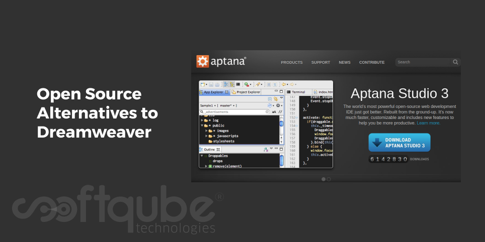
Open Source Alternatives to Dreamweaver

There are many ways to design a website. Some develop on their own by writing the codes by themselves while some use WYSIWYG editor. It can also be designed using the combination of WYSIWG and hand coding.

Those who do the coding by hand use various softwares like Dreamweaver, notepad editor etc. Apart from these two; there are many more options available which we will discuss here. So, few years back; every webpage on the internet was developed by hand. This was really a tough task.

Later then, CSS took place and then it became well supported across all the browsers. It involves hacking a layout together with the use of HTML tables in such a way that these were never envisioned to support.

Most of the designers developed workflows that are completely based on manual editing of raw HTML files. The WYSIWYG editor then came into existence as a tool of empowerment to several beginners in the field.

Various products like CoffeeCup, Hotdog, Frontpage, GoLive and others were seen in the market and then many web based WYSIWYG editors came into existence. Among these; the more successful was Macromedia Dreamweaver which was the favourite of almost everyone.

Even today, it is recommended by most of the web designers as it is easy to work with.

Apart from this, there are various other options available:

  1. Aptana Studio: It is an open source development tool used for open web. This means it is more of advanced IDE specializing web development. Depending on the open source Eclipse project, it has tools that can be of assistance in HTML and CSS authoring along with code colouring and completion, debugging and document outlining.
    Aptana Studio
    The main selling point is JavaScript support which makes it a strong tool for developing complex web applications.
  2. Blue Griffon: Yet another WYSIWYG editor that supports HTML5 and all the modern components of CSS that are licensed under MPL, GPL and LGPL versions of Blue Griffon that are available for most of the major platforms.
  3. Seamonkey: This is a community continuation when Mozilla decided to narrow their focus on individual projects then Seamonkey continues to make regular release for its full suite. The composer portion of Seamonkey is no longer actively updated.
  4. Select a legacy editor: There are various other projects that have fallen by wayside. Some of the legacy editors include:
    • Amaya- a W3C editor that was last updated in 2012 and that supports HTML 4.0.1
    • Komposer- It is a community developed fork of Nvu editor with WYSIWYG support along with side to side editing whose last stable version was released in 2007.
    • Maqetta- It is an HTML 5 capable in-browser editor that was last released in 2013.

Some of the Advanced text Editors:

There are various text editors that provide additional functionality which is incredibly useful to those who edit HTML/CSS documents. When used with modern browser with built in debugging tools; one must be as productive as one is with dedicated solutions:

  • Atom: This is a relatively new project from GitHub that describes itself as “hackable text editor for 21st century” which supports HTML and CSS and also has many additional plugins available.
  • Bluefish: It is one of the lightweight integrated environments that highlights code and offers HTML and CSS matching along with remote upload capabilities as well as number of other basic features useful for web authoring.

Take Away:

Among those discussed here, none of them are in any way the reproduction of Dreamweaver or another proprietary tool. Each of them has their own roadmap and goals along with their own strengths and weaknesses.

Select the tool that meets your needs or try a new tool and then see what you like and what you don’t and then finally select the one that suits your needs. For more such tips and tricks; stay tuned to Softqube Technologies; a well known web development company India.
Web Development Tips that can Improve Website’s SEO

Investing in website business is a good decision and after investing; you will definitely wish to have lots of visitors on your website and then transform them into potential customers. Once you have a website then you will make efforts to make it visible among search results.

Here comes the role of SEO; that can help you to determine your website rankings. Search engine rankings are worthless because mainly websites must be optimized for conversions if you wish to get business from your website.

Website SEO

Rankings are not as important as what happens after the customer finds your website, showing up in search engines is important. Showing up for most relevant searches with high buying intent is much more difficult.

This is because there are various factors that play an important role in a Website’s SEO. Google has entire secret algorithm to measure these. One of the important factors is there are many businesses that ignore the site’s actual development.

In this blog post; we have mentioned various SEO focused web development tips that can help to get proper rankings for your website which it really deserves.

Web Development tips to enhance website’s SEO:

  1. Develop a Mobile Responsive Website: Today, most of the people use mobile or tablet device to view websites and some use both mobile as well as desktop or laptop computers to surf websites.

    Most of the people are slowly shifting from desktop to mobile for internet usage. Hence, if you want all the potential customers to view your website on every device then responsive design is preferable.

    With Responsive design; bounce rates can be reduced to an extent as Google now considers “mobile friendliness” while calculating the website’s SEO score.

  2. Keep Pages as small as possible: Images give an attractive look to the website however everything is ok when done in a limit; exceeding use of images can reduce the page loading speed. This reduces the SEO score.

    A good website company website equals the need for high quality images that have good typography and it uses words instead of text in graphics when possible. Make sure that your image files are smaller in size.

    It is advisable to resize the images before adding them to the website. Some content management systems resize an image by altering the height and width dimensions in HTML but this actually leads to the original image download.

  3. Use Caching: Page caching is yet a good way to help your page’s load time. When your page is cached; it is stored on visitor’s browser as a static HTML version of your site. This means when a visitor returns to your site then they don’t have to reload the entire page.

    While developing your site; you can identify whether the page is cached or not and who can cache it and how long can it be stored for?

  4. Integrate with Social media sharing on Blogs, News, Press releases: Sharing your website on social media is a good way to boost your site’s SEO. Make it easy for people to share your content on social media profiles with the use of sharing buttons or toolbars.

    This will help you to directly place a link to your page in such a way that all followers can see it with just a simple click of the button. This is one of the great chances to make most use of free marketing.

    It’s not necessary to have social media icons at the top of every page; at times these can be available at the bottom as well.

  5. Go for better usability: Good SEO is not just about keywords. It is necessary to have a good experience to customers to visit your website. Usability really brings several things that one must pay attention to:
    • Content: Do you think your website acts as resource for potential customers?
    • Design: Do you think your website is designed well enough and is easy for navigation?
    • Development: What is your webpage loading speed? Does it work properly with all browsers?
    • Responsive web design: Do you think your website is readable on mobile phone?

Bounce rate is the website metrics that is to be measured. Websites having higher bounce rates will help you to make usability improvements to a page as people are visiting and leaving. A company’s website can serve many purposes and one of them is to help you boost up the business.

Take Away:

With these web development tips; you will be easily able to develop a website that can help you to boost rankings.

For more such tips and tricks, stay connected with Softqube Technologies providing cost effective web development services in India.

Now Get Faster Websites with Joomla 3.5

Joomla is a well known content management system that is used by most of business owners. Day in and day out, we can see various updates available in Joomla versions. Recently, Joomla released its new version- Joomla 3.5.

Now, what’s new in this version and how this will be useful? Every version has something unique in it; versions are basically the updates that are meant to fulfill the rising demands of consumers. Few days back, Joomla released a new version of its open source web content management system.

Here, in this blog post; we are going to discuss about this version.

What’s new in this version?

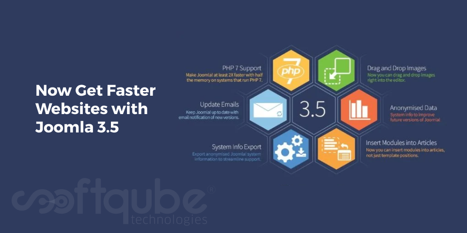
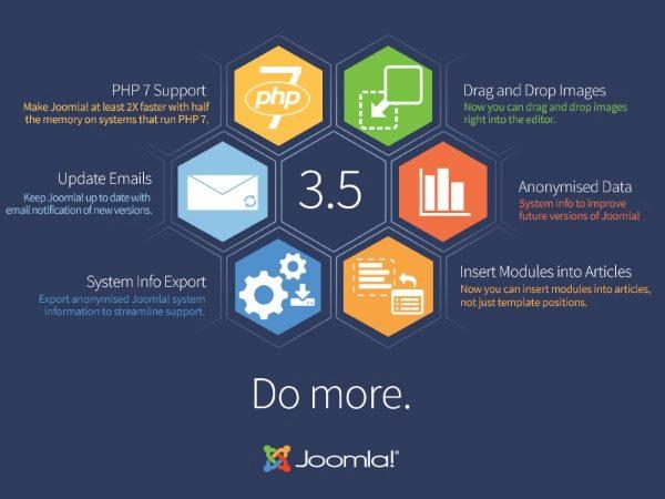
Joomla’s new version is developed to improve user experience for developers as well as administrators. This content management system is developed using PHP and MYSQL. This updated version will be used to develop faster websites as it offers PHP 7 support.

Main Features of Joomla 3.5:

  • Email notifications will be useful to keep the software up to date.
  • Offers ability to export Joomla system information for aligned support. It is then separated from anonymized data that users opt for to share with Joomla in order to improve later versions.
  • Users can drag and drop the images into the editor.
  • Different modules can be inserted into articles not just into template positions.
  • New functionality will be offered including module buttons which can be inserted into articles.

This version will make things two times faster than those that run on PHP 7. Everything that can increase the website speed is wonderful. As per Joomla officials, Joomla offers PHP support that is available for use by general public.

Joomla 3.5

Joomla also updates email notifications of new versions. It helps users and site administrators to get updates on Joomla releases such as updates and bug fixes. Previously, notifications were available in Joomla backend or when we sign up for Joomla security news mailing list.

Other features of Joomla 3.5:

  • Adding CSS file to Protostar: At present; users cannot use a custom CSS file while using Protostar template. With this update; one can check whether the file user.css is available or not and if it’s available for customization.
  • Added site and admin links for module user: This adds switches to the mod_status in order to hide or show links in front as well as back end of the site.
  • Article counts: It is a set of pull requests which allows visual presentation of published as well as unpublished and trashed articles in the Category Manager.
  • Email tests: Are used to test email addresses with one click.
  • Random category blog and list order: is used to answer a common request which is used to add perfect ordering option for articles in the blog category as well as category list view.
  • UX editor button: offers users with another button below main editor that allows them to insert a module to their articles.
Take Away:

So, with these features; one can identify that how useful this new version is? We are sure that this will be useful to you as well. Let us know how this blog post was useful to you. For more such updates, stay tuned to Softqube Technologies; a well known Joomla web development company.

Developing a Website that can Record Income

Nowadays, everything is run on devices and the web. Today, the world has become technically sound. Web is used mainly for searching, buying as well as for marketing items and services. With the advancements in technology; lives have become much easier.

Among the well known discoveries; web design is the one that needs maximum innovation. Web Design makes use of all the aspects as similar to that of print design. It is necessary to have a good layout in order to deal with typefaces and colours so that everything can be placed in format that gives you complete message.

This method is very simple however the limitation is you are unable to choose the money that you make. Other websites that can be used are press release websites as well as article submission sites. You can offer valuable content with each of the submissions; make it short and simple so that readers can take action.

Web Development

With articles and news releases; one can truly let the creativity flow. Write as you wish, people will notice your personality based on that. Do you think C is made for you? You must keep reading. Majority of sites compromise in terms of Web site design because they never discover a well known web development company who can help them to develop the website as per the need.

It is one of the reasons “bulk emails” fail. What leads to the website failure? The first two minutes of visitors stay on the website decides the success or failure of the website. If you cannot have a website that can make your audience stay till end then it is useless to develop such site.

What’s the solution?

In order to have a well designed site; one can choose among the well known Web design companies where needs are understood in a perfect manner and one that has a team which deals into web marketing business having experience in developing web applications.

Such firms offer services beginning from the simple ones to the most complicated ones. They further make advanced ads that can fulfill the customer requirements for their firm. They don’t request payments until they have delivered the services.

This is one of the ways to win the trust of clients. They do the tasks initially before they make money. Designers and workers are well experienced and skilled. With the help of proper management system like as WordPress; one can develop amazing sites for little money.

The ability to develop self hosted websites that can be controlled and owned without understanding HTML can save lots of money. With free styles available, one can find something different that actually works.

Take Away:

In a nutshell, we can say that website design with appealing looks can help you to generate income in bulk so that it can be recorded. Hence, the title is apt for the post “Develop a website that can record income”.

Hope you might be able to get some good tips from this blog post. For more such tips and tricks; stay tuned to Softqube Technologies; Web Development India.

How to Develop Strong user Experience with Navigation?

Do you wish to evaluate any existing digital product? Are you sure from where to start? Then, you may be in need of some guidance on driving strong user experience along with navigation. We know that navigation is an important tool of the website that is solely responsible for navigation.

Here, we will take a look at three navigation principles that if you adopt on regular basis; you will definitely develop strong user experience. These are as follows:

  • Information Architecture that aligns users’ mental models.
  • Means for navigating the structure are easily identifiable and are entirely consistent.
  • Options available for navigation are reasonable.

You can easily incorporate the below mentioned framework in the UX workflow:

Navigation for Digital Products:

When it comes to navigation; it means the way user moves via websites and applications. It is the part of Information architecture useful for structure and function. One of the important components of navigation is “finding the way” or posting a sign.

This relates to people letting know about different cues and treatments. Every website page may be the one only viewed by the users. Hence, some context is important to goals.

Site Structure

So, the first principle is in regards with information architecture. Let’s define the structure first:

  • Defining the structure: One needs to define IA before designing user experience. This can be done with user group where one solicits the number of target users and then ask them to arrange it via different labels into different groups and user expert design.

    There are several tools that can be used to define the website structure or software.

  • Does Call to Action actually work? The trust and credibility of the site depends on small things like as spelling errors, alignment between buttons and links and their lead destination.

    If the user is on product page that has call to action which says “Buy Now” then you will expect it to land on the checkout page. Just avoid unnecessary call to actions or offer them visual weight.

  • Is the placement of menus perfect? Know about the designing context. People are habituated to see navigation like as menus in consistent places. For instance; iOS phones have the menu at bottom of the screen while as Android will show navigation options in the hamburger menu.

Another Principle is that the means to navigate the structure is easily recognizable and always available through the entire site.

Do you see the things at its place? Do you find the structure clear and consistent?

The entire user experience is developed from all the things that users encounter. Let’s say a well designed website perfectly meets the standard conventions. The different website components include Logo & Branding, Navigation changes, Contextual cues, Wizards/ Steps, Breadcrumbs, URLs as well as the title of window page.

Navigation Changes

The third and the most important principle is number of options provided are reasonable. Let’s say in any interface product; be it any iOS app or website, one must have the minimum number of options.

Don’t get the user lost or confused by the website structure; the number of options provided must be reasonable. Having too many options can overload the user and make it counterproductive. In simple terms; we can say that include minimum options.

The drop down option has different links which the user can easily access. Try to make navigation as easy and as simple as possible; you can use some analytics to identify what they have been. For a typical website; it must be pretty simple to lay out seven links on every single page in a consistent manner.

Take Away:

Apart from those mentioned here; there are several principles that boost the user experience with navigation. Just understand the heuristics and principles that are used to define navigation. Just remind good design practices and then examine the existing products.

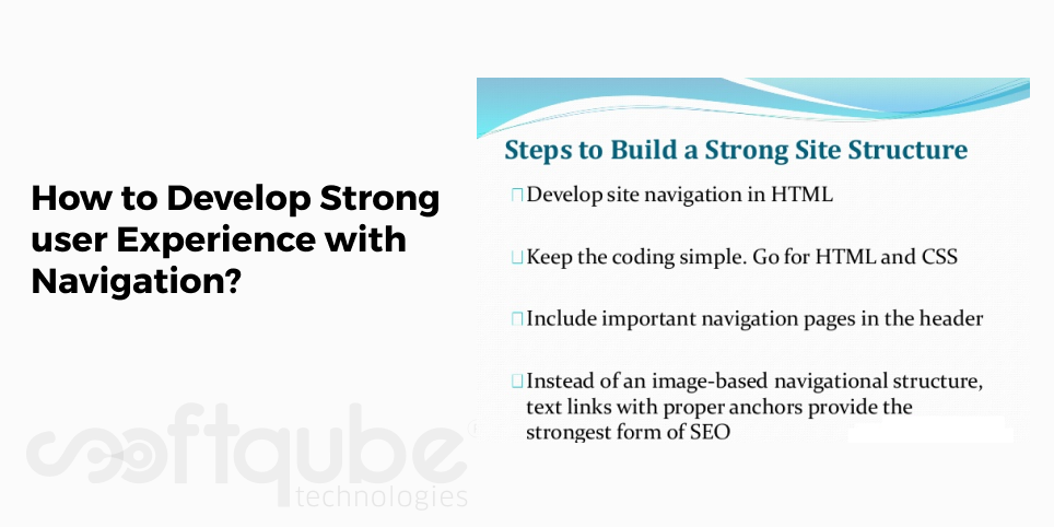
The basic website structure, Information architecture and different pages, labels must match with the user expectations. This guide can be used to develop an intuitive experience. Further, consider the important pages and then include them at the top.

Don’t include more than seven navigation options visible; this can be overdoing. Now, next time when you go for website development India then keep these things in mind. Have something to say? Get in touch with us.

Background Property – One of the Familiar CSS Properties

CSS; as we all know is one of the widely used for developing websites along with HTML. Here, we will take a look at one of its well known properties known as “Background” property. I think before I go further and discuss about this; I must give you a brief intro of CSS.

CSS Properties

What is CSS?

CSS is an abbreviated form of Cascading Style Sheets which is used to show the appearance of HTML elements on screen, paper as well as other media. With CSS; heap of tasks is reduced. It is used to manage the layout of multiple web pages everything altogether.

So, now hope this is clear and let’s move on to background Property:

Background is one of those CSS properties whose features are always ignored. In CSS3, it got upgraded thus making it easy to receive new capabilities along with new background image or colour.

Let’s take a look at some of these:

  • Background Position Offset: Designers and developers are already familiar with this. If one wants to position the background to the bottom right element then just apply “bottom-right” to “background- position”.

    For instance:

    #workspace {    
    width: 100%;
    max-width: 668px;
    height: 400px;
    background-color: #525d62;
    background-image: url(images/macbook.png);
    background-repeat: no-repeat;
    background-position: right bottom

    With the use of CSS3, one can easily specify the position offset; short distances to the positions set. If we take the above example then we can include “bottom 20px right 30 px” to adjust the background at 20 px from bottom and 30 px from the left.

    These positions can be defined in any order i.e. bottom, top, left, right) however the offset length must be defined after each background position.

  • Multiple Background images: This background property can be used to add multiple background images. Here, let’s continue with our previous example and other gadgets.

    These images are added to a single background or “background- image” declaration by dividing each of them with a comma. The “background position” property also accepts multiple values in order to control each and every background image.

    Various fixed units like as pixels, flexible units or combination of both must be used. Each pair denotes the coordinates from top left of the container element to the top left of the image.

    For instance, the top left camera image is of 280px from the top of container. The available width = total width of the container – width of background image. This means if any background image is positioned 50% on X axis then it appears to be centred.

  • Motion: Motion is an animation property. Using this; one can create compelling background.
Take Away:

Background Property is the one that is used frequently in the projects. With the help of this article; one can know about its varied uses and in case you have more of such ideas then you can mention them in comments.

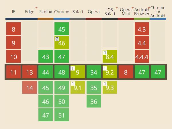
Multiple backgrounds are supported by Internet Explorer 9 along with some trivial issues. Background image options such as “background- clip” property seems to be good. Blended colours seem to work best in Chrome, Opera and are slightly applicable in Safari due to few bugs but these seem to have no sign of progress with Microsoft Edge.

Hope this blog post will help you to understand background property in a perfect manner. For more such posts; stay tuned to Softqube Technologies; a well known Web Development company India.
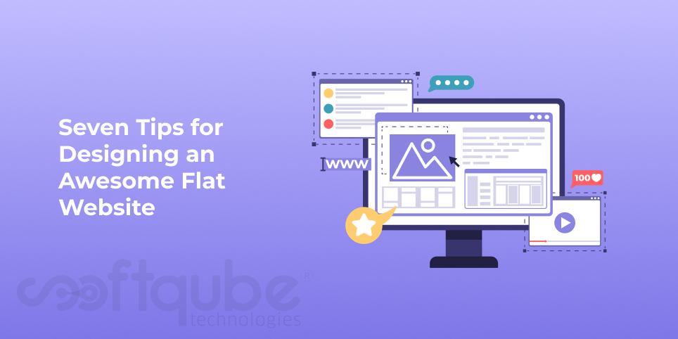
Seven Tips for Designing an Awesome Flat Website

Take any of the IT fields and you will see that everything seems to be new every now and then. Web Designing is one such field where trends come and go. Some trends get lapsed with time while others get evolved with the span of time and get more exciting.

Flat designs belong to those trends that evolve with time and slowly it starts growing in various directions. The secret to the success of this design is that it is very simple, universal and it develops flimsy user experience.

But what does “flat” design actually mean? How design principles can be put into practice while creating a website so that it can impress your visitors. Well, this is what web developers are looking for now days.

Seven Tips for Website Designing

Keeping in mind this thing, we decided to provide some tips that will be useful to all those who wish to have flat websites for their business:

Tips for an Awesome Flat Website:

  • Focus on Important things: Flat design relies on several geometric shapes, frames and typography in order to create a layout. In order to have clear content inside the layout; it is necessary to focus on the order, symmetry as well as size of the elements. Make sure you organize them in the way you like.
  • Choose colours to create depth: In any flat design; colours play an important role. They make websites look prettier as well as valuable in identifying the depth. The reason behind this is; flat design is actually based on 2D look.

    It is a usual trick that web designers use to create the depth. Playing with hues and colours, light elements on dark surfaces can provide a subtle depth which fits right into it.

  • De-clutter: Website must be kept neat and clean, no unnecessary stuff is allowed to be added there. Flat design serves this purpose very well and hence one must add only those things that are actually needed. Make sure to keep the page elements at a definite space and avoid decorative stuff.
  • Separate Clickable from Non Clickable: One of the issues with flat design is it makes really difficult to know which elements in the website are linked and which ones are clickable. While conceptualizing the website; know how you wish to signify the visitors and where should they click.
  • Make Navigation Easy: When it comes to flat design; navigation is an important thing apart from just looks. It is must to have simple user experience and simplicity begins with navigation.

    The website structure must be basic and drop down menus must be used only if needed or in case you have more pages.

  • Avoid all Show offs: Flat design is meant to be simple, easy, neat and clean. To stay committed to this flat design; one needs to leave all the cute effects and animations. Just follow the principles of flat design and you will have an awesome website without the use of any animations or effects.
  • Choose the right fonts: Flat design is restricted to certain font styles only. Select the fonts that are straight forward and simple. One of the most preferred fonts is Sans Serif Font Family.

    You can search on Google for other such font styles that suit the best in flat design.

Take Away:

These tips will definitely help you to get an awesome flat website developed by experts at Softqube Technologies; a well known web development company in India serving customers since 2009.

How to Make HTML Accessible to Visually Impaired?

When it comes to web design, accessibility is very important. If the website is not accessible properly then there are chances of getting few visitors. In order for website to be accessible by everyone including visually impaired ones; it is necessary to create a design that is easy for them to use.

HTML Structures

This depends on the quality of HTML used to write the website code as it is as important as its visual look. For this, HTML must be semantic. So, what are semantics?

HTML Semantics:

In order to understand the importance of HTML Semantics; it is first of all necessary to understand the term “Semantics” in context to web application. In general sense; semantics can be known as “branch of linguistics and logic that is concerned with meaning”.

A website is understood in different ways by different people. Visually impaired people experience it through touch on several Braille output devices.

How Semantics must be applied to any Website?

Here, we are discussing about ways to make website accessible for visually impaired people. Such people use assistive technologies that offer quality interface to understand the content. For website interaction; two separate interfaces are to be used to convey the meaning to the users.

The section of user demographics who make use of browsers like as Chrome or FireFox and then are solely dependent on visual cues will infer the meaning of the page entirely from its visual design language.

Users of assistive devices like as screen readers rely highly on semantic nature of HTML to get the same meaning.

How HTML can be used in assistive devices?

Several types of mechanisms are to be used from HTML. These include:

  • Hierarchy inferred representation of the page that is known as Document Outline. It depends on important structural elements in order to develop a document structure which is to be used for document presentation in several different ways.

    A separate example of this is OSX Voiceover’s “Web Rotor” feature that presents the user with a complete list of ‘landmarks’ within the document which allows quick navigation.

  • It is high level composition that contains an enriched document object model representation as well as objects from user interface which is referred to as Accessibility tree.
Great Power and Great Responsibility go hand in hand:

It is a tough task to convey the meaning of complete website to visually impaired ones. Yes, making customers understand your website is the basic aim of web. A common pitfall is when website becomes inaccessible and it arises from web developers being unable to understand the difference between explaining the HTML role as well as the explaining the presentation of that meaning. This difference between content and presentation is powerful and it displays a variety of visual designs that use the same HTML structure.

This allows a fixed typeset into virtually any of the HTML structures that can be used in different levels of semantic quality.

Will it work with old HTML?

The web sphere has quickly involved due to technological advancements and rich internet applications that include the characteristics of desktop applications. These user interfaces include complex HTML structures and these become difficult for assistive technologies to infer their intent without using some level of analysis.

The HTML specifications are very less flexible and hence it cannot include current user interface trends.

Take Away:

So, whenever you compose any HTML structure; you ensure that its meaning must be explained with the use of correct HTML elements as well as ARIA state and role flags wherever necessary.

Only then, one must pay attention to the presentation of those structures. Hope you liked this post. Let us know your views about the same. For more such tips and tricks, stay connected to Softqube Technologies; a hub of expert website developers in India.

Five Joomla CMS Mistakes to Avoid

Joomla is a very well adopted CMS that is used for developing websites. Large enterprises prefer Joomla the most. No matter how much expert one is in developing websites; always one or the other thing is left out.

Sometimes; in an urge to complete tasks within given deadlines; Joomla website owners often tend to make some mistakes. Here, in this blog post; we have highlighted those so that these are not repeated thus making the development task error free.

Joomla Extensions

Mistakes made by Joomla Website Owners:

  • Back up Testing Undone: Be it a small mobile app or any website; back up is necessary. It is the most helpful thing that provides us all our old data back which is useful when at any point of time if things go wrong and we may lose the data, back up will help us to retrieve everything.

    Without back up; you will not be able to get the data back when your website gets hacked or there are other such critical issues. Failing to have a back up is one of the biggest mistakes ever done by website owners.

    Never rely on hosting companies; have a back up of your own!

  • Failing to stay updated with Joomla updates: Joomla keeps on updating its versions on regular basis but if you fail to login into administration dashboard of Joomla website then you will not know when and how the update is available.

    In most of the cases; website owner fails to offer administrator access with web developers. Here, we can say that 99% of websites are never updated once they get launched. Joomla comes with regular updates related to security patches and bug fixes.

    For this, Joomla extension Auto Update is available which automatically handles minor version updates to Joomla.

  • Failing to Maintain the Database: Database is the most forgotten areas of any Joomla website. Databases can grow quickly however lack of maintenance can slow down the website.

    Back up sizes increase to an extent when any database is uncontrollable. It is necessary to hire a qualified web developer who can help you to maintain websites regularly.

  • Failing to stay updated with Joomla Extension updates: Joomla has several core updates and there are various 3rd party extensions that keep on updating their softwares. It is necessary to ensure that Joomla extensions are updated regularly as this will help you to get benefit of new features, bug fixes, security patches and compatibility updates.
  • Lack of Image Optimization: High resolution images clicked with professional digital cameras are crystal clear. So, just you need to upload it and scale it down so that it can easily fit the page. There’s a common mistake made by website owners i.e. failing to optimize the images before uploading them.

    It is necessary for your website to be visible on mobile devices and hence your images must be optimized for mobile devices so that website doesn’t take much time to load.

Take Away:

So, from now on; don’t forget to keep an eye on latest updates. Let us know how this blog post helped you? For more such tips; stay tuned with Softqube Technologies; Joomla website development company in India.

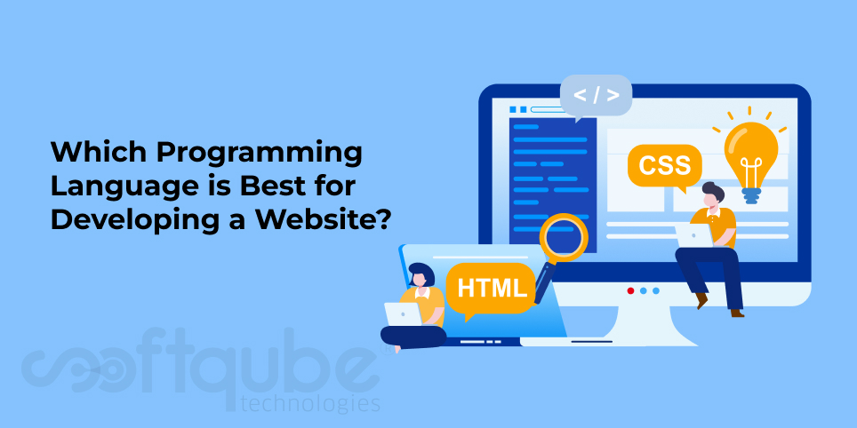
Which Programming Language is Best for Developing a Website?

After reading so many blog posts that show the importance of website for business; finally you have made your mind that you need a website for your business as it is the mirror which will show your professional face to the visitors.

Now, when this thought comes in any owner’s mind and following to this, there are several other thoughts like as colour combination, selection of programming language and lots more. In our previous blog post, we discussed about the selection of colour combination for professional websites

Today, here in this blog post; we will discuss about the selection of programming language. When you go to any developer and say “I want to get a website developed for my business” then he/she will give you various options like as PHP, HTML, Java, ASP. NET etc.

Programming Language for your Enterprise

Now, how will you decide which one will be useful for you? So, this blog post will answer this question and now next time when you go to any web design company or any website developer then you will be prepared with the answers.

Let’s Begin and Understand Which Language Meets the Needs:

Basically, if we understand then there is no such language that can be considered as perfect for website development but the selection varies based on the needs. So, before deciding the language; keep these things in mind:

  • Server Platform
  • Server Software
  • Budget
  • Your programming experience(if any)
  • Database selected for backend

The operating system that you are using is your platform and the choice of OS plays an important role in the language selection. Wrong selection can lead to several problems in future and not every language provides easy altering options.

Microsoft Windows and UNIX are two of the most preferred operating systems. After choosing the OS, another choice is for server software. Windows system offers IIS that is available free for Windows however it is believed to have lots of history and security problems.

Apache web server and others similar to it are used commonly on UNIX like systems as well as Windows.
Most of the programming languages are available for free under GNU license as well as other open source licenses. Rest of these are commercial products that have a licensing fee. Commercial products have the advantage of offering commercial support and tighter integration with other products of the company.

Among us, some of them cannot afford higher prices of commercial solutions on the market. The tradeoff is the effort made to properly configure the environment which may not be worth the savings cost.

Some of the popular Programming Languages:

  • Java/Servlet/JSP:
    Type: Compiled
    Website: Oracle
    License: NA

    Java is a powerful and secured open source web based programme which can run as a standalone programme in any website. Web based applications that use MVC are created using Java. It is the most recommended programming language for developing secure web applications.

    Java Tutorials are available to assist you when you have problems developing the website with Java.

  • Perl: It is an interpreted script language that can be transformed into binary executable bytecode. Its license is available for free.
  • PHP: Like as Perl, it is also an interpreted script language that can be easily compiled. This one is also available for free. PHP is one of the most popular programming languages used by several websites and web applications over the internet.

    Some PHP examples are Facebook, Magento and Twitter.

  • C Language: It is a standard programming language mainly used on UNIX operating system and slowly it was used on many other operating systems. Today, it has become one of the widely used web development languages.
  • C++: It is a programming language which supports data abstraction and object oriented concepts to C.
  • Cold Fusion: It is a scripting language based on standard HTML used for writing dynamic websites. One can quickly create dynamic pages and use several built in tags and functions used for creating object oriented enterprise level applications.
  • ASP. NET: It is a web development language that combines html and server side code to create web pages that have hidden functionalities and scripts.
  • C#: It is known as C sharp. This language includes imperative, generic, object oriented and component oriented programming disciplines. It is a simple object oriented programming language with object oriented syntax based on C++.

    Its recent version 4.5 was released in 2012.

  • WebDNA: It is an easy to learn language with inbuilt memory databases that are designed specifically for server side programming. It uses a small set of instructions that can be used to create smooth database oriented websites.

    This language can be easily integrated with CSS, HTML, HTML5 and AJAX which allows mixing the layout with programming and server side with client side. It is available for most operating systems like as Unix, OS, X and Windows.

Take Away:

Here, we have covered some of the well known web development languages. You can first know your needs and then see which language will suffice it and based on that, you can take the decision.

For more such tips regarding Web Design, keep in touch with Softqube Technologies; Web Design Company India.

Let’s Work together!

"*" indicates required fields

Drop files here or
Max. file size: 5 MB, Max. files: 2.
    This field is for validation purposes and should be left unchanged.