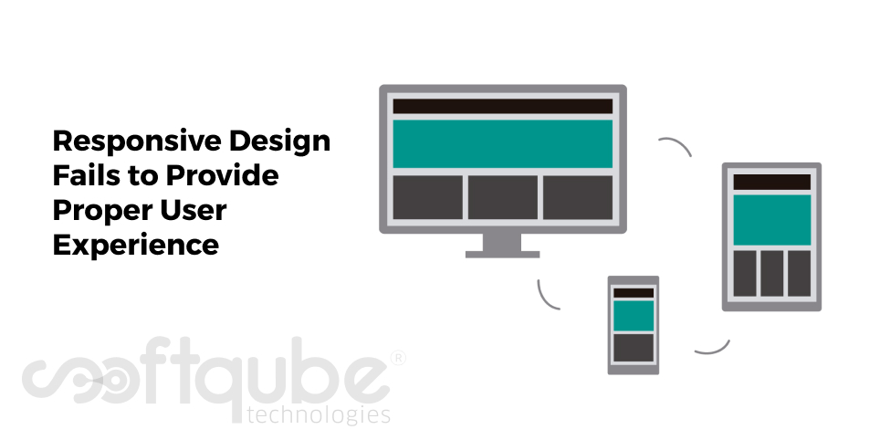
Responsive Design Fails to Provide Proper User Experience
August 26, 2015

Till now, we all were in a dilemma that responsive websites actually provide good user experience but the truth is out; responsive designs are now slowly failing to provide proper user experience. So, why this happened?
Reason; updation of Google’s Mobile Algorithm; only web content that fits the small screen won’t serve the purpose in fact it is necessary to have a well planned design that works perfectly on the mobile device.
Just adjusting your website for any mobile device won’t serve the purpose; it’s necessary to take a look at the user experience that this website provides to the mobile device users and in case something is missing then try to adjust your design accordingly.
Yes, not all the functionalities of desktop are needed in a mobile based website however they may wish to get some content removed when they are viewing the website on a smaller screen. So, what exactly is the problem with these small screens?
Issues with Responsive design that lead to bad user experience:
- Arranging Images: According to the survey, clients love to have static images and screenshots of those before they are actually published. Now days, design is more focused on proper arrangement of the elements for various mobile devices and is less concentrated on placing the static images.
- Screen restraints: Users may face difficulty in reading the content on small screens. The web standards actually inspires people to use a different format for showcasing data on the mobile screens instead of tables and tabs that are used to represent the data in easy manner.
- Perspective shift: Sometimes, the only problem is of perspectives i.e. consumers’ point of view varies as compared to that of company’s point of view. Businesses tend to ask their customers what they want.
For instance, if we say registration is an important aspect of any website and this is because businesses need more functionality as they wish that customers should see the logical entry point of entry for which customers are searching.
This shows that responsive designs don’t fulfill all the needs of the customers yet there are many things that are lacking.
How to update responsive designs?
When it comes to website design; the main thing is to make it responsive as well as adaptive. Responsive means that the website should fit to every screen size where as the adaptive approach means changes in content and how it appears depending on the screen size.
Adaptive designs are preferred more as compared to responsive designs. Websites should match the context in which users are using the site with the nature of the content. The requirements of businesses vary as per the type of product or service they are selling.
So, here is the summary of what must be considered while developing websites for different businesses:
- Pre store: People will reach to the website via social media and they may search for coupons, offers or recipes.
- In store: Once they enter in store they now are searching for reviews, coupons as well as price comparisons with other sellers.
- Post store: During post store they are now in search of branded content.
Wind Up
Knowing where customers are while purchasing helps you to design the site in a way that suits their needs. With adaptive designs, users can have good customized experience depending on the device they are using.
Wish to get adaptive designs developed from experts then get in touch with Softqube Technologies; one of the best Web Design company in India.
Share on


