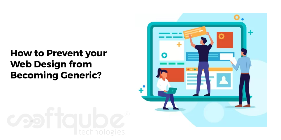
How to Prevent your Web Design from Becoming Generic?
November 3, 2015

There are times when you are full of work pressure and you have lots of tasks to be completed before the deadline and the last month is left to finish the projects. Clients are howling on you and in any way you want to finish the project.
Just imagine the situation. How messy it is? And at such times instead of using your own imagination and designing the icons, you start using readymade fonts available. This means now at the end moment just to finish the tasks, you are creating the website using automatic tools.
This instead of helping you to develop an amazing website will just give you an output with a design that might be available in the market.
So, here are some ways through which you can finish your projects easily and that too with an amazing design.
Ways to Develop Attractive Websites within less time:
- Use different Icon Styles: Yes agreed that within short span of time and under pressure, it is impossible to create your style font. However, instead of using the same old font style, try using different font styles.
Different web pages have different demands. On some pages, we need to use large icons with necessary text blocks. This means that further text context is to be added which can easily explain things to the user.

Here, we fail to achieve the goal and instead of being different; our website becomes generic. So, in order to look different and develop a strong way of establishing a memorable brand it is necessary to create a style guide for every serious business.
The bottom line is to avoid using same fonts again and again and do some research for other text fonts.
Some useful and attractive Font icons will be easily available at various design market places like as Creative Market and UI8. You can innumerable types of icons at reasonable rates.
- Avoid following the rat Race: We know today Flat web design is the market trend but it is not necessary that every website you design must have flat design. It’s not always necessary to use the trend in all websites.
This applies to Google Material Design as well. So, always choose the tool that is compatible to you and which suits the task perfectly. An expert web designer will be able to compare both and decide the one that is suitable on a basic level.
Both styles come with own set of suggested fonts and colours. So, now decide which one to use keeping in mind your needs.
Don’t adopt complete set of principles but keep in mind these principles as they will be helpful to you in one or the other project. Use these styles as a breeding ground for new designs to get generated in mind.
- If possible avoid using Full Screen Headers: Lets’ say you are designing a website by using same old fonts as well as same start up stocks and the same old rounded ghost buttons. These are just there without any meaning.
It’s simply a waste of time as these don’t deliver anything to your business and also don’t reveal anything about the same. This is an opportunity that is wasted. So, how these headers are used at their best?
These can be used to compel customers to take action. This will motivate users to spend their valuable time by learning more about what you are going to sell. One can add a simple conversion button on the header however just making it the centre of focus of your website is useless.
Hence, if you are able to explain your website in one or two sentences and provide some thoughtful reasons to buy your product then just add a simple conversion button as there’s no need of adding big headers. Just use simple ways such as FAQ section through which users can easily contact you.
Trends bring struggles because designers have to have their hands on latest trends and they must be able to create anything and everything as per the latest trends.
We usually fall in love with the simplicity of the design and sometimes we tend to overuse some design aesthetics. This leads to the development of websites that have no identity. We look at the design and think that it is really cool.
But sometimes we fail to understand what makes it really cool and without understanding the fact, we try to make similar designs thus expecting the same effectiveness and this leads to disappointment.
So, next time when you wish to develop a website; avoid using those robotic designs and try to create one as per your own choice. This will help you to develop websites as per your choice.
Wind Up
Hope this blog post will help web designers to come out of the mess that occurs at the end of every month. Try out these tips and let us know how you feel after adopting them. Do you think this is the right way to develop amazing websites as per the client’s needs?
Share your feedback with us and in case you wish to get your business website developed from experts then you are at the right place. Softqube Technologies is one such leading website development company India which helps you to develop your business website as per the need.
Share on


