Introducing Ghost Buttons in Web Design
October 8, 2015

We all are familiar with the idea of quick call to action buttons. However, sometimes these are designed in such a manner that users are easily distracted instead of being attracted. And here comes the role of Ghost buttons.
So, what these ghost buttons are and how are they actually useful in your web design? Here, we will explain everything in detail and make you aware about the usage of these in your web design.
Let’s begin:
Well, this was adopted already in 2014 but still we can find many websites lacking its usage either due to improper knowledge or may be due to unawareness of its benefits. 2015 is the year where we have seen many changes in the web design world. Today, ghost buttons are quickly adopted by web designers due to their undisturbed look as well as simple photography.
Ghost Buttons – Introduction:
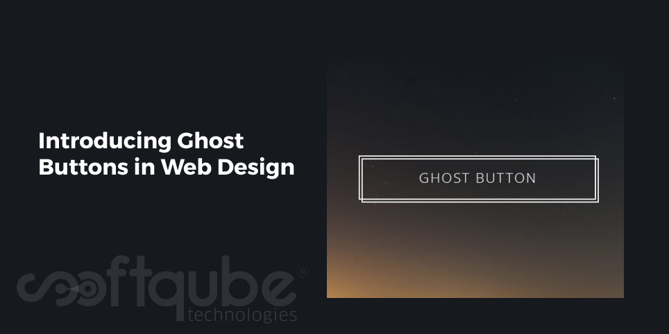
Can you imagine anything in your web design that has a simple outline and no fills or at sometimes only has transparent fills and through which one can easily see the background components? Yes, such elements exist in web design and these are called Ghost Buttons.

This means designers will create the same button as they do but the difference is they will give a “ghost” effect to it which means the button is there but it is not visible with our naked eyes and it will only be seen once we click or hover the mouse; as per the effect given by the designer. This ghost effect can be given to any design style such as icons, banners, images or any other visual elements.
Ghost buttons offer a beautiful look to the website. These are often preferred to be placed at the top of the website.
Using Ghost buttons in an Appropriate Manner:
Generally, when it comes to website design; the first thought is to use huge images, videos, sliding banners and more. See it’s a belief that huge things attract more people and that’s why everything huge is to be put on the website to attract more people! Ghost buttons really work well on these huge elements.
However, there are some rules that must be considered while using them in your web design. These are as follows:
- Ghost buttons must be placed on large visual backgrounds so that they stand out differently from other web design elements.
- Ghost elements must always be interactive. This means when someone brings the cursor to that button then it can change colour or the outline.
- These must be larger in size as compared to other usually used call to action buttons. It is advisable to use 40px tall and 100px wide ghost button. This is the average size that is recommended to be used as it easily works on touch screens.
After all, mobile design is an important aspect to be borne in mind while creating design elements!
So, following these rules web designers can easily create ghost menus, buttons as well as other interactive elements which are always put on the top of the homepage as this will help to maintain the focus on photography.
Ghost buttons are used throughout the website. This can be found if one goes through the complete website. However, these are available in the different sections of the home page.
Some websites also use these buttons at the end of the page and these are very easy to find while there are certain sites that use it on their homepage. It is also a good way to draw the attention of people towards important tasks such as call to action.
The ghost effect can also be applied to the icons. Designers can create such effects that can keep the users engaged throughout the entire website.
Creating Ghost Buttons using CSS:
Well, till now we understood what ghost buttons and how they are useful? Now, let’s see how these can be created using CSS:
Here, we will explain the process of developing a simple ghost button:
Using simple hand coded CSS; web designers can create lovely ghost buttons. Hover effects can also be added so that these buttons can give visual feedback when hovered upon.
The CSS for ghost buttons is as follows:

Here, one can change the font as well as remove the text decoration of links and can modify the buttons by adding thin border lines, changing the padding and much more. In short, this CSS can be modified as per the needs.
Giving Hover effect to Ghost buttons:
.ghost-button:hover, .ghost-button:active {

color:#fff;

background:#009688;

}
This command can be used to change the background colour of the ghost button in such a way that it changes on the hover of the mouse.
Such ghost buttons when implemented in the website can lead to increase in the visits to the website. Apart from hover effect, one can add more of such effects to make them attractive.
Wind Up
Ghost buttons were initially introduced in 2014 but these were used less and now again in 2015; these have gained the momentum. This blog post covered all the important things related to Ghost buttons i.e.
- Introduction
- Usage
- Creating Ghost buttons using CSS.
Hope this blog post was useful to you. We will discuss more about Ghost buttons and other related web design trends in our upcoming blogs till then, stay tuned with Softqube Technologies; Web Design India where all of your web design needs will be easily met by experts keeping in mind your business niche as well as your own expertise.
Have you ever used ghost buttons? Let us know your experience about the same. We would love to hear from you.
Share on


