The UX Design Case Study For Salon App
August 21, 2023
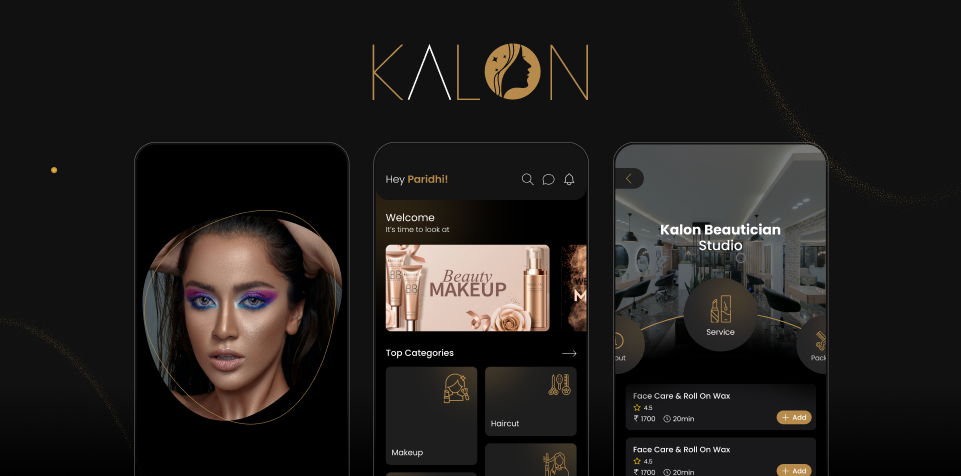
The Salon App market has grown dramatically in recent years, changing the way individuals interact with salon products and services. Thanks to the proliferation of smartphones and increasing access to technology, salon apps have become vital tools for customers seeking personalized salon experiences. These applications include various services, ranging from virtual try-ons of cosmetics and skincare products to appointment booking with salon specialists. The industry has seen an increase in user engagement as a result of the convenience and convenience provided by these apps.
The salon app “Kalon” and its progress toward creating a smooth and user-centric salon experience are the topic of this case study. By investigating the problems that consumers in the salon business encounter and the solutions provided by “Kalon,” we acquire useful insights about the influence of user experience (UX) design on the success of a salon app.
Overview of the “Kalon” app and its features
The “Kalon” app is a complete salon platform that enables users to have a personalized and easy salon experience. The app offers a variety of creative features with its user-friendly interface to appeal to the different demands of salon aficionados. Users may browse a large catalog of salon goods, each with thorough descriptions, reviews, and suggestions.
Identification of the challenges faced by users in the salon industry
The salon industry offers users a number of issues, which the “Kalon” app tries to address. Furthermore, customers have difficulty imagining how specific cosmetics or hairstyles would appear on them before purchasing or visiting a salon. Finding and making appointments with reputable salon providers can take time and be difficult. Recognizing these issues, “Kalon” aims to deliver solutions that simplify the salon experience while also catering to the individual demands of consumers.
The “Kalon” app’s goal is to change the way people interact with salon by giving a quick, personalized, and powerful experience. The app’s target demographic includes salon enthusiasts, cosmetics lovers, skincare fans, and anyone looking for professional salon services. It appeals to people who place a premium on ease, accessibility, and customization in their salon rituals.The app encourages users to discover, experiment, and develop their salon journeys with confidence and self-expression by providing a broad set of functions.
User Research and Insights
A detailed and iterative technique was used to perform user research for the “Kalon” app. It started with an experimental phase to learn about the target audience’s salon-related preferences, behaviors, and pain concerns. To acquire significant ideas, qualitative research approaches such as in-depth interviews and focus groups were used. The research process’s iterative nature allowed for ongoing feedback and revision, culminating in a user-centric and effective app design.
The research phase for the “Kalon” app provided important insights into the target audience’s preferences and pain issues. Users were overwhelmed by the large assortment of salon items and desired individualized advice, according to key findings. There was also a great desire for reliable salon advice and keeping up with the current trends. These findings influenced the design and development of “Kalon,” ensuring that it addressed these issues while also providing consumers with a customized, convenient, and instructive salon experience.
Insights gained into user preferences, behaviors, and pain points
The user research for the “Kalon” app provided useful insights into the target audience’s preferences, behaviors, and pain concerns. Users reported a high desire for personalized experiences, wanting salon goods and recommendations tailored to their unique needs. Users want convenience in making appointments with trusted salon professionals, with time management being a significant concern. Additionally, consumers stressed the necessity of trustworthy salon advice and remaining current with the latest trends. These insights influenced the design of “Kalon” to match user expectations and effectively solve their pain areas.
User Persona
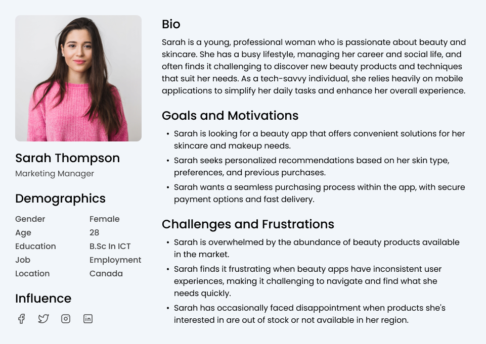
Creating personas is a way to imagine who I would be designing for. I listed the goals & needs, motivation, and fear & frustrations.
Empathy Map
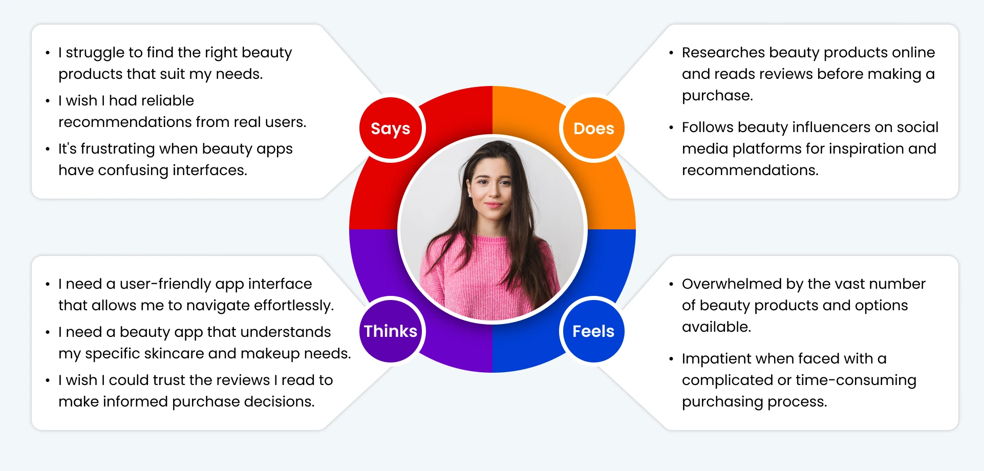
What does a typical day look like for Sarah? What does she value and think about? How are her actions different — or the same as her thoughts?
UX Design Process
The design process is a systematic and iterative approach to problem-solving and creating solutions for various design challenges. It is a series of steps or stages that designers follow to move from an initial concept or idea to a final design solution. While there are different variations of the design process depending on the field or context, the general framework typically includes the following stages
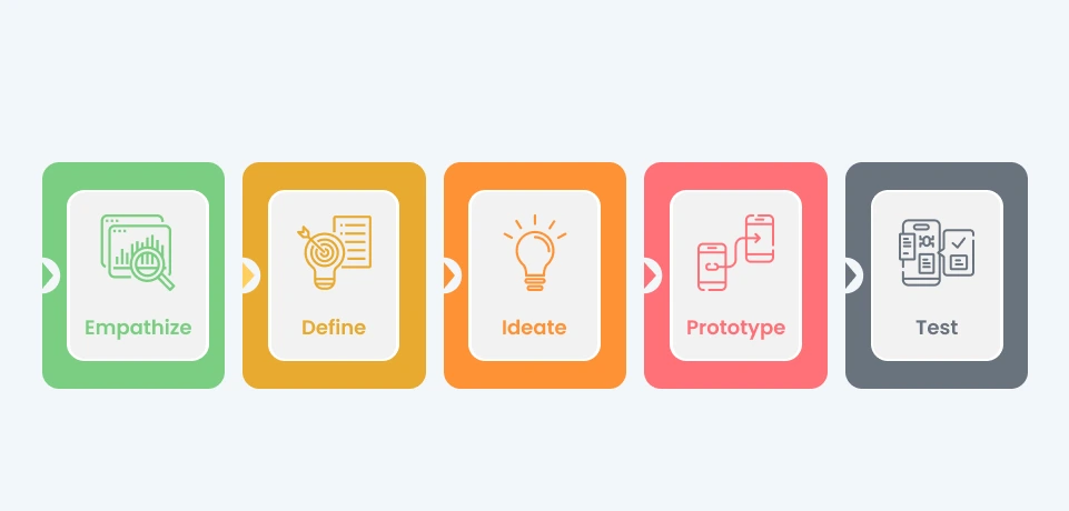
Each stage of the “Kalon” app’s creation followed a systematic process, beginning with research and ending with testing. The research step entailed acquiring user insights and comprehending their requirements. Ideation came next, with brainstorming and conceptualization sessions to develop ideas and solutions. The ideas were then wireframed into low-fidelity visual representations, illustrating the app’s structure and navigation. The wireframes were brought to life using prototyping, which created interactive mockups for user testing and feedback.
Wireframing and Prototyping
The “Kalon” app’s wireframes and prototypes were critical in envisioning the app’s structure and functionality. The wireframes served as low-fidelity blueprints for the app’s layout and organization of essential elements. They enabled early feedback and refinement by providing a clear visual depiction of the user interface. The prototypes demonstrated the flow and navigation, allowing stakeholders and users to directly experience the app’s capabilities. This presentation of wireframes and prototypes aided in the comprehension of the app’s design and functioning, allowing for iterative adjustments prior to the final production stage.

User feedback, usability testing, and stakeholder input were used to guide design iterations. The preliminary design was tested and assessed, and input was obtained in order to identify areas for improvement. This feedback cycle influenced later design revisions, which resulted in improvements in usability, functionality, and visual appeal. Each iteration improved on the preceding one, correcting faults and incorporating user preferences. The “Kalon” app evolved and improved over time as a result of this iterative strategy, resulting in a user-centric and refined solution that fulfilled the needs and expectations of its target audience.
Description of the user testing phase and its objectives
The “Kalon” app’s user testing phase sought to obtain useful insights and input from actual users in order to evaluate its usability, functionality, and overall user experience. The goals of user testing were to detect any concerns with usability, confirm the effectiveness of design solutions, and assess user happiness. This stage aimed to identify areas for improvement, collect feedback on specific features or interactions, and confirm the app’s design decisions. The user testing phase was critical in enhancing the app’s usability and user happiness.
The feedback gained during the app’s user testing phase was critical in driving later design modifications. Users’ recommendations, observations, and feedback provided useful insights into areas for improvement and identified pain points inside the software. Additional rounds of testing were conducted as part of the feedback loop to validate the effectiveness of the design improvements. The “Kalon” app evolved as a result of this iterative approach, resulting in a more refined and user-friendly experience.
Enhancing User Experiences through A/B Testing
A/B testing is a cornerstone of user experience (UX) design, providing a methodical way to enhance digital interfaces and optimize human interactions. This scientific procedure entails comparing two versions (A and B) of a design element, such as a webpage, app interface, or email layout, to see which one produces the highest level of user engagement and intended outcomes.
A/B testing allows designers and developers to make data-driven decisions in the context of UX design. It is feasible to assess the impact of modifications in real-world circumstances by showing alternative versions of a design to specified user groups. Metrics like as click-through rates, conversion rates, bounce rates, and user behavior patterns are tracked and analyzed to determine which version connects with users the most effectively.
Finally, A/B testing serves as a guidepost for UX designers in their quest for ideal user experiences. It helps teams to produce designs that resonate, fascinates, and meet consumers’ demands while attaining organizational objectives by enabling evidence-based decision-making..
Introduction to the visual design elements and branding strategy for “Kalon”
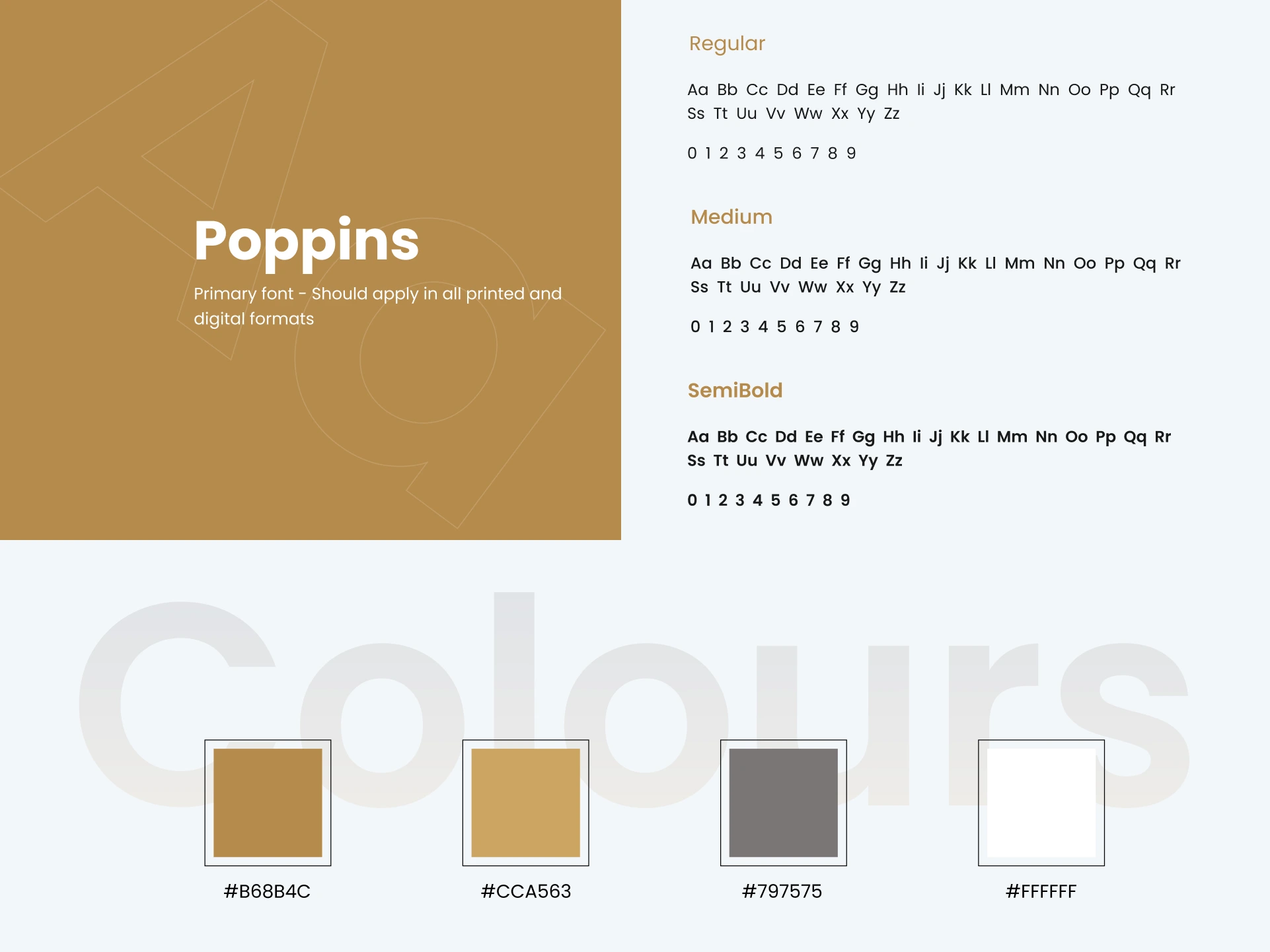
The “Kalon” app’s graphic design components and branding approach were created to offer a cohesive and visually engaging experience. The design elements included a carefully chosen color palette, typography, and artwork that represented the desired tone and look of the app. The graphic design elements were designed to convey an air of elegance, sophistication, and trustworthiness. “Kalon” aspired to establish a visually appealing and identifiable brand that resonated with users and generated a strong emotional connection with the app through the constant usage of these aspects.
The research phase for the “Kalon” app provided important insights into the target audience’s preferences and pain issues. Users were overwhelmed by the large assortment of salon items and desired individualized advice, according to key findings. Users complained about how time-consuming it was to discover and arrange appointments with salon professionals. These findings influenced the design and development of “Kalon,” ensuring that it addressed these issues while also providing consumers with a customized, convenient, and instructive salon experience.
Overview of the final design of the “Kalon” app
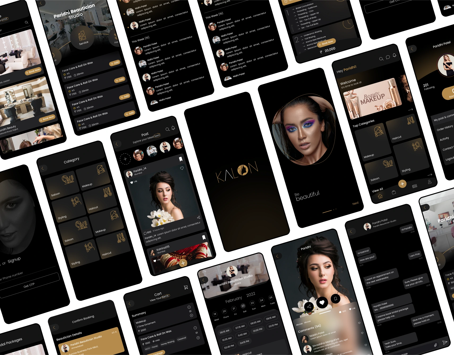
The “Kalon” app’s final design features a seamless and visually appealing interface that caters to the demands and preferences of salon enthusiasts. The design has a simple and easy structure that allows users to browse through the app’s features easily. A well-balanced color palette exudes elegance and sophistication, while a properly chosen font improves readability and visual hierarchy. In addition, the final design incorporates high-quality visuals, such as product photos and user-generated content, to provide an immersive and exciting experience. The final design of the “Kalon” app shows a streamlined and polished product that elevates the salon journey for its customers, with a focus on simplicity, personalization, and user-centricity.

The “Kalon” app combines crucial features that directly address the pain points experienced by salon industry users. Personalized Recommendations make customized recommendations based on user interests, making the time-consuming chore of choosing the correct cosmetic items easier. Easy Appointment Booking streamlines the process of booking salon services with reputable specialists, saving users time and effort. Reliable salon Advice and Trend Updates keep people informed and motivated, filling a void in the market for reliable salon knowledge.
Conclusion
In a nutshell, the case study of the ‘Kalon’ app underscores our holistic approach, together with Softqubes unique perspective, in crafting a user-centric and distinctive salon application. By aligning my methodologies with Softqubes expertise, we effectively tackled pain points in the salon industry through meticulous user research, innovative ideation, precise prototyping, and rigorous testing. The app’s key features, including personalized recommendations, and streamlined appointment booking, directly addressed customer pain points, elevating their salon experiences. This case study holds significance as it vividly illustrates the potency of our user-centered design approach, in collaboration with Softqubes, in generating impactful solutions that reshape industries while exceeding user expectations.
Share on


