Rotating Banners: Why these hinder conversions
November 21, 2014

Rotating Banners Everyone be it a digital marketer or a website owner loves to have image sliders on the website as these include maximum content in a single place. The only drawback of these sliders is that they distract users from the most important content.
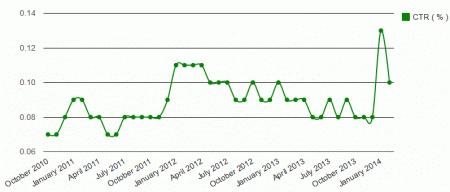
Many people still use these sliders on their homepage or landing page. So for them, now is the time to do some research and know whether it is really useful or harmful for your website. From a recent survey, a conclusion arrived that this attractive design might be executing your conversions thus providing you lesser number of customers than needed.
1. Animated Designs easily distract visitors
When your animation is going on, on the website it really distracts the viewers as the motion inside it attracts them but it eventually diverts their attention making it inconvenient for them to fulfill the tasks they actually wanted to accomplish on your website.
2. Point of Attraction
Image sliders were actually meant to attract visitors. The message displayed is for few seconds followed by another message of same or less duration. This type of message pattern is the most fascinating form of the banner. This motion actually makes these banners more distracting.

3. Eye tracking Maps used for Banner Blindness
When you browse anything online, you constantly find advertisement pop ups. To avoid these pop ups, users opt for advertisement filters. As per the research, this movement of blocking ad pop ups is called Banner Blindness which means users don’t like to see ads every time they visit their favourite website.
Another experiment called Eye tracking maps was done where it was found that users searching for any information on the website were unable to find it when placed on a huge promotional banner instead they were able to find it easily on every other place except banners.
4. Bottom line
Banners may attract visitors but actually their conscious mind tries hard to ignore it.
5. Trust comes with Controllability
Rotation banners are hard to control as messages come one after another even if the visitors don’t want to watch them. This really irritates them. A simple logic or motto of the website is to allow visitors to control their web experience instead of forcing them to watch what they don’t want to.
This will eventually increase their trust in you.
6. Banners are less effective
Designers creating these banners think that these are highly effective in increasing the traffic on their website but this is not the reality. Banners are very less effective as visitors have to stay for long to see every single image for a company’s complete view.
Wind up
These auto advancing shows or we can say animated banners are highly popular. However, web designers have started developing strategies to avoid them. The aim of conversion optimization is to allow websites to successfully complete their task.
An advice from well known Online Marketing Company, India – Softqube Technologies: Always attract your visitors with great deals and offers instead of spending your resources in developing website banners. These great offers help in getting more conversions as they are at the same place and allow people to think and finally get converted.
Share on


