An Overview About Website Designing Convergence
January 16, 2016

Most of the website launches fail to surprise people. This was the trend 15 years ago i.e. in 2001. This can be because web design got merged with mobile trends. As a result, people want those websites that are compatible with all of the devices they are using; be it laptop, desktop or mobile.
We can say that responsive designs are in huge demand and so designers need to develop interactive design patterns as well as cultural conventions as clients are highly influenced by the crowd when deciding their own approach.
As per the website predictions of 2016; convergence is of prime importance and hence today in this blog post; we are going to have an overview about convergence:
So, let’s begin:
What is Converging?
According to an expert; website convergence is all about design. This includes sarcastic but serious templates. Such templates are mostly preferable for technology websites or start ups that need to simplify brand product or service.
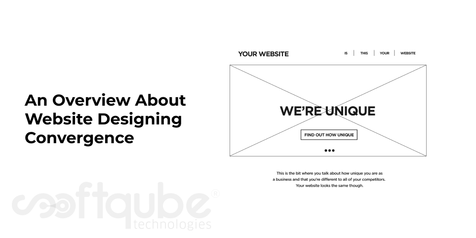
Such designs are self perpetuating but get lot of attention from audience.The following image will show you such websites:
What is the need of converging?
Themes play an important role. These make websites easy to develop. Centred designs with large fonts are suitable for all devices including mobile. Such websites have lot of white space and icons and they don’t need more in the form of assets from business.
The three column design suits a website with sufficient information available.
Is Convergence good or bad?
Irrespective of lack of imagination, maintaining this style design; convergence is not actually considered bad. Instead, the user finds it easier to navigate among the websites.
The scrolling page and the main image with the overlaid type and ghost buttons are two features which can be found on one page start up sites.
There are websites that use such designs where some are more sophisticated than the remaining two. It is a fully functioning eCommerce site from a huge business. Such websites include the design that is mentioned in the above image.
There’s a website called the The Lush which uses style as per the substance and also reveals a bold message and the image that is consistent with fresh and sustainable brand image.
Another website is The Prince Ink Company which uses three column layouts. So, if you are thinking to design a website that possesses a professional look then don’t forget to apply these tips.
What is the perfect way for businesses to stand out from the crowd?
2016 will see a change in website designs. Hence, in order to stand out from the crowd it is necessary for websites to use rich content like as grand photography, video and interactivity.
Take Away:
Are you willing to have a great website design then get in touch with Softqube Technologies, a well known web design company in India where you can get the designs created from experts and also you can hire expert web designers for your project.
Stay connected with us for more such updates about website design and its latest news and updates.
Share on


